
I keep coming back to this idea that the words don’t matter as much as how they’re said.
The same phrase can feel soft, structured, a little messy, or almost like you weren’t trying at all depending on the typography. It’s subtle, but once you start noticing it, you can’t unsee it.
So I tested it.
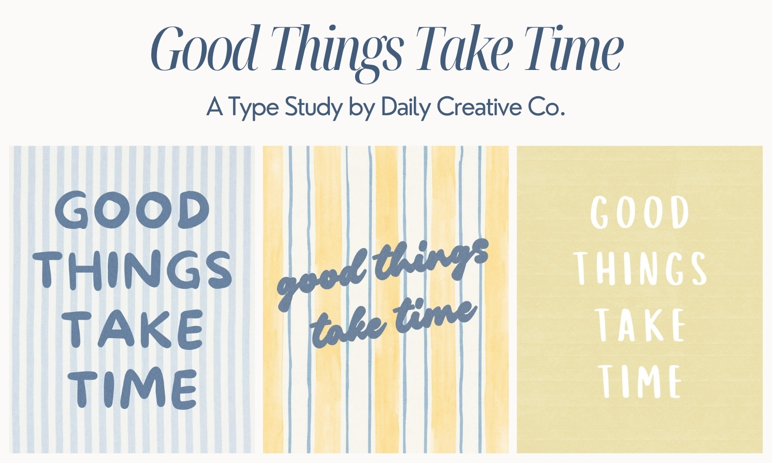
I used the phrase “Good Things Take Time” and treated it like a constraint. I didn’t change the concept or rebuild the layout. I only changed the fonts and adjusted spacing.
It turned into five completely different typography styles.
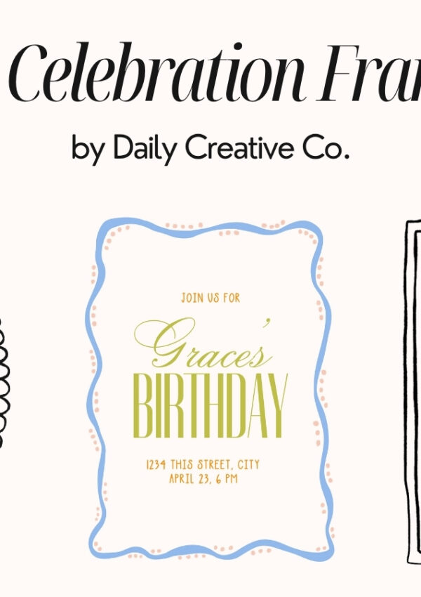
A Simple Typography Study Using One Phrase
This type study is based on one idea: how much typography alone can change the feel of a design.
Each version uses the same words, but different fonts, spacing, and overall tone. Some feel more structured and editorial. Some feel softer and more relaxed. One feels slightly imperfect in a way that makes it more personal.
Nothing else changed. That’s what makes this such a useful way to understand typography.
Why Fonts Change the Feel of a Design
Typography controls how a design is perceived.
Even when the layout stays the same, changing the font can make something feel more modern or more classic, more polished or more casual, more minimal or more expressive.
If your design feels off, it’s often not the layout. It’s the type.
This is why small adjustments like switching fonts or refining spacing can completely change the outcome without starting over.
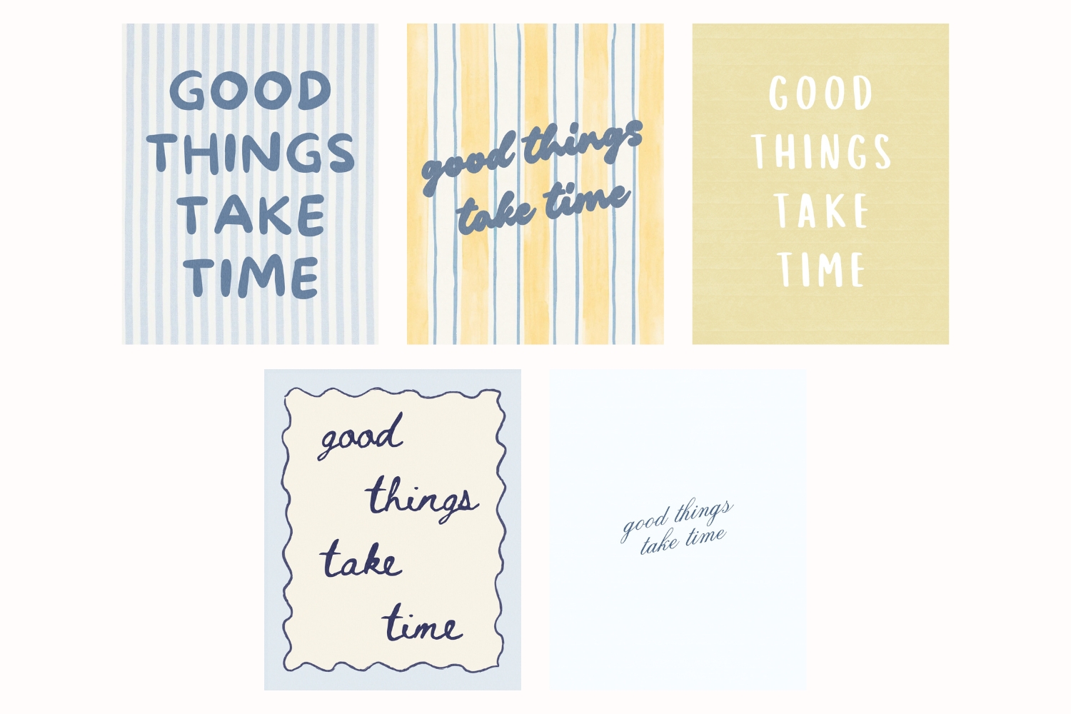
5 Typography Styles Using the Same Phrase
Below are five variations of the same phrase, each using different fonts.
As you look through them, pay attention to how each one feels different even though the words are identical.
This is the core of typography in design.
This will be available for a limited time before moving into the vault!
Free Download: Font List From This Type Study
I pulled all of the fonts used in this typography study into a simple one-page PDF.
It includes:
- all 5 typography variations
- the exact font names used in each design
- a clean reference you can come back to when you’re working
This is meant to be something you can use quickly when you need direction without starting from scratch.
? Download the free type study PDF here
This Freebie Friday download is available for 24 hours before it moves into the Vault.
How to Use This in Your Own Designs
The easiest way to use this is to take one phrase and try a few different typography directions.
Start with a structured serif, a clean sans serif, and a handwritten or script font. Then adjust spacing and alignment slightly.
You’ll start to see how quickly the feeling changes without needing a new concept.
Final Thoughts on Typography and Design
Same words. Different feeling. That’s really what this comes down to!
Once you start seeing typography this way, it becomes much easier to fix designs that feel off and create work that feels more intentional.
AbAbout Type Drops
Type Drops are a resource for small but powerful design assets like brushes, textures, font pairings, and layout helpers, all created to work across tools like Procreate, Canva, Photoshop, and more. Each resource is designed to help you produce clean, polished, and expressive work without adding friction to your creative flow.
Stay tuned for next Friday’s drop!
Looking for More Free Design Resources?
Browse more Type Drop downloads including:
- 5 Typography Styles Using the Same Phrase (Free Font Study Download)
- Kindest Note Font Pairing Templates for Branding
- The Mahjong Edit Color Palette: A Unique Spring Color Palette for Branding and Design— Freebie Friday Download
- Kindest Note Demo Font, A Warm Handwritten Caps Font — Freebie Friday Download
- Whimsical Wavy Hand-Drawn Border Designs — Freebie Friday Download
- Paper Grain Texture for Canva and Procreate — Freebie Friday Download
Leave a Reply