
If you have been feeling a little stuck with color lately, this one might shake something loose.
I feel like I have been seeing Mahjong everywhere recently, so I finally learned how to play and immediately got obsessed. Not even just with the game, but with the tiles themselves. The colors, the contrast, the tiny details. Everything feels so intentional.
Naturally, my brain went straight to design.
This palette started as a way to capture that feeling. Something soft but grounded. A mix of porcelain tones, jade greens, and warmer colors that actually work together without feeling overly pastel or too trendy.
I kept adjusting each color until it felt like you could use the entire set across a brand without anything clashing or competing for attention. That was the goal from the beginning. Not just something pretty to look at, but something you would actually use.
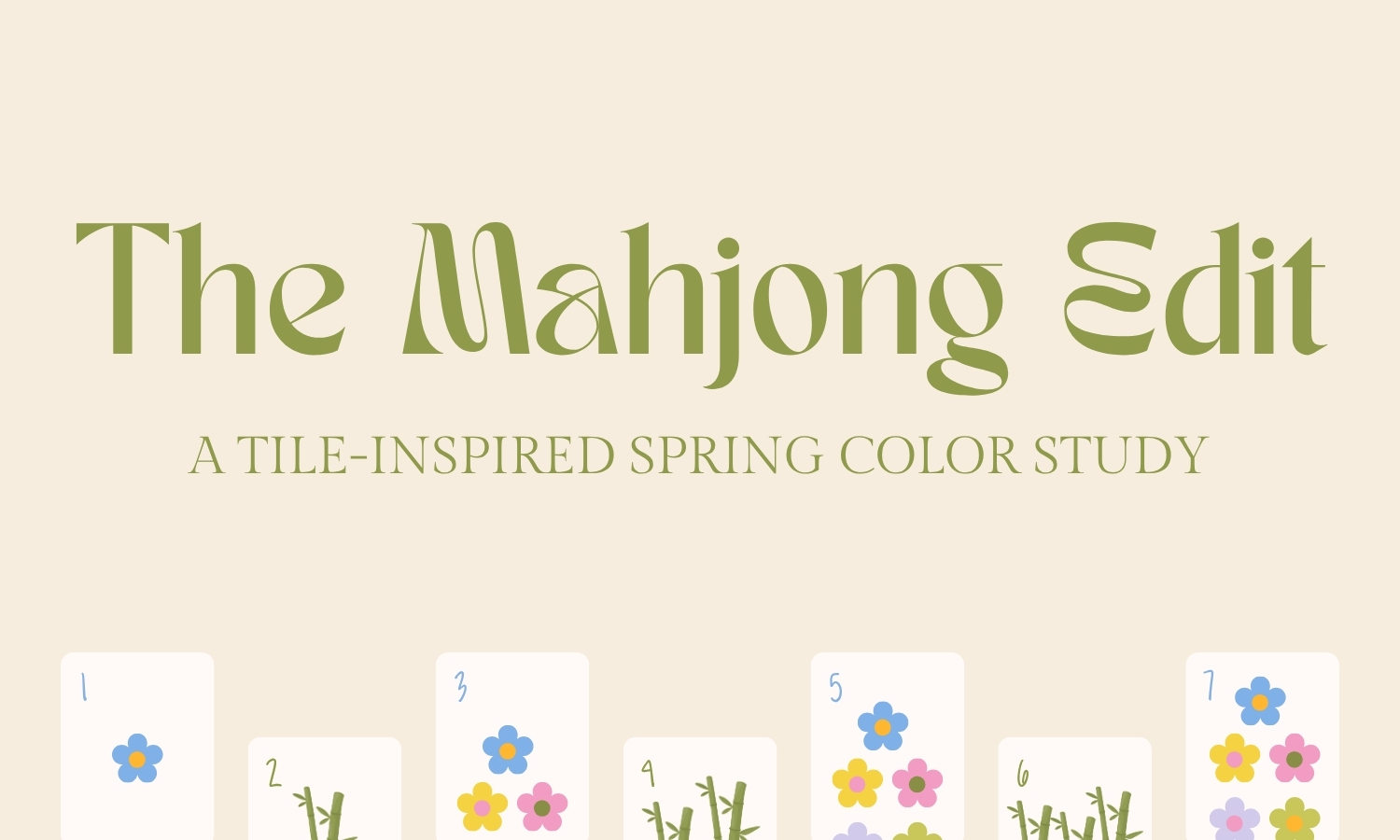
A Mahjong-Inspired Spring Color Palette
The Mahjong Edit pulls from the materials and tones you see in traditional tiles. There is this balance between structure and softness that I kept coming back to while building it out.
The blue has that slightly glazed, ceramic feel. The greens are more grounded and earthy, closer to jade than anything tropical. The pinks and purples are softened down so they sit in the background instead of taking over. And then the yellow and orange bring just enough warmth to keep everything from feeling flat.
Nothing in here is overly bright or overly muted. It all sits somewhere in the middle, which is what makes it so easy to use.
Why This Palette Feels Different
A lot of spring palettes lean really light or really bright, and they end up feeling hard to actually apply. This one sits in a more usable range.
The olive and clay tones give you something to anchor to. The softer colors layer on top without overpowering anything. You can pull just two or three colors from this and still have it feel complete, or use the full set and everything still works together.
It is one of those palettes that feels flexible depending on how you use it, which is what I always look for when I am building anything for branding.
How I Would Use This Palette
If I were building a brand with this palette, I would start with one of the deeper tones as a base and then bring in the lighter colors more sparingly.
The porcelain blue works really well for backgrounds or larger sections. The pinks and lilacs are perfect for accents or softer moments. And then the yellow or orange can be used to draw attention without feeling too loud.
You do not need to use everything at once. In fact, it works better when you do not.
Download The Mahjong Edit
This palette is part of this week’s Freebie Friday, so you can download it and start using it right away. It is also part of a growing collection of color capsules that are meant to be saved and reused over time, not just used once and forgotten.
About Freebie Fridays
Freebie Fridays are your weekly source for small but powerful design assets like brushes, textures, font pairings, and layout helpers all created to work across tools like Procreate, Canva, Photoshop, and more. Each resource is designed to help you produce clean, polished, and expressive work without adding friction to your creative flow.
Stay tuned for next Friday’s drop!
Previous Freebie Fridays:
- Kindest Note Companion Symbols Font — Freebie Friday Download
- Kindest Note Demo Font, A Warm Handwritten Caps Font — Freebie Friday Download
- Whimsical Wavy Hand-Drawn Border Designs — Freebie Friday Download
- Line Grid Pattern Brush for Procreate — Freebie Friday Download
- Paper Grain Texture for Canva and Procreate — Freebie Friday Download

Leave a Reply