
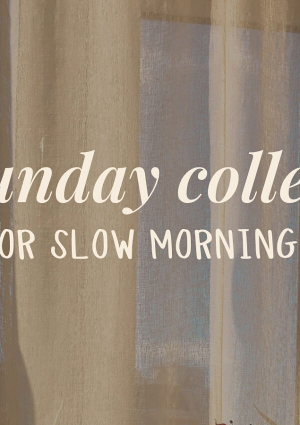
If you’ve ever opened Canva and immediately felt overwhelmed by all the font choices, you are definitely not alone. Pairing fonts can be surprisingly tricky. You want your designs to look polished and professional, but sometimes it feels impossible to know what actually works.
That’s why I’m sharing three of my favorite font combinations this month. These are the exact pairings I’ve used in real designs that I know hold up across posts, products, and promos. Whether you are working on a social media graphic, a digital product, or a presentation slide, these combos are ready to drop in and make your content feel more put together.
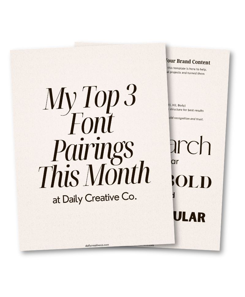
And because I want you to see these pairings in action, I created a free Canva template with all three styles included. You can scroll to the bottom of this post and grab it to start using them right away.
Safira March + Poppins
This font combo is one of my go-to choices when I want something that feels elevated but still friendly. Safira March is soft and stylish with an elegant, editorial vibe. It adds a touch of personality without being too formal or fussy. When paired with Poppins, which is clean and simple, the whole design feels modern and fresh.
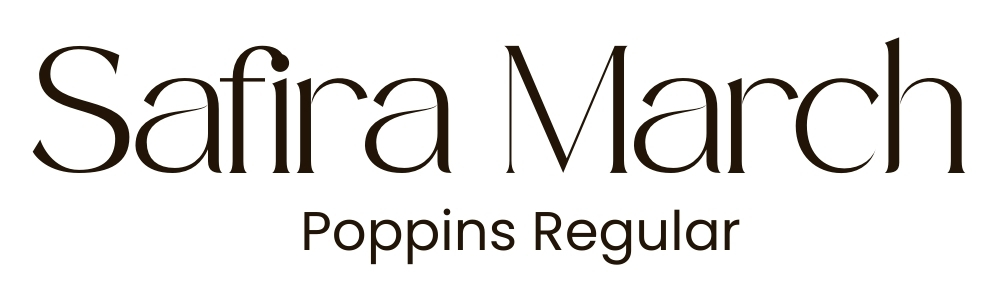
This pairing is perfect if you want to look polished without losing your personal touch. Safira catches the eye and Poppins keeps your content clear and easy to read.
Here are a few great ways to use this combo:
- Digital product covers
- Pinterest pins
- Webinar slides or intro decks
London + Nourd SemiBold
If your brand has a bold, confident vibe, you will love this pairing. London is sleek, structured, and stylish. It gives your design a strong voice right from the start. Nourd SemiBold balances things out by offering just enough structure to support your layout without competing for attention.

This duo works beautifully when you want to look professional and creative at the same time. The combination feels modern and direct but still has personality.
Try this one for:
- Sales or launch graphics
- Service or pricing guides
- Portfolio pieces
Sunborn + Hussar Bold
This pairing is full of character. Sunborn brings a creative and editorial feel with its unique serif style. It has a little flair that sets it apart without feeling too dramatic. Hussar Bold adds strength and clarity, giving your design a grounded feel that balances out the personality of Sunborn.

This is a great option if you want your brand to stand out in a way that still feels approachable and intentional. It’s fun and expressive, but still easy to work with.
This combo is perfect for:
- Blog graphics
Brand storytelling - Social media carousels
Want to See These in Action?
It’s one thing to read about font pairings, but it’s another to actually see how they look in a real design. That’s why I created a free Canva template featuring all three combinations from this post.
You can open it, explore how each pairing looks in context, and then plug in your own content to make it yours. It is an easy way to experiment with styles without starting from scratch.
A Little Preview of What’s Coming
These font pairings are just a small sample of something much bigger I’ve been building. Soon, I will be launching a complete design toolkit that helps you create beautiful, consistent branding without all the second-guessing.
Inside the full kit, you will get:
- More hand-picked font pairings with suggested use cases
- Canva templates for posts, products, and presentations
- Ready-to-use brand boards you can personalize in minutes
If you have ever wished branding could feel more fun and less frustrating, this toolkit is going to make your life so much easier.
Stay tuned. More details are coming soon. For now, grab the free template and start building visuals you actually feel good about.

Leave a Reply