
A Softer Alternative to Pure White for Typography
White feels like the safest choice in design. It is clean. It is neutral. It does not ask you to commit to anything.
And yet, it is often the reason a layout feels harsher than it needs to.
If you work with typography a lot, you have probably had this moment. The fonts are right. The spacing is solid. Everything technically works. But the design still feels a little sharp or unfinished. Nine times out of ten, the background is the problem.
Pure white does not always give typography the support it needs.
Introducing Neutral Foundations for Typography
For this week’s Freebie Friday, I created Neutral Foundations for Typography Color Capsule & Canva Template. A small background neutrals capsule designed specifically for typography-heavy design.
These are not brand colors. They are not aesthetic statements.
They are practical background surfaces you can swap in anywhere you would normally use white.
The goal with this freebie was to create something you could reuse constantly without thinking twice.
Why pure white can work against your typography
Pure white creates the highest possible contrast between text and background. On paper, that sounds ideal. In practice, it can feel aggressive, especially in text heavy layouts.
When you are designing something meant to be read, not skimmed, white can become tiring. It exaggerates spacing. It makes type feel louder. It can even make well chosen fonts feel less refined than they actually are.
You see this most often in:
- long PDFs and guides
- brand boards
- editorial layouts
- presentations and slide decks
- workbooks and resources
The longer someone looks at the page, the more noticeable it becomes.
This does not mean white is bad. It just means it is not always the best default.
What neutral background colors actually do
Neutral background colors are not meant to be noticed. That is the point.
They sit just far enough away from white to soften the overall experience without introducing color in a way that changes the design direction. They act more like a surface than a palette.
Think paper instead of screen. Think warmth instead of glare.
Good neutral backgrounds reduce visual tension. They help typography feel calmer and more grounded. They allow letterforms to do their job without fighting the background.
This is why off-white background design shows up so often in editorial work and high end branding. It makes everything feel more considered without being obvious about it.
Choosing neutral background colors for typography
When you are working with text, your background should never be the loudest part of the design.
The best typography background colors are the ones that disappear. They support contrast without pushing it too far. They work equally well with serif and sans serif fonts. They hold up across different font weights and sizes.
A good neutral background should
feel comfortable to read on
make long text feel easier on the eyes
work across multiple projects and clients
never feel like a brand color
Once you start designing this way, it becomes very hard to go back to pure white everywhere.
Why minimalist design backgrounds benefit from soft neutrals
Minimalist design puts a lot of pressure on small choices. When there are fewer elements on the page, every decision becomes more noticeable.
In minimalist layouts, white can feel empty instead of intentional. Soft neutral backgrounds add just enough presence to make the layout feel finished while still staying out of the way.
This is especially helpful when you are designing:
- brand boards
- typography studies
- educational PDFs
- clean web layouts
- social graphics with lots of text
Neutral backgrounds give minimalist design more depth without adding decoration.
How to use these neutral backgrounds in your own work
If you are ever unsure where to start, replace white first.
Try these backgrounds in:
- brand boards
- PDFs and workbooks
- slides and presentations
- editorial layouts
- Canva designs
- social graphics that are text-led
You do not need to redesign anything. Just swap the background and see how the typography feels.
Most people are surprised by how much calmer the layout looks with such a small change.
Why this is a brand-safe design tool
One of the biggest reasons designers avoid changing backgrounds is fear. Fear of changing the brand. Fear of making the wrong call.
Neutral background colors remove that friction.
They do not ask you to commit to a new direction. They simply improve the foundation your typography sits on. That makes them one of the safest and most reusable tools you can add to your design process.
Download the Freebie Friday background neutrals capsule
This freebie is available for a limited time as part of Freebie Friday at Daily Creative Co.
After the free window closes, Neutral Foundations for Typography will move into the Vault for members to keep and collect.
If typography plays a big role in your work and you want a softer alternative to pure white, this is one of those small tools that quietly makes everything feel better.
Download the Freebie Friday Canva Template here!
About Freebie Fridays
Freebie Fridays are your weekly source for small but powerful design assets like brushes, textures, font pairings, and layout helpers all created to work across tools like Procreate, Canva, Photoshop, and more. Each resource is designed to help you produce clean, polished, and expressive work without adding friction to your creative flow.
Stay tuned for next Friday’s drop!
Previous Freebie Fridays:
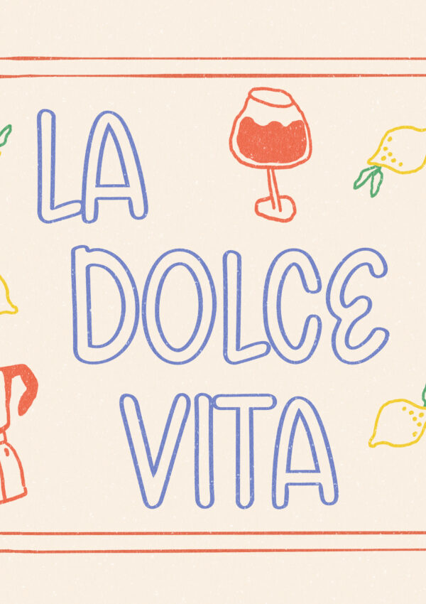
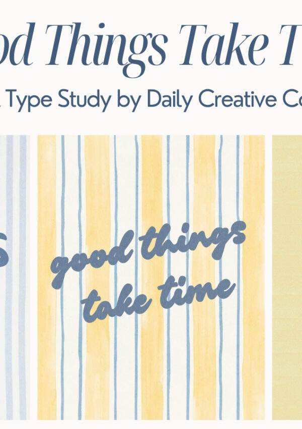
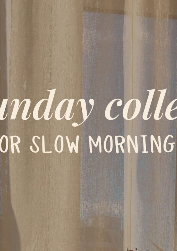
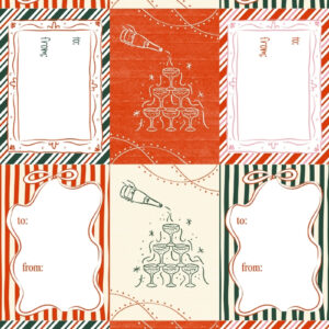
- Printable Holiday Gift Tags & Christmas Gift Tags PDF — Freebie Friday Download
- Whimsical Wavy Hand-Drawn Border Designs — Freebie Friday Download
- Line Grid Pattern Brush for Procreate — Freebie Friday Download
- Holiday Font Pairings for Canva and Procreate — Freebie Friday Download
- Paper Grain Texture for Canva and Procreate — Freebie Friday Download
Leave a Reply