
Every year, right around the time holiday music starts sneaking into grocery stores, I notice the same pattern in my inbox and search data. People start looking for printable Christmas gift tags and holiday gift tags they can download and use immediately. Something simple. Something that does not require another decision when everything already feels like a decision.
What always stands out to me is that gift tags are usually the moment where good intentions fall apart. I see beautiful wrapping paper choices, carefully picked ribbons, and thoughtful color palettes, and then the tag feels rushed or disconnected. Not because someone did not care, but because they underestimated how much visual weight that tiny piece of paper actually carries.
Gift tags are small, but they are loud. And once you realize that, you start designing them very differently.
What Printable Christmas Gift Tags Are and How They Are Used
Printable Christmas gift tags are one of the few design pieces that almost always end up being handled. They are cut out, written on, tied, bent, and viewed from every angle. They are rarely seen flat or straight. They exist in real life, not just on a screen.
Most printable holiday gift tags are designed for standard letter paper because accessibility matters. I always design with the assumption that someone is printing these at home, probably in a rush, maybe on a slightly low ink cartridge, and cutting them out at their kitchen counter. That reality informs every design decision I make.
This is also why I think gift tags deserve more respect than they usually get. They are not just decorative. They are functional objects that need to work under imperfect conditions.
Watch the YouTube Tutorial on Designing Gift Tags in Canva
If you are more of a visual learner, or if you want to see how these ideas translate into real decisions inside Canva, I also recorded a full YouTube video walking through my process for designing holiday gift tags.
In the video, I show how I think through sizing, margins, spacing, font choices, and layout in real time. You can see where I pause, where I simplify, and where I decide not to add something even when it might be tempting. It is less about following steps and more about understanding why certain choices lead to cleaner results.
This video pairs really well with this post. The blog explains the why. The video shows the how.
You can watch the gift tag design tutorial here:
If you have ever opened Canva and felt unsure about when to stop or why something feels off, this walkthrough will help you trust your instincts a little more.
Why Most Holiday Gift Tags Look Messy When Printed
One thing I have learned over the years is that screen design lies. A design can look perfectly balanced on a monitor and completely fall apart once it is printed.
Small formats exaggerate everything. Tight spacing feels tighter. Decorative fonts lose charm quickly. Seasonal elements that looked cute suddenly feel crowded. I have personally printed designs I loved on screen and immediately thought, oh no, this is too much.
Most messy gift tags are not the result of bad ideas. They are the result of too many ideas competing in too little space. Once I accepted that gift tags need fewer decisions, not better ones, my designs improved instantly.
The Best Sizes for Printable Holiday Gift Tags
I used to think size was just a technical step. Now I see it as one of the most important creative decisions.
Two by three inches is my default for a reason. It forces restraint. It does not invite overdesign. It naturally limits how much text and decoration you can add, which is exactly what most people need.
Three by four inches can work beautifully when I want a bit more breathing room or when the design relies on a frame. Wrapping labels are a completely different category. Their horizontal shape changes how the eye moves, which is why I usually keep them slim and directional.
Choosing size early saves me from myself later.
How to Design Printable Gift Tags That Feel Intentional
The biggest shift in my own design process happened when I stopped starting with decoration. I used to jump straight into fonts and seasonal elements because that felt fun. Now I start with margins, spacing, and alignment, even when it feels boring.
Margins are my safety net. They keep me from pushing text too close to the edge and help everything feel grounded. Alignment gives the design quiet order. Even very simple layouts feel intentional when things line up.
I also design gift tags imagining them already tied onto a gift. Slightly crooked. Layered over texture. That mental image helps me avoid over polishing something that will never be seen perfectly straight.
Font Choices That Work on Christmas Gift Tags
Fonts are where I see people overthink the most, and I have absolutely been guilty of this myself.
There was a time when I believed every holiday design needed a special festive font. In reality, most of the gift tags I actually love use very calm typography. The personality comes from proportion, spacing, and restraint, not from novelty.
On small printed pieces, one font used consistently almost always feels more intentional than a pairing that is trying to feel clever. I care far more about how a font prints than how unique it looks on screen.
If a font feels slightly boring, it usually means it will age well.
Using Frames and Borders on Holiday Gift Tags
Frames were a turning point for me with gift tags. I used to avoid them because I thought they felt old fashioned or unnecessary. Now I see them as one of the most useful layout tools available.
A frame gives the design a home. It stops elements from floating and immediately makes the layout feel finished. Especially on small designs, that containment matters more than decoration.
I almost always choose thin frames that match the weight of the font. If the frame and type feel like they could have been drawn with the same pen, the design instantly feels cohesive.
Adding Seasonal Elements Without Overdoing It
I have learned the hard way that seasonal design gets overwhelming very quickly.
Early on, I would add a snowflake, then another, then a stripe, then a star, all in the name of making something feel festive. What I eventually realized is that one small seasonal cue does more work than five obvious ones.
Now I ask myself one question. What single detail tells the story of the season. Once I answer that, I stop.
Restraint does not make a design boring. It makes it confident.
Writing Copy That Works on Printable Christmas Gift Tags
Copy is one of the easiest places to overdo things. Gift tags do not need sentences. They need cues.
Short phrases work because they respect the scale of the object and leave room for handwriting. That space is intentional. It allows the person using the tag to participate in the design.
When I leave space, I am designing for real people, not just aesthetics.
Designing Minimal Wrapping Labels for Holiday Gifts
Wrapping labels are some of my favorite things to design because they behave differently. They move horizontally and feel more like a banner than a tag.
I almost always left align the text because it gives the eye a clear starting point. Then I add a small detail on the opposite side to create motion. That balance keeps the label from feeling static.
Muted colors matter here. I test everything with the assumption that it will be printed at home. If it feels slightly soft on screen, it usually looks perfect on paper.
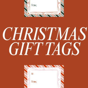
Download My Printable Christmas Gift Tags
If you want to see all of this thinking applied in a finished, ready to use format, I created a set of printable Christmas gift tags that reflect exactly what I have been talking about here.
These tags were designed slowly and intentionally. I paid close attention to spacing, margins, and how everything would actually look once printed, cut out, and tied onto a gift. I tested them the same way most people will use them at home, on standard letter paper, with normal ink, and real handwriting added afterward.
What I love most about these tags is that they do not compete with your wrapping. They are meant to support it. They leave space for names, notes, and little imperfections that make gifts feel human. They work whether your wrapping is simple kraft paper or something more colorful and layered.
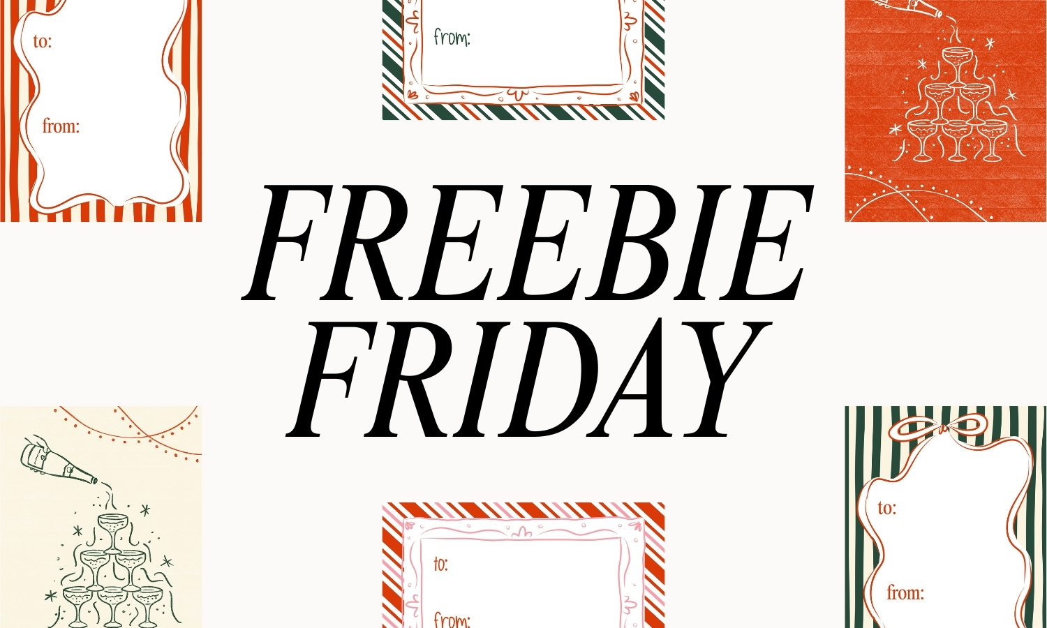
You can download my printable Christmas gift tags here!
They were originally released as part of Freebie Friday and now live in my library, so you can use them whenever you need them, not just this year.
Common Mistakes to Avoid When Designing Holiday Gift Tags
The most common mistake I see is speed. Everything happens too fast.
Decoration before structure. Fonts before spacing. Layers before hierarchy. I know this pattern because I have followed it myself many times.
Designing in stages changed everything for me. Structure first. Type second. Decoration last. And always print one test page before committing.
Most problems reveal themselves immediately once the design becomes physical.
Time to Design Your Gift Tags
Printable Christmas gift tags and holiday gift tags might be small, but they are one of the clearest reflections of how someone designs.
When they are rushed, it shows. When they are thoughtful, it elevates everything around them.
Whether you are downloading ready made tags or designing your own in Canva, focusing on structure, spacing, and restraint will always give you better results than chasing decoration.
Small designs teach big lessons. And once you learn how to design them well, everything else gets easier.

Leave a Reply