
Have you ever made a design in Canva, taken a step back, and thought, “Hmm, something just feels off”? You’re definitely not the only one.
In most cases, when a design doesn’t look quite right, the issue isn’t your colors or your layout. It usually comes down to your fonts. Font pairing sounds easy until you’re deep into a project, flipping through options and wondering if your design is clever or just kind of messy.
If you’ve ever second-guessed your font choices or stared too long at your screen trying to make things work, this is for you. Let’s walk through five common font pairing mistakes that trip people up and look at how to fix each one quickly and confidently.
1. Choosing Fonts That Are Too Similar
One of the easiest ways to make your design fall flat is by using two fonts that are nearly identical. When your headline and body text look almost the same, your message can start to feel blurry and hard to follow. It becomes difficult for the reader to know what to focus on.
To create balance and interest, try mixing different types of fonts. A bold serif font for your heading paired with a simple sans-serif font for the body text works beautifully. It helps create contrast and makes your design more visually appealing.
Here are a few tips to help you choose fonts that stand apart:
- Use fonts from different categories. For example, serif and sans-serif or script and bold.
- Choose fonts with clearly different weights. A thick heading works nicely with a lighter subhead or body font.
- Avoid combining fonts that are too close in style or width. You want variety, not confusion.
When done well, contrast between fonts makes your design feel structured and thoughtful.
2. Using Too Many Fonts at Once
It can be really tempting to use several different fonts in one design, especially when Canva gives you so many to choose from. But the more fonts you use, the harder it becomes for your audience to follow your message. Too many styles can make your design look noisy and disorganized.
Keep it simple. Stick to just two fonts for most designs. Use one for your headings and another for your body copy. If you want to add a third, make it subtle and only use it occasionally as a decorative accent.
Here is a simple setup that works for just about anything:
- Choose a primary font for headlines and titles
- Use a clean, legible font for body text
- Add a unique accent font only if it adds meaning or impact
This kind of consistency helps your brand look more polished and more professional. It also saves you time when designing new graphics or layouts.
3. Picking Fonts That Don’t Match Your Brand’s Energy
We’ve all fallen in love with a fun handwritten font at some point. It might look cute, but that doesn’t mean it fits your brand. If you’re creating content for a premium product or a serious service, that playful font could be sending the wrong message.
Your fonts should reflect the personality of your brand. Think about the kind of experience you want to create for your audience. Do you want them to feel excited and energized? Calm and reassured? Inspired and empowered?
Once you know what kind of energy your brand gives off, you can choose fonts that match that feeling.
Here are a few helpful questions to guide you:
- What emotion should this design create?
- Does this font feel casual, elegant, modern, or bold?
- Would this style speak to your ideal audience?
Choosing fonts that match your brand tone helps build trust and makes your message feel more authentic.
4. Skipping Font Hierarchy
When everything on your page looks the same, it becomes really hard to know what to read first. Your audience needs a clear sense of direction. Without it, they might feel overwhelmed and move on without absorbing anything.
Font hierarchy gives your text a structure. It shows people where to start and what’s most important. The easiest way to do this is by changing the size, weight, and spacing of your fonts.
Try this approach:
- Make your headline the largest and boldest element on the page
- Use a slightly smaller and less bold font for subheadings or secondary information
- Keep your body text easy to read with consistent spacing and alignment
Also remember to give your text room to breathe. A little white space can make your message stand out even more.
When you create visual order in your text, you make it easier for people to understand and engage with your content.
5. Not Checking Your Design on Mobile
A design that looks amazing on your laptop might not work at all on your phone. Thin fonts, script styles, and small text can be really hard to read on smaller screens.
More and more people view content on their phones first. That means your design needs to be readable and clear even when it’s scaled down.
Here are a few quick ways to test your design:
- Zoom out in Canva to see how it looks at a smaller size
- Email the image to yourself and open it on your phone
- Ask a friend to glance at it on their mobile and give you honest feedback
If your text is hard to read, consider bumping up the font size or switching to something simpler. Clear and legible beats trendy every time, especially when people are scrolling quickly.
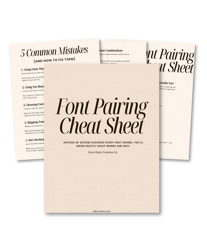
Bonus: Get My Free Font Pairing Cheat Sheet
Still not sure which fonts look good together? I made something to help with that. My free Font Pairing Cheat Sheet includes three ready-to-use font combinations that look great on social media, digital products, presentations, and more.
You don’t have to spend time hunting for the right pairings. Just open the guide, choose one that fits your brand, and start designing.
Want an Easier Way to Pick Fonts That Actually Look Good?
If fonts stress you out or you’re tired of second-guessing your choices, this free guide is going to save you time and frustration.
The Font Pairing Cheat Sheet includes three designer-approved font combos that work well in all kinds of projects. Whether you’re creating content in Canva, working on a course, or building a lead magnet, these pairings will give you a great starting point.
[Click here to download your cheat sheet now]
It’s completely free, and you can start using it right away.
The Good News
You don’t have to be a designer to create content that looks clean and professional. You just need a few helpful tools and a little bit of guidance.
By simplifying your font choices, thinking about how you want your designs to feel, and giving your readers a clear visual path, you can make beautiful, effective designs without all the stress.
Try one of these tips the next time you open Canva. You might be surprised how much easier it feels to bring your ideas to life.
Related Posts:
- How to Upload Fonts to Canva + Video Tutorials: (Pro, Mobile & Fixes for Every Issue)
- Canva Licensing Explained: A Complete Guide to Free, Pro, and Enterprise Use
- My Top 3 Canva Font Pairings This Month (With Free Templates!)
- How I Finally Nailed My Brand Design (Without Overthinking Everything)
- 5 Common Font Pairing Mistakes (and What to Do Instead)
- 3 Canva Time-Saving Tips You’ll Wish You Knew Sooner

Leave a Reply