
Food branding is one of those places where the font has to do more than just look nice. It has to make someone feel something before they even read the words. A bakery logo, a cafe menu, a gelato shop sign, a tiny jam label, a pastry box, a coffee bag, a cute sticker on a takeout bag, all of those little pieces are doing brand work. The font is part of the reason something feels sweet, handmade, cozy, polished, nostalgic, playful, or very “I need to buy this because the packaging is adorable.”
That is why choosing fonts for food branding is not just about picking the prettiest option. I love a pretty font, obviously, but the font still has to fit the brand and actually work in real life. It needs to look good on a logo, but also on the label, the menu, the product packaging, the Pinterest graphic, the Instagram post, the website banner, the thank-you card, and all the smaller pieces that make the brand feel finished.
So instead of turning this into a giant roundup of random fonts, I want to walk through how I would actually think about food branding fonts as a designer. What kinds of fonts work well, when to use a playful display font, when to keep things simple, and how to make cute packaging feel charming and custom without tipping into font chaos.
Because cute is the goal. Font chaos is not.
Why fonts matter so much in food branding
Food branding is tied to mood in a way that feels different from a lot of other industries. People are not only buying the actual product. They are buying the little experience around it. The Saturday morning pastry run. The iced coffee that feels like a treat. The jar of jam that looks like it came from the sweetest little market. The gelato menu that somehow makes every flavor sound more romantic than it needs to be.
Typography helps create that moment. A clean serif can make a food brand feel boutique and refined. A soft sans serif can make it feel fresh and modern. A hand-drawn display font can make it feel warm, playful, nostalgic, and personal. A script font can add a romantic or handmade touch, as long as it is not used on every single word.
The main thing is that the font needs to support the feeling of the brand. It should not feel like it was randomly dropped into the design just because it looked cute in the font preview.
Your font sets the mood before the design is finished
Before you choose the color palette, illustrations, textures, mockups, or packaging details, the font is already telling people what kind of brand this is.
A tiny gelato shop should not feel exactly like a dark chocolate truffle brand. A soft little cake studio probably needs a different type direction than a loud ice cream truck. A sourdough bakery might need something warm and grounded, while a pastel cupcake brand might need something sweeter and more playful.
That is why I like to start with the feeling first. Is the brand sunny and nostalgic? Is it more elevated and minimal? Is it handmade and local? Is it bold and fun? Once you know that, the font choices start to make more sense.
For a sweet, sunny brand, I would look for a font with warmth. Maybe something hand-drawn, soft, playful, or a little nostalgic. For something more boutique, I might choose a gentle serif or a very clean sans serif with an edited layout. For a handmade food product, I usually like a font with a little imperfect character because it makes the brand feel more personal.
The right font is not always the one that looks the coolest by itself. It is the one that makes the whole brand feel right.
Food packaging needs personality and readability
Food packaging is where cute fonts can get a little dangerous, because packaging has to be charming and clear at the same time. A font can be adorable and still be the wrong choice if nobody can read the flavor name, price, product description, or label details.
This happens a lot when one decorative font gets used everywhere. The logo looks cute, so then it goes on the menu, the packaging, the ingredients, the website button, the Instagram graphic, the sticker, the entire universe. Suddenly the design has personality, but nothing feels easy to read.
Usually, the better move is to give each font a job. One font gets to be the charming one. One font gets to be the practical one. The charming font can handle the logo, product name, flavor, headline, menu title, or front-of-label moment. The practical font can take care of ingredients, descriptions, prices, serving notes, website links, and all the smaller information that should not require effort.
That balance is what makes a food brand feel polished instead of just cute.
What makes a good font for food branding?
A good font for food branding should feel like it belongs to the product. That sounds simple, but it is where a lot of designs start to feel off. A font might be beautiful on its own, but if it does not match the mood of the brand, it will always feel a little random.
Food typography has to create feeling while still being usable across a lot of different pieces. It may need to work on a tiny sticker, a printed label, a menu board, a website header, a product photo, and a Pinterest pin. That does not mean every font needs to be boring or overly safe, but it does mean the font system needs some thought.
It should match the flavor of the brand
I really do think food branding has a flavor visually. A lemon gelato brand should not feel the same as a dark chocolate truffle brand. A tiny cafe with linen curtains and ceramic mugs should not feel the same as a bold, bright ice cream shop. A farmers market jam label should probably feel more handmade than a luxury olive oil bottle.
The font should help create that world. If the product is sweet and sunny, the typography can be warm, playful, and a little nostalgic. If the brand is more elevated, a soft serif or clean sans serif might make more sense. If it is handmade or small-batch, something hand-drawn can add that personal touch right away.
This is why I would not choose a food branding font only because it is trendy. Trends can be fun, but the font still needs to match the actual product.
It should be easy to read on labels, menus, and packaging
Cute is great, but readable is better. Especially when the font is being used for food packaging, cafe menus, bakery labels, or product details.
The best food branding fonts are not just pretty in a mockup. They still work when they are printed small, placed on a label, used in a menu, added to a product photo, or turned into a Pinterest graphic. That is why I would not use one decorative font for every single piece of text.
Let the personality font be the thing people remember. Let the simpler font handle the details people need to read.
It should feel memorable, not overly trendy
There is a big difference between a font that feels current and a font that makes the brand look like every other cute template online.
A good food branding font should make the brand feel more recognizable. Sometimes that means choosing a handmade display font. Sometimes it means using a classic serif in a really thoughtful way. Sometimes it means keeping the main font simple and adding one playful type moment where it counts.
The goal is not to chase the trendiest font style. The goal is to make the brand feel like itself.
The best font styles for food brands
There are a few font directions I come back to again and again for food branding. None of them are “the best” for every single brand, but each one creates a different kind of feeling.
Hand-drawn display fonts
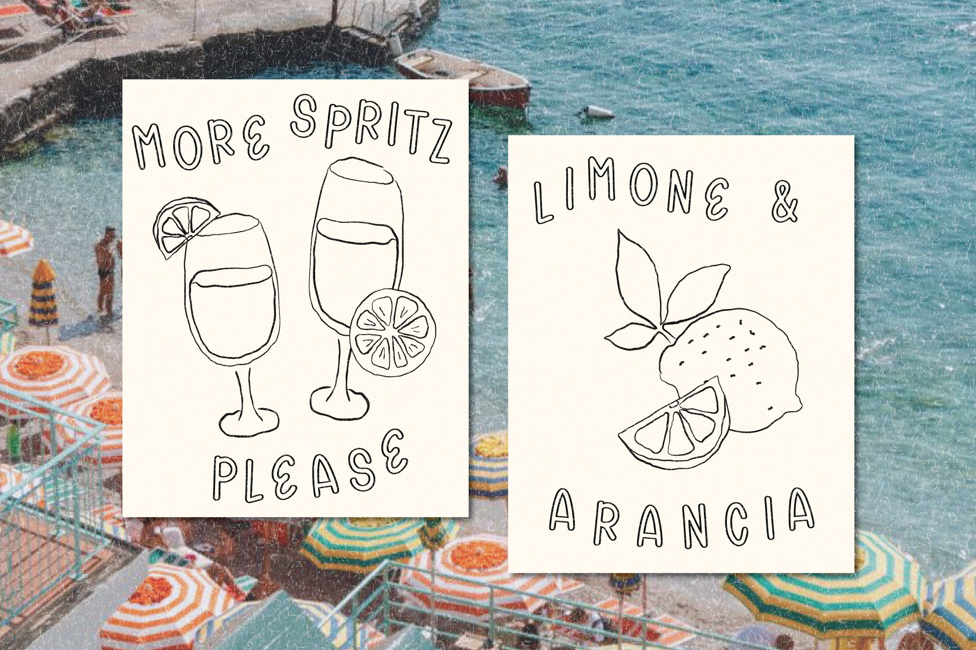
A hand-drawn display font is one of my favorite choices when a food brand needs warmth, charm, or personality. This style works beautifully for bakeries, cafes, gelato shops, ice cream packaging, farmers market labels, dessert brands, recipe cards, and small-batch products because it gives the design that real-person-made-this feeling.
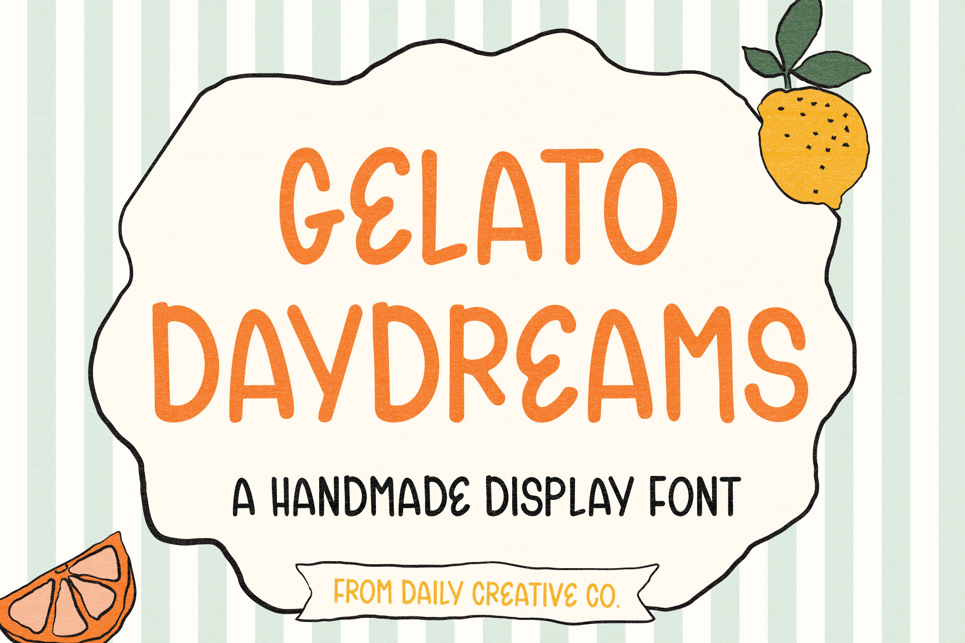
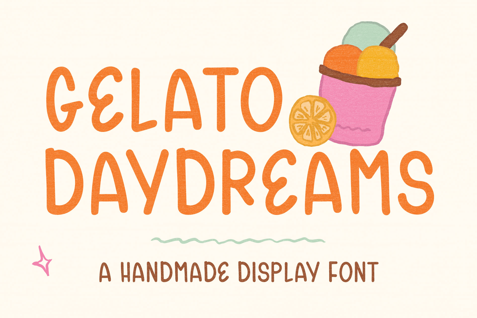
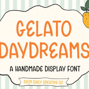
This is where Gelato Daydreams fits so naturally. It has a sweet, hand-drawn, nostalgic look that makes a design feel charming without being messy. It is playful, but still usable. Cute, but not childish. Handmade, but not hard to read.
Clean sans serif fonts
Clean sans serif fonts are less exciting to talk about, but they are usually what keep the whole brand from falling apart. If your main font has personality, a simple sans serif can make everything feel more grown up and intentional.
Use a clean sans serif for ingredients, product descriptions, menu items, prices, website links, social handles, and anything that needs to be clear at a glance. It may not be the font people remember first, but it makes the design easier to use.
Soft serif fonts
Soft serifs are lovely when the brand needs to feel more boutique. Think pretty pantry products, wedding menus, chocolate packaging, specialty coffee, tea, olive oil, or a bakery that wants to feel elevated instead of overly cutesy.
A soft serif can also pair really nicely with a handmade display font because it adds structure without taking away the charm. The display font brings the personality, and the serif keeps everything feeling a little more polished.
Script and handwritten fonts
Script fonts can be beautiful in food branding, but they need a little restraint. A small handwritten note on a bakery box can feel sweet. A romantic phrase on a wedding dessert menu can be beautiful. Every menu item in a delicate script is where things can start to get hard to read.
I would use script and handwritten fonts as accents more than the full brand system. They are best for little phrases, signatures, notes, or small moments where the extra softness actually adds something.
Bold playful fonts
Bold playful fonts are perfect for food brands that want to feel fun right away. Ice cream shops, candy packaging, kids’ snacks, party treats, dessert brands, seasonal launches, and bright social graphics can all handle a more playful type style.
The trick is giving the font space. If the font is already bringing a lot of personality, the rest of the design can usually calm down a little.
Featured food branding font: Gelato Daydreams
Gelato Daydreams lives in that hand-drawn display font world. It is sweet, sunny, a little nostalgic, and made for designs that need charm without feeling too perfect.
When I was making it, I kept picturing gelato signs, warm colors, tiny cafes, vintage dessert packaging, handwritten labels, cute little menus, and the kind of branding that feels collected instead of overly polished. It is not trying to be the font for every single word on the page. It is more of a main-character font, the one you use when the words need to feel like part of the design.
A hand-drawn display font for sweet, nostalgic food branding
Gelato Daydreams is meant for the moments that need to stand out. I would use it for a gelato shop logo, ice cream pint label, bakery sticker, cafe specials menu, farmers market tag, recipe card, product launch graphic, food blog header, Pinterest pin, or packaging label that needs a soft handmade moment.
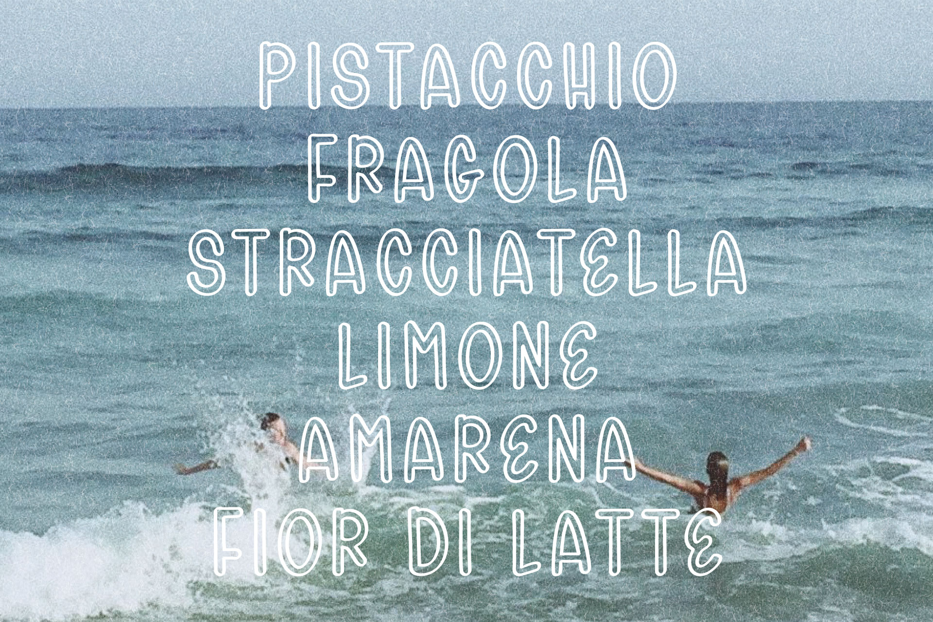
It is especially cute for flavor names. Pistachio, limone, strawberry, vanilla bean, chocolate, sorbet. They all instantly feel more charming in a font like this.
Where Gelato Daydreams works best
Gelato Daydreams works best when it gets to be the charming part of the design. For food branding, I would use it on bakery logos, cafe menus, gelato shop branding, ice cream packaging, dessert labels, farmers market signs, recipe cards, small business packaging, Pinterest graphics, Instagram posts, paper goods, and cute seasonal product launches.
I would not use it for tiny ingredient text or long paragraphs. That is not really the job of a display font. I would use it for the words that need to be remembered, then pair it with something simple for the details.
Why it works for food packaging
For packaging, I would let Gelato Daydreams do the sweet part. Imagine a small cream label with a tiny illustration, maybe a butter yellow, cherry red, pistachio green, chocolate brown, or soft blue palette. The brand name or flavor is set in Gelato Daydreams, and underneath it there is a simple supporting font for the product details.
That can be enough. You do not always need a million extra graphics to make packaging feel designed. A good display font can carry a lot of the mood on its own.
Font ideas by food brand type
Different food brands need different type personalities. A bakery, cafe, gelato shop, market product, and boutique pantry brand should not all feel identical, so here is how I would think about each one.
Bakery fonts
For a bakery, I would use fonts that feel warm, charming, and easy to read. Gelato Daydreams would be sweet on pastry labels, cookie bags, market signs, cake flavor cards, little thank-you stickers, or seasonal menus. It gives everything that soft handmade feeling without going full farmhouse.
For the smaller details, I would pair it with a simple serif or sans serif so the menu and packaging still feel clean.
Cafe fonts
Cafe fonts need to be cute, but they also need to function. A cafe menu has too much information for every word to be in a decorative font, so I would probably not use Gelato Daydreams for the entire menu body. I would use it for seasonal specials, pastry signs, coffee bag labels, loyalty cards, or a cute little brunch graphic.
One personality font plus one clean supporting font is usually the move.
Ice cream and gelato fonts
This is where Gelato Daydreams makes the most obvious sense. For gelato shops and ice cream brands, the font can be more playful, more nostalgic, and more fun. Flavor names, menu boards, pint labels, cup stickers, signage, summer graphics. That whole world just fits.
Use it for the words that should feel sweet and memorable, then keep the rest of the layout simple enough that the font can shine.
Farmers market and handmade food fonts
For farmers market products, I like fonts that feel personal without feeling messy. Jam jars, honey labels, granola bags, recipe cards, product tags, and table signs are all places where a hand-drawn display font can add charm and make the product feel more small-batch.
Gelato Daydreams gives small-batch, but in a sweeter and more playful way than the typical rustic farmhouse look.
Luxury or boutique food fonts
For a more boutique food brand, I would use a display font with restraint. Maybe Gelato Daydreams shows up on a limited-edition flavor, a gift box, a seasonal label, or a product name. Pair it with a soft serif, keep the layout clean, and suddenly it feels charming without feeling too much.
The key is not to overload the design. Let one type moment feel special.
How to pair fonts for food packaging and menus
Font pairing does not need to be complicated. Actually, I think it gets worse when people try to make it too complicated.
Use one personality font and one simple supporting font
If Gelato Daydreams is the personality font, let it take the most visible spot: logo, product name, flavor, headline, or label moment. Then use a quiet font for anything that needs to be read quickly.
The quiet font does not have to be boring. It just needs to be calm enough to support the display font. This is where a lot of designs start to look more professional, not because they are complicated, but because there is a clear hierarchy. Your eye knows where to go first. The personality font gets its moment, and the supporting font keeps everything grounded.
Keep small text clean and easy to read
Small text is not the place to get wild. Ingredients, menu descriptions, prices, product details, addresses, websites, and social handles should be simple and readable. Especially on packaging, the practical information needs to do its job.
Use the fun font where it matters most, then let the supporting font make everything feel polished.
Let the display font be the main character
A display font should not have to fight for attention. If you pick a font with personality, give it room to do its thing. You do not need three decorative fonts, seven colors, five illustrations, and a busy background.
Most of the time, the font will look better when the rest of the design is calmer. Gelato Daydreams already has personality, so let it be the sweet part.
Food branding design ideas using Gelato Daydreams
If you are trying to picture how Gelato Daydreams could actually be used, here are a few directions I would try.
Gelato shop logo and menu design
Use Gelato Daydreams for the shop name, flavor names, menu headers, cup stickers, or signage. Pair it with warm cream, cherry red, butter yellow, pistachio green, chocolate brown, or dusty blue for a sweet Italian summer feeling.
Bakery packaging and dessert labels
Use it on pastry boxes, cupcake labels, cookie bags, cake flavor cards, market signs, or packaging stickers. It gives everything that handmade, sweet feeling without needing to add a million extra details.
Cafe graphics and seasonal specials
Use Gelato Daydreams for cafe specials, pastry signs, coffee bag labels, loyalty cards, brunch graphics, or social media posts. It is especially cute for limited-time flavors or little menu moments.
Pinterest pins for recipes, food blogs, and product launches
A font like Gelato Daydreams can make Pinterest graphics feel less like a template. Use it for the main phrase or the words you want people to notice first. Then use a simple supporting font for the rest of the text so the pin still stays easy to read.
Farmers market signs and product tags
Use it on product tags, table signs, stickers, recipe cards, and little handwritten-style notes. It adds charm without making the design feel sloppy.
Common font mistakes in food branding
A good font can make food branding feel so much better, but a few font mistakes can make cute packaging feel messy really fast.
Using too many decorative fonts
This is the fastest way to make a design feel chaotic. When every font is yelling “look at me,” nothing actually stands out. Pick one personality font and let everything else be quieter.
Choosing a cute font that is hard to read
I hate that this is true, but cute is not enough. If someone cannot read the product name, flavor, label, or menu item, the design is not working. Cute and readable is the goal.
Making the packaging feel too generic
The opposite problem is going so safe that the brand loses all personality. A simple font can be beautiful, but if the whole brand starts looking like every other template online, it may need one more memorable type moment.
A handmade display font can make a design feel more custom almost instantly.
Forgetting about the small details
A food brand is more than the logo. It is the label, sticker, bag, menu, website banner, social post, Pinterest pin, product photo, thank-you card, market sign, and packaging mockup.
The font system should still make sense once it leaves the one perfect mockup. That is usually the real test.
Final thoughts on choosing fonts for food branding
The best fonts for food branding are the ones that make the brand feel more like itself. Sometimes that means a soft serif. Sometimes it means a clean sans serif. Sometimes it means a script used in one tiny perfect place. And sometimes it means a hand-drawn display font that makes the whole thing feel sweeter, warmer, and more custom right away.
If you are working on food branding, bakery logos, cafe menus, ice cream packaging, dessert labels, cute product packaging, Pinterest graphics, or anything that needs a playful handmade type moment, Gelato Daydreams is a very sweet fit for that world.
It was made for the designs that need a little charm. The ones that would feel too plain with a basic font. The ones that need the words to feel like part of the visual story.
Shop Gelato Daydreams
Gelato Daydreams is a hand-drawn display font designed by Daily Creative Co. Use it for food branding, bakery logos, cafe menus, ice cream packaging, dessert labels, Pinterest graphics, product packaging, recipe cards, paper goods, and small business branding that needs a little extra charm.
You can shop Gelato Daydreams in the Daily Creative Co font shop and view licensing options for your project.
Frequently asked questions
What are the best fonts for food branding?
The best fonts for food branding are fonts that match the feeling of the brand and stay easy to read across packaging, menus, labels, websites, and social graphics. Hand-drawn display fonts, clean sans serif fonts, soft serif fonts, and carefully used script fonts can all work well depending on the brand.
What font should I use for bakery branding?
For bakery branding, I would look for fonts that feel warm, charming, and readable. A hand-drawn display font can be beautiful for a bakery logo or packaging, while a simple serif or sans serif can handle menus, prices, descriptions, and smaller details.
What fonts work best for food packaging?
Food packaging usually works best with one personality font and one simple supporting font. Use the personality font for the brand name, product name, or flavor, then use the supporting font for ingredients, descriptions, prices, and practical information.
Can I use a hand-drawn font for a logo?
Yes, a hand-drawn font can be a great choice for a logo, especially if the brand wants to feel handmade, playful, nostalgic, creative, or more personal. Just make sure the font is readable and works across the other parts of the brand too.
What font pairs well with a playful display font?
A playful display font usually pairs best with a clean serif or sans serif font. Let the display font handle the main logo, headline, or product name, then use the simpler font for smaller text and supporting details.
Is Gelato Daydreams good for food branding?
Yes. Gelato Daydreams is a great fit for food branding, especially for brands that want a sweet, nostalgic, hand-drawn look. It works well for gelato shops, ice cream packaging, bakery logos, cafe menus, dessert labels, farmers market signs, recipe cards, and cute product packaging.
Can I use Gelato Daydreams in Canva?
Yes, you can use Gelato Daydreams in Canva if your Canva plan allows custom font uploads. It is a great way to make Canva graphics feel more custom, especially for food branding, Pinterest pins, packaging mockups, product images, and social media designs.



Leave a Reply