
Typography is a fundamental aspect of both graphic and web design which leads us to the question, what is leading in typography? Beyond selecting the right font or color, there are intricate adjustments that can make or break the readability and visual appeal of text. One of the most important of these adjustments is leading.
If you’ve ever wondered, “What is leading in typography?” or how it impacts your designs, you’re in the right place. In this guide, we’ll dive deep into everything you need to know about leading, how to use it effectively, and why it’s crucial for successful design.
Leading is the term used in typography to refer to the space between lines of text. Leading can have a big impact on how easy or difficult your text is to read, so it’s important to get it right! In this blog post, we’ll take a close look at leading and why it’s so important in graphic design.
We’ll also share some tips on how you can use leading to improve the readability of your own designs. So grab a cup of coffee and settle in for a little lesson in typography!
This blog post covers everything about the question “What is leading in typography?”
Introduction to Leading
At its core, leading (pronounced ledding) refers to the space between lines of text. More specifically, it’s the distance from the baseline of one line of text to the baseline of the next. It’s a key element in typography that directly influences readability, aesthetics, and overall user experience in both print and digital design.
Leading isn’t just about adding space for the sake of design. The right leading ensures that your text is easy to read and visually balanced. If the lines of text are too close together, the reader may struggle to follow from one line to the next. Conversely, if the lines are too far apart, the text may look disjointed and disorganized.
What is leading in typography?
Leading refers to the space between lines of text within a block of text. Leading is an important part of graphic design because it can have a big impact on how easy or difficult your text is to read.
The size of the leading, which is usually measured in points, will determine how much space there is between each line of text and ultimately affects readability.
Too small or tight of a leading can make reading more difficult, while too large or loose of a leading can make it look awkward and unprofessional.
When done correctly, however, leading can help create balance and visual harmony in your designs as well as improve legibility. With these tips in mind, you’ll be sure to use leading effectively when creating your own designs!
Leading Definition Typography
Leading definition typography refers to the technique of typesetting and manipulating the space between lines or batches of text. It also involves adjusting letter spacing, line spacing, and word spacing in order to craft a pleasing and aesthetically pleasing effect.
When applied correctly, leading helps create an inviting page layout that allows readers to focus on the content without distraction. A few minor adjustments to leading can turn boring text into visually stunning visuals that entice viewers to read further.
This type of design strategy is particularly important when trying to capture attention with short bits of text such as headlines, pull quotes, and even logos.
Why Leading Matters in Typography
Good leading is all about creating harmony between text lines. It ensures that the text is easy to read and the design feels cohesive. Without proper leading, even the most beautiful typefaces can look cramped or too spaced out, which diminishes the overall user experience.
One of the primary reasons leading is important is that it directly affects readability. Especially in longer blocks of text, poorly spaced lines can tire the reader’s eyes, causing discomfort and encouraging them to abandon the text altogether. Whether it’s a website, a magazine layout, or a book, ensuring that your leading enhances readability is key to keeping the reader engaged.
Additionally, leading can influence the hierarchy of text. For instance, headlines generally have less leading compared to body text, emphasizing their importance. Designers can also use leading to subtly guide the reader’s eye through a page, giving breathing room to specific sections.
Historical Context of Leading
The term “leading” originated in the days of traditional typesetting when printers would insert thin strips of lead between lines of type to adjust spacing. Back then, fonts were physically cast in metal, and lead strips were the most practical solution to achieve the desired line spacing.
This practice has long since been replaced by digital design software, but the term “leading” remains. Today, leading is adjusted electronically, but the concept is just as important as it was during the age of the printing press. Understanding the historical significance of leading can help designers appreciate its modern usage and how it impacts digital typography today.
Why is it called leading in typography?
Leading in typography refers to the space between lines of text in a work. It originates from the printing press days when lead strips were used, quite literally, to increase the space between lines of print and give text clarity on the page.
The term persists today even though heavy lead lines are no longer involved. On digital platforms, leading is generally referred to as line spacing and involves adjusting pixels rather than pieces of lead.
While it pays off to get creative with your leading choices, selecting a size that is not too large or small for the particular project’s needs is an essential part of good typographical design.
For instance, if you opt for too loose a leading, it may unsettle readers by making your text difficult to parse; or if you select lines that are tightly spaced together it can cause uncomfortable strain on readers’ eyes.
What is the purpose of leading in typography?
Typography is an important aspect of graphic design. It can really make or break a piece. Leading in typography is the spacing between lines of text, and it is a powerful tool for conveying different types of messages.
By adjusting the leading, designers can control the way readers perceive a piece of text; whether they find it exciting or calming, easy to read, or too busy. It’s all about creating balance, such that readers are respected as both intellectual and emotional beings.
To do this successfully, designers must take into account factors like typeface, type size, line length, tracking (space between characters), and language conventions. With these elements in mind, leading can bring clarity and impact to typographic designs.
Ultimately breaking the rules (where appropriate) helps make typography stand out and truly enhance any message it holds!
Why Leading is Important in Design and Typography
Creating good design and typography aren’t just skills they’re important strategic assets for any organization. That’s because leading is a powerful tool to direct readers’ eyes and create an impactful visual experience.
Design and typography influence the way new ideas are conveyed and make them easier to comprehend by formatting text or images in meaningful ways. With it, designers and typographers can even determine the right balance between text and visual elements to further enhance the content they display.
Proper use of leading shows that the designer understands what good design looks like, which in turn helps set products apart from their competitors. So next time you need to jazz up your product or website, don’t forget about leading!
Best Practices for Using Leading in Typography
To ensure your typography is both readable and visually appealing, here are some best practices for setting leading:
Body Text Leading: For long paragraphs, leading that is approximately 120-145% of the font size is generally recommended. This gives enough breathing room for the eyes to move comfortably between lines.
Headline Leading: Headlines or larger fonts typically benefit from tighter leading—about 100-120% of the font size. This ensures that the text remains cohesive and draws attention without creating unnecessary whitespace.
Consistency is Key: Once you establish the right leading for your design, maintain consistency throughout. Inconsistent leading can make the overall design feel unbalanced.
Context Matters: The optimal leading can also depend on the type of project. For web design, consider how leading affects readability across different devices, particularly on smaller screens.
Leading and Line Length: Leading should work in harmony with your line length. For longer lines of text, consider increasing the leading slightly to make the text easier to read. For short lines, tighter leading might be more appropriate.
Font Choice Impacts Leading: Serif fonts, due to their decorative nature, often benefit from slightly more leading than sans-serif fonts. Always test your chosen leading with the specific font in your design to see how it performs.
Common Mistakes with Leading
Even seasoned designers sometimes make mistakes when setting leading. Here are some common pitfalls to avoid:
Too Tight Leading: When the leading is too tight, the text becomes difficult to read. Lines of text can blend into one another, making it hard for the eye to follow along. This is especially problematic for large blocks of text.
Excessive Leading: On the other hand, if the leading is too loose, the text may feel disconnected and disorganized. It can also make the design appear less polished.
Not Adjusting for Different Mediums: Leading should be adjusted based on where the text will be displayed. A leading size that works well for print might not translate effectively to web or mobile screens.
How to Measure Leading in Typography
Leading is typically measured in points, just like font size. The default leading in most design software is about 120% of the font size, but this is often adjusted based on the specific needs of the design.
For example, if you’re working with 10-point type, the default leading might be set to 12 points. However, this is just a starting point, and adjustments should be made depending on the overall look and feel you’re aiming for.
In digital design, leading can also be adjusted in pixels. It’s important to preview how your leading looks across different screen sizes to ensure consistent readability.
Leading vs. Tracking and Kerning
It’s easy to confuse leading with other typographic adjustments like tracking and kerning. Here’s how they differ:
- Leading affects the vertical space between lines of text.
- Tracking adjusts the overall spacing between letters in a block of text.
- Kerning refers to the space between individual letters.
While all three are important for creating a balanced design, leading specifically influences the flow of text from one line to the next, while tracking and kerning handle the spacing within lines of text.
Leading vs Kerning in Typography
Leading and kerning are two of the most important elements in typography. While leading is the space between lines, kerning refers to the spacing between individual letters and characters. Both leading and kerning can be adjusted for optimal legibility, but leading has a greater impact on overall readability since it affects larger pieces of text.
Kerning is particularly important for logos, typefaces, and other letterforms that require a more precise level of control over spacing between individual characters. In contrast, leading is often used to provide visual balance and clarity to longer blocks of text.
Getting the leading and kerning just right in your typography projects can be a challenge, but it’s worth investing your time to ensure that your designs are visually appealing and legible.
Leading vs Tracking in Typography
Leading and tracking are often confused in the world of typography, but they mean two different things! Leading is the space between lines of text while tracking is the space between all letters in a segment of text.
Tracking can be used to create a more open or closed look to your typeface, depending on how much you adjust it. It can be helpful in creating a more unified look when working with multiple typefaces and sizes.
Leading, on the other hand, is used to provide visual balance and clarity to longer pieces of text. It can also help create better readability by adjusting the leading size without changing the font size to make small text easier to read.
While leading focuses on the vertical spacing between lines of text, it’s also important to consider how the spacing between individual letters, known as tracking, influences your design. Tracking adjusts the horizontal space between characters, impacting readability and the overall visual flow.
To achieve a well-balanced typographic layout, it’s crucial to understand the relationship between leading and tracking. For more insight on how tracking works and how it complements leading, check out our guide on what is tracking in typography. Both elements work together to create clear, cohesive text that enhances the reader’s experience.
Typography for Web Design: The Role of Leading
In web design, leading plays a crucial role in ensuring text readability, especially with responsive layouts. With devices ranging from smartphones to desktops, ensuring that your leading adapts across screen sizes is essential.
CSS properties such as line-height control leading in web design. A typical rule of thumb is to set the line height to 1.5 times the font size for body text. However, this should be tested on different devices to make sure it’s visually appealing.
Why do designers use leading?
Leading is one of the most important tools in a designer’s toolkit. It can be used to control the way readers perceive a piece of text, making it easier to read and more visually appealing.
It also serves as an important balance between type size, tracking, leading, and language conventions all of which have an impact on the readability and visual impact of a design.
Leading can also be used to create an overall theme or feel in a design, helping bring together various elements into one cohesive look.
Whether you’re creating a logo, website, or magazine layout, leading is an essential part of typography that professional designers must understand and use to their advantage.
By understanding leading, you can better control the way your text is read, leading to a more impactful design that stands out from the crowd. So take some time to get familiar with leading and experiment with different leading sizes and typographic elements.
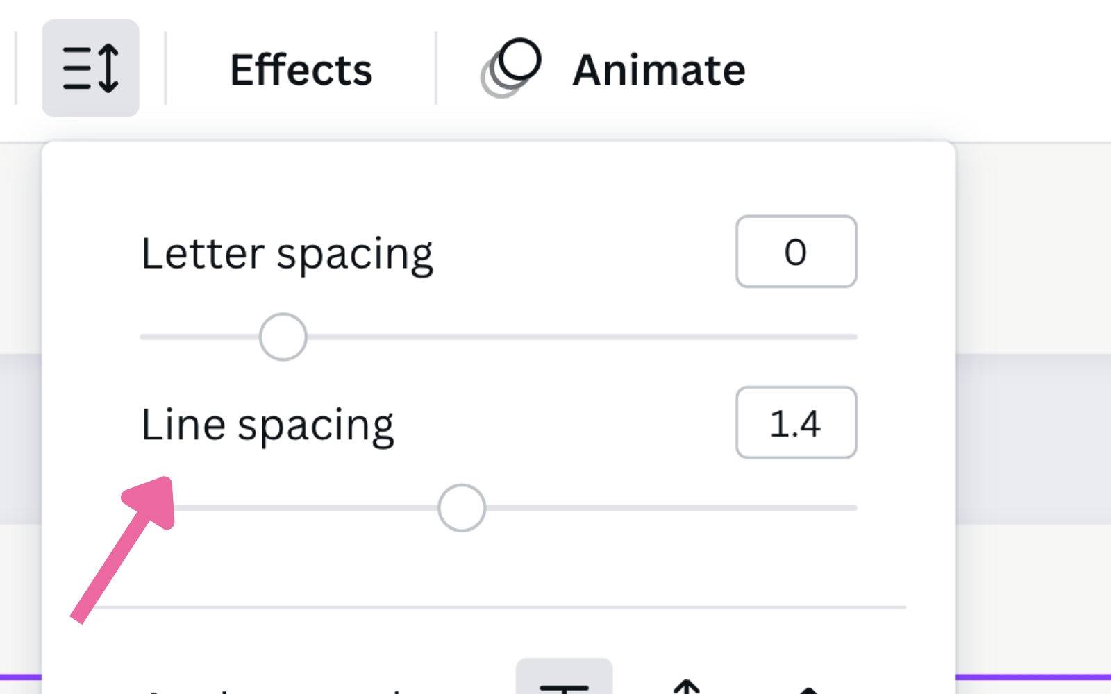
What typography panel do you use in Photoshop to change the kerning, tracking, and leading?
In Photoshop, you can use the Character panel to adjust leading, kerning, and tracking. This panel is located in the Window menu, under Type > Character. The leading value can be adjusted by entering a number for the leading size in the leading field at the top of the panel. Kerning and tracking are also adjustable from this panel.
The Character panel is a great tool for fine-tuning your typography and ensuring that your text looks its best. With this panel, you can quickly adjust leading, kerning, and tracking to create beautiful typefaces with maximum readability.
I suggest taking some time to explore the Character panel and see how leading, kerning, and tracking can help you create more impactful typography!
Leading is an important element of any design project, so make sure to give it the attention it deserves. With a little practice, you’ll be able to quickly adjust leading, kerning, and tracking to create the perfect typography for your project.
How is leading measured in typography?
Leading is measured in points and is measured from baseline to baseline between two lines of text. You can adjust leading to either a larger or smaller value depending on your needs. Leading can also be measured in pixels, which makes it easier to use leading in digital design. To measure leading in pixels, simply change the measurement within Photoshop.
What is an example of leading in typography?
Leading in typography refers to the vertical space between lines of text. For example, if you have a block of text that is 12pt font size and the leading is set at 24 points, then each line will be spaced 24 points apart.
The leading value affects how your readers perceive the content visually and can make a big difference in terms of readability and overall design.
Leading is important in graphic design because it can help create a certain look or feel for your project. For example, leading can be used to create a more dynamic layout or to draw the readers’ eye to a specific piece of content. It can also be used to separate sections of text, making it easier for readers to skim and scan the content.
Leading is just one of the many typographical details that can have a big impact on your design. It’s important to consider leading when designing any project, as it can make or break the readability of your content and the overall aesthetic of your design.
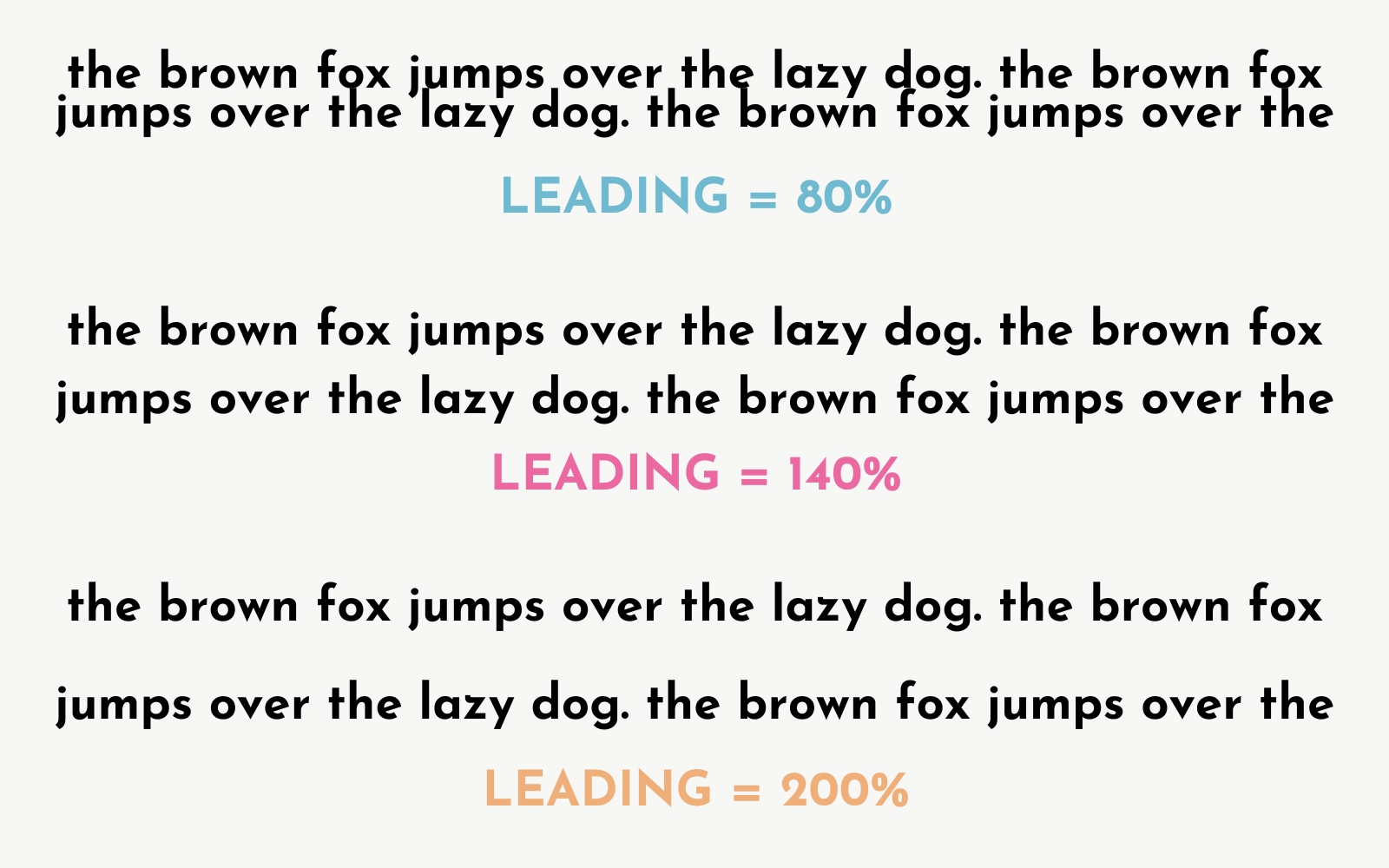
Examples of Good and Bad Leading in Typography
Let’s compare two scenarios:
- Good Leading Example: When lines are spaced comfortably, the text is easy to read, and the content flows naturally. The design feels balanced, and the white space is used effectively to separate sections.
- Bad Leading Example: When leading is too tight, the text feels cramped, making it hard to follow. Conversely, if the leading is too loose, the text appears disjointed, and the design loses its structure.
What is standard leading in typography?
The standard values for leading differ based on the medium the design is ultimately destined for. For print, the standard leading value is the font size + 2 points. This is considered standard leading for printed pieces like literature.
If the final medium for your design is digital, then the standard leading is the point size of your font plus 20%. You would get this value by multiplying your text size by 120%. These “standard values” are only to be used as a guide and not the holy grail of leading rules.
Keep in mind that these values may not work for all fonts, so I suggest experimenting with different leading values and how they affect your design overall.
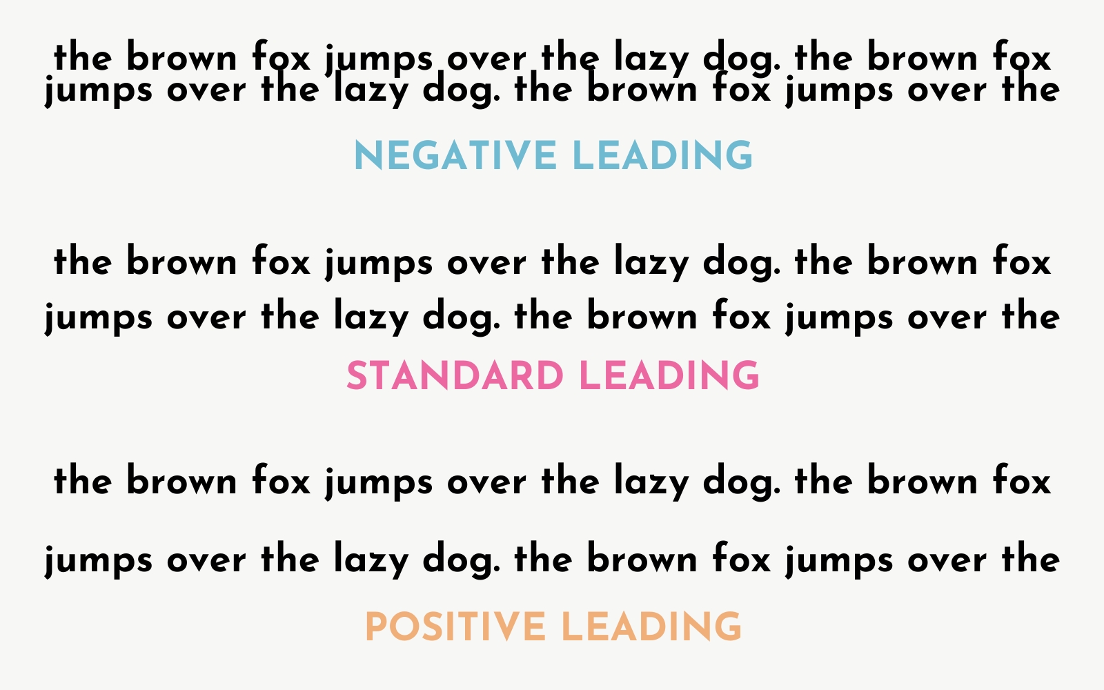
Normal Leading, Negative Leading, Positive Leading
Leading can be adjusted to create different effects. Normal leading is when leading is the same as the font size, whereas negative leading is when leading is smaller than the font size. Positive leading is when leading is larger than the font size. Each of these types of leading can be used to create different looks and each has its own advantages and disadvantages.
Normal leading is the most common type of leading and can be used to create a consistent, easy-to-read layout. Negative leading should generally be avoided as it can make text difficult to read and cause headaches for readers unless you are going for a particular design style. Positive leading can be used to create more dynamic layouts that draw the readers’ eye toward certain pieces of content.
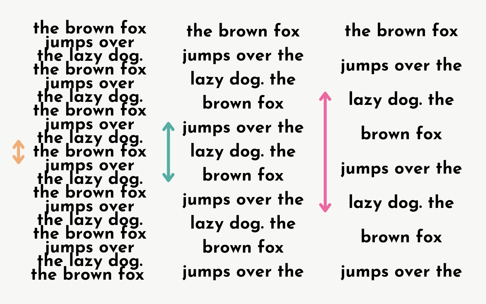
Normal Leading, Tight Leading, Loose Leading
When leading is adjusted to create a more dynamic look, it can also be described as either tight leading or loose leading. Tight leading refers to when leading is set slightly smaller or lower than the font size and can be used for emphasis or to separate sections of text. Loose leading is when leading is set slightly larger or higher than the font size and can be used to create a more relaxed, airy look.
Customizing Leading for Different Languages and Fonts
The amount of leading required can vary depending on the font and language. For example:
- Serif fonts often require more leading than sans-serif fonts because the added details of serifs can make text appear more cramped.
- Languages with complex scripts such as Arabic or Chinese may require specialized leading adjustments to ensure the text remains legible without overwhelming the reader.
Always test different leading options based on your specific font and language requirements.
Examples of Bad Leading in Graphic Design
When leading is not used correctly, it can result in a design that looks sloppy and unprofessional. Here are a few examples of how bad leading can negatively affect your designs:
Legibility Issues
For example, if the leading is too small, the text can become difficult to read and blurry. If the leading is set too large, then it may cause the design to look stretched or awkward. Choose leading values with care to ensure that your design looks professional and is easy to read.
Spacing Issues
Incorrect leading can also cause spacing issues. If the leading is set too small, then it may cause the lines to run into each other. If the leading is set too large, then the design may have a lot of white space that looks unbalanced and awkward.
Not Following the Brand Kit
Finally, incorrect leading can also cause a design to look inconsistent with the company’s brand kit. For example, if all of your other designs use leading values that are 16pt and you accidentally set the leading for one design to 12pt, it will immediately stick out and appear unprofessional.
How to Use Leading Correctly in Graphic Design
Leading is a key element of typography that can have a big impact on how readable and professional your designs are. Here are some tips on how to correctly use leading in graphic design:
Consider the Font
Depending on the font that you are using, leading values may vary. Generally speaking, the leading should never be smaller than the font size, as this can make it difficult to read and cause legibility issues.
Consider the Design
Leading is also affected by the overall design that you are creating. For example, if you are creating a layout with a lot of different elements, then you may want to increase leading values to create more white space and make the design easier to read.
Test Out Different Values
Finally, it’s important to test out different leading values before committing to one for your design. Try different leading values and see how each one affects the overall look and feel of your design. This will help you find the perfect leading value for your design!
Experiment with Different Leading Styles
Don’t be afraid to experiment with different leading styles. Tight leading and loose leading can both create interesting and dynamic looks for your design. Just remember to test out leading values before committing to one for your design!
Use Graphic Design Software
Using graphic design software such as Adobe InDesign, Adobe Photoshop, or Canva can make it easier to adjust leading values. These types of software allow you to quickly and easily adjust leading and see the changes on-screen in real time.
Use Header and Body Copy Character Styles
Using character styles for header and body copy can also help you keep leading consistent throughout your design. Character styles allow you to save leading values as presets so that you don’t have to manually adjust leading every time.
Look at the Full Design
Always take a step back and look at the full design when adjusting leading values. This will help you ensure that the leading looks balanced and professional in relation to the overall design.
Design for All Screens
Finally, it’s important to remember that leading values may look different on different screens. For example, leading values may look bigger on a laptop compared to a mobile device. So make sure to design for all screen sizes and test out leading values on each one!
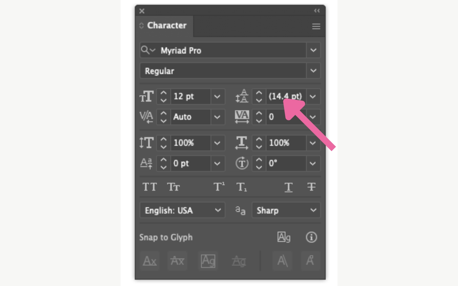
How to Calculate Leading for Your Typefaces
While leading values can vary depending on the font and design, there is a general rule to help you calculate leading for your typefaces. The leading should be 120% of the font size. For example, if the font size is 12pt, then the leading should be 14.4pt (12 x 1.2).
You can use leading calculations to ensure that your leading values are consistent throughout all of your designs. This will help your typefaces look professional and well-balanced no matter the device it’s viewed on!
How to Create Harmony with Different Typefaces and Sizes Using Leading
Using leading can also help you create harmony when combining typefaces or fonts of different sizes. For example, if you’re using a header font that is larger than the body copy font, then increasing leading values can help to create a more balanced look.
By adjusting leading values, you can ensure that all typefaces and font sizes look harmonious when used together in a design.
Impact of Leading on SEO
Leading, while not a direct SEO factor, can have an indirect impact on your rankings. Well-designed, readable text keeps users on your page longer, reducing bounce rates—a key factor in search engine rankings. If your leading is too tight or too loose, users may quickly leave your page, signaling to search engines that your content isn’t meeting user needs.
Typography Leading FAQs
How much is too much leading in typography?
The leading value should always be based on the font size. As a general rule, leading should be 120% of the font size. However, leading values can also be adjusted to create different looks or emphasize certain elements in your design.
What is open leading in typography?
Open leading is when leading values are increased to create more white space between lines. This can be used to increase readability or create a more interesting design.
What is negative leading?
Negative leading occurs when leading values are decreased and the lines of text overlap one another. This style should generally be avoided as it can make your text difficult to read.
What is the standard leading in typography?
Standard leading is typically 120% of the font size. However, this varies based on the font and design context.
What does 100 leading mean in typography?
100 leading is equal to the font size, so if the font size is 12pt, then the leading would be 12pt. This is known as “ideal leading” and can help create a perfectly balanced look.
How do I adjust leading in design software?
In most design software like Adobe InDesign, Photoshop, or Illustrator, leading can be adjusted by selecting the text and altering the “leading” value in the character panel.
What is the difference between leading and line spacing?
Leading refers to the space between baselines of text, while line spacing is a broader term that encompasses leading and other spacing adjustments.
Can leading impact website load time?
No, leading itself doesn’t impact load times, but poor design choices related to typography can affect user experience.
Why is leading important for mobile typography?
Proper leading ensures that text remains legible on smaller screens, improving user experience and reducing bounce rates on mobile devices.
By understanding and mastering the concept of leading in typography, you can create designs that are not only visually pleasing but also highly readable. Proper leading enhances user experience, strengthens your design hierarchy, and ensures that your content is both engaging and easy to digest. Keep these principles in mind as you adjust leading in your next design project!
Leading is an important part of typography and graphic design that can have a big impact on the readability and overall appearance of your designs. With a few quick tips and tricks, you’ll be able to adjust leading values easily and create beautiful designs that are easy to read. So get out there and start tweaking leading like a pro!
This post was all about what is leading in typography
Related Posts You May Like:
- What Is a Script Font? Different Styles of Script Fonts and How to Use Them
- What is Tracking in Typography? Comprehensive Guide to Perfect Letter Spacing
- Serif vs. Sans Serif Fonts Explained: A Complete Guide for Designers
- 15 Essential Canva Tips for Beginners: The Ultimate Guide
- How to Create a Professional Logo in Canva: A Step-by-Step Guide for Beginners


I’m really impressed with your website and this post in particular. It’s evident that you have a deep understanding of the subject and have presented it in an easily digestible manner. Great job!