
Did you know that 75% of people judge a business by its logo alone? You read that right! It’s like we’re all walking around with our own personal “Judge Judy” in our heads, sizing up businesses based on a tiny little image. That’s why your logo is so important and why we are diving into how to create a logo in Canva.
I’ve been in the trenches of logo design, and let me tell you, it used to be a nightmare. I’m talking expensive software, steep learning curves, and enough frustration to make you want to throw your computer out the window. But then, like a knight in shining armor, Canva swooped in and changed the game.
In this blog post, I’ll walk you through creating a logo that’ll make your brand pop like a firework on the 4th of July. And the best part? You don’t need a degree in graphic design or a magician’s wand to do it. Just your trusty computer, an internet connection, and maybe a cup of coffee (or three).
Buckle up, buttercup! We’re about to embark on a logo-creating adventure that’ll transform your brand faster than you can say “Where’s the undo button?” (Don’t worry, we’ll cover that too!)
This blog post is all about how to create a logo in Canva for beginners!
1. Getting Started with Canva
First things first, we need to get you set up with Canva before you can create a logo in Canva. Creating a Canva account is easier than convincing yourself you need that extra slice of pizza. Just head over to Canva.com and click that big ol’ “Sign up” button. You can use your Google account, Facebook, or just your email. I went with Google because, let’s face it, I can barely remember what I had for breakfast, let alone another password.
Once you’re in, you’ll see the Canva dashboard. It’s like the cockpit of a spaceship, but instead of flying to Mars, you’re rocketing your brand to success! Don’t let all the options overwhelm you. Take a deep breath and remember: you’re the captain now.
How much does it cost to create a logo on Canva?
Here’s where you face your first big decision: free or pro? It’s like choosing between regular and extra cheese on your pizza. The free version is great for getting your feet wet, but if you’re serious about your logo game, Pro might be worth considering. It gives you access to more templates, elements, and features that can really make your logo pop.
I started with the free version because, well, free is my favorite price. But as I got more into it, I splurged on Pro. It was like upgrading from a tricycle to a mountain bike – suddenly, I had so many more places I could go!
Understanding the Canva Pricing Plans can help you choose the best option for your logo design needs. Knowing what features are available at each tier ensures you can access all the tools you need to create a standout logo. For instance, advanced features like the background remover and custom font uploads are part of the Pro plan, which can be a valuable investment for businesses. Learn more in our post about Canva Pricing Plans.
Whether you go free or pro, the most important ingredient in your logo-making recipe is your creativity. Canva is just the kitchen – you’re the chef. So roll up those sleeves, and let’s start cooking up an awesome logo!
2. Choosing the Right Template
The fun part begins – choosing a template to help you create a logo in Canva! It’s like being a kid in a candy store, except instead of sugar, we’re high on design possibilities.
To navigate to the logo section, type “Logo” into the search bar at the top of the page. Boom! You’re now staring at more logo templates than you can shake a stick at. It’s enough to make your eyes go crossed!
Before you start clicking on templates like a caffeinated squirrel, take a moment to think about your brand identity. Are you a sleek, modern tech company? A cozy, homestyle bakery? A rugged outdoor adventure brand? Your logo should reflect your brand’s personality. It’s like choosing an outfit for a first date – you want to make the right impression!
As you browse, keep an eye out for templates that align with your brand vibe. But here’s a pro tip: don’t get too attached to any template. These are just starting points. We’re going to customize the heck out of whatever we choose.
If you’re feeling particularly brave (or if you just can’t find a template that speaks to your soul), you can always start from scratch. Just click on the “Create a blank Logo” option. It’s like jumping into the deep end of the pool – scary at first, but exhilarating once you get going!
When I made my first logo, I spent hours scrolling through templates. I must have looked at hundreds before I found “the one.” And you know what? I ended up changing almost everything about it anyway! The moral of the story? Don’t stress too much about finding the perfect template. It’s all about the journey, not the destination.
3. Customizing Your Logo Design
It’s time to roll up our sleeves and get our hands dirty with some serious customization! This is where the magic happens, folks. We’re about to turn that template into a unique logo that screams “YOU!”
Canva’s design interface might look like the control panel of a spaceship at first glance. But don’t panic! It’s actually pretty intuitive once you start poking around. The left sidebar is your new best friend – it’s got all the elements you need: text, photos, elements (that’s Canva-speak for shapes and icons), and more.
Colors are a big deal in logo design. I learned this the hard way when I created my first logo using neon green and hot pink. Let’s just say it wasn’t the professional look I was going for! Canva makes it super easy to play with colors. Just click on any element in your design, and you’ll see a color picker pop up at the top of the screen. Pro tip: if you already know your brand colors, you can input the exact hex code to keep everything consistent.
Make logo white in Canva
I always suggest creating a white version, black version, and color version of your logo. It’s good to have these on hand so you have simple versions of your logo if needed. An example of where you may want to use a one color logo is if you want to brand your videos by putting your logo in the corner.
Typography is another game-changer. I used to think Times New Roman was the height of sophistication (don’t judge me), but Canva opened my eyes to a whole new world of fonts. To change your text, just double-click it and go wild. But remember, with great power comes great responsibility. Just because you CAN use that super funky font doesn’t mean you SHOULD. Keep it readable, people!
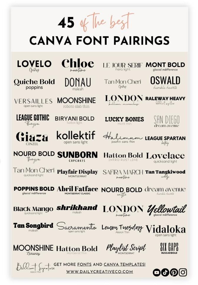
Choosing the right font combination can make a big difference in achieving a professional look. To make this easier, I’ve put together a free Canva Font Pairings Template that offers a curated selection of font pairings perfect for logo design. This template helps you quickly find combinations that work well together, saving you time and effort in experimenting with different styles. With these font pairings, you can create a unique logo that captures your brand’s personality and stands out to your audience. Download it now to elevate your Canva logo design process!
One of the coolest features I discovered was the ability to add and manipulate shapes and icons. There’s this little “Elements” button on the left sidebar – click that bad boy and you’re in for a treat. You can resize, rotate, and recolor these elements to your heart’s content. I once spent an embarrassing amount of time making a triangle look “just right” for a logo. No regrets.
Don’t make the same mistake I’ve seen so many others do… they get so excited about all the options that their first few logo attempts look like a digital Jackson Pollock. Remember, sometimes less is more. Start simple, and then add elements sparingly. Your logo should be recognizable even when it’s tiny, like on a business card or as a social media profile pic.
And don’t forget about spacing! I’ve seen so many people cram everything together like sardines, but I’ve learned that giving your logo elements some breathing room can make a world of difference. Canva has this nifty feature where it shows you guidelines when you’re moving things around. Use ’em – they’re like training wheels for good design.
Having a clean, transparent background can make a big difference in the final look. Using the Canva Background Remover tool allows you to seamlessly eliminate any background from your design, giving your logo a professional touch. This feature is especially handy when you need your logo to blend smoothly onto different backgrounds or products. Learn more in our post about the Canva Background Remover.
Lastly, don’t be afraid to experiment. I must’ve created about 50 versions of my logo before I found “the one.” It’s like dating, but less awkward and with more fonts. Try different color combinations, play with the arrangement of your elements, flip things upside down – you never know what might work until you try it.
Remember, creating a logo is a journey, not a destination. Okay, it is a destination, but the journey is where you figure out what works for your brand. So have fun with it! And if all else fails, there’s always the “undo” button. Trust me, it’ll become your new best friend.
Forbes discusses the importance of branding for business success, highlighting why branding is crucial for any business, including the role a good logo plays. It’s a great way to emphasize the importance of taking the time to create a professional logo, even when using DIY tools like Canva. These tools are great, but you need to use them properly. Follow this guide to create a logo in Canva for your business!
4. Incorporating Brand Elements
It’s time to take your design from “meh” to “marvelous” by incorporating some killer brand elements. This is where your logo starts to really strut its stuff and show off your brand’s unique personality. Your brand elements can include your images, fonts, and more.
Your logo is the face of your brand; that’s why we need to ensure it’s just perfect. Harvard Business Review offers insights on the right way to build your brand, emphasizing the long-term aspects of brand-building, including visual identity like logos. They highlight why investing time in logo design is valuable.
A unique font can set your logo apart, and knowing how to upload fonts to Canva can give you more creative freedom. This guide walks you through the simple steps to bring your custom fonts into Canva, allowing you to maintain brand consistency and create a logo that truly reflects your style. Learn more in our post about how to upload fonts to Canva. You can also browse my custom fonts here!
Let’s talk about uploading custom images or logos. Maybe you’ve got an existing logo that needs a facelift, or perhaps you’ve got some brand imagery that you want to incorporate. Canva’s got your back! See that “Uploads” tab on the left? Click it, and you can drag and drop your files faster than you can say “branding genius.”
When I first discovered this feature, it was like finding the secret passage in a video game. I had this hand-drawn sketch of a logo idea, and being able to upload it and work on top of it in Canva? Game-changer! Just remember, if you’re using any images, make sure you have the rights to them. We don’t want any copyright ninjas coming after us!
Canva’s element library is a rabbit hole you’ll enjoy falling down! Click on that “Elements” tab, and you’ll find more icons, shapes, and doodads than you can shake a stick at. It’s like being a kid in a candy store, except instead of a sugar high, you get a design high!
But here’s the thing – and I learned this the hard way – don’t go overboard. It’s tempting to throw every cool element you find into your logo. Trust me, I’ve been there. My first attempt looked like a circus threw up on my screen. Not a good look for a professional writing service, let me tell you!
The key is to find that sweet spot between simplicity and uniqueness. You want your logo to stand out, sure, but you also want it to be easily recognizable. Think of the most iconic logos you know – Apple, Nike, McDonald’s. They’re all pretty simple, right?
Here’s a trick I use: I add all the elements I like, then I start taking away one at a time. It’s like playing design Jenga. You keep removing pieces until you’re left with just the essential elements that capture your brand’s essence.
Pay attention to how your logo elements interact with each other. You want them to play nice together, not fight for attention. I once had a logo where the icon and the text were having an all-out brawl for dominance. It was not pretty.
Remember, your logo is like the face of your brand. You want it to be friendly and approachable, but also professional and trustworthy. It’s a balancing act, for sure, but with a little patience and a lot of tweaking, you’ll get there.
And hey, if you’re feeling stuck, don’t be afraid to step away for a bit. Some of my best ideas have come to me while I was doing something completely unrelated, like walking my dog or attempting to fold a fitted sheet (still haven’t mastered that one). You can always come back to Canva to keep working on your logo later!
5. Applying Design Principles for Logos
Time to put on our thinking caps and dive into the world of design principles. Don’t worry, I promise it’s not as scary as it sounds. In fact, it’s kind of like being a wizard, but instead of casting spells, we’re creating awesome logos!
Colors aren’t just pretty to look at; they can actually influence how people feel about your brand. It’s like each color has its own superpower. Blue? It’s the Superman of trust and stability. Red? It’s the Flash of excitement and energy.
When I was designing a logo for a children’s toy company, I went with a bright yellow because it screamed “fun” and “happiness.” But then I showed it to my colorblind friend, and he thought it was a logo for a banana company. Oops! Lesson learned: always consider how your logo will look to different people.
Your logo needs to look good whether it’s on a giant billboard or a tiny business card. It’s like designing a superhero costume – it needs to look awesome in action and when standing still.
I once made a logo with so many intricate details that it looked like a blob when shrunk down. It was a face-palm moment for sure. Now, I always test my logos at different sizes. If it doesn’t look good as your social media profile pic, it’s back to the drawing board!
And speaking of social media, that brings us to our next point: your logo needs to be versatile. It should look great in color, black and white, on light backgrounds, dark backgrounds – you name it. It’s like creating a chameleon that can adapt to any environment.
Here’s the million-dollar question: how do you make your logo memorable? This is where you really get to flex those creative muscles. Think about the logos that stick in your mind. What makes them special?
For me, it was the day I realized the arrow in the FedEx logo. Mind. Blown. That’s the kind of clever, subtle detail that can make a logo unforgettable. But don’t go overboard trying to hide images in your logo. I once spent hours trying to incorporate a hidden message in a logo, only to realize no one could see it but me. Facepalm moment number two!
Lastly, let’s talk about timelessness. You want your logo to age like fine wine, not like that milk you forgot in the back of the fridge. Avoid trendy fonts or design elements that’ll make your logo look dated faster than you can say “What’s a fidget spinner?”
I learned this lesson when I had to redesign a client’s logo that was so ’90s, it practically came with a Tamagotchi. Now, I always ask myself: “Will this still look good in 5 years? 10 years?”
Remember, applying these principles doesn’t mean your logo has to be boring. It’s about finding that sweet spot between eye-catching and enduring, between unique and universal. It’s a balancing act, for sure, but that’s what makes it fun!
Create logos that are colorful (but not overwhelming), scalable (but not simplistic), memorable (but not confusing), and timeless (but not boring). It’s a tall order, but I believe in you. And hey, if all else fails, there’s always the trusty undo button. It’s the real MVP of logo design if you ask me!
6. Experimenting with Different Versions
We’re in the home stretch now! It’s time to channel your inner mad scientist and start experimenting with different versions of your logo. Trust me, this is where the real fun begins!
Creating variations is an important aspect of logo design. It’s like being a proud parent – you’ve created this beautiful logo baby, and now you want to dress it up in different outfits. And why not? Your logo should be versatile enough to rock any look.
Start by playing around with different color combinations. When I was designing a logo for a fitness brand, I created versions in energetic red, calming blue, and earthy green. It was like watching my logo go through a makeover montage in a ’90s movie. Totally radical!
Next, try flipping things around. Move your icon from left to right, top to bottom. It’s amazing how a simple rearrangement can completely change the vibe of your logo. I once spent an entire afternoon just sliding an icon around like it was a game of logo Tetris. Time well spent, if you ask me!
Testing your logo in different contexts is where things get really interesting. It’s like sending your logo out into the wild to see how it survives. Try placing it on various backgrounds – light, dark, textured. See how it looks on a website mock-up, a business card, maybe even a t-shirt.
I learned this lesson the hard way when I designed a logo that looked amazing on screen but turned into an unrecognizable blob when printed. It was like watching a beautiful butterfly turn back into a caterpillar. Not cute.
Don’t forget about social media! Your logo needs to look just as snazzy as a tiny profile pic as it does on a billboard. I once had a client whose logo looked great everywhere except as a Facebook profile picture. Cue the frantic redesign!
Pro Tip: get feedback! And I don’t just mean from your mom (love you, Mom, but you’re a bit biased). Show your logo variations to friends, colleagues, or even better, potential customers. It’s like having a focus group, but without the one-way mirror and stale donuts.
I remember when I thought I had created the perfect logo for a client. I was so proud of it, I could practically hear the angels singing. But when I showed it to a group of their target customers, they thought it was for a completely different industry. Talk about a reality check! But you know what? That feedback was worth its weight in gold. It helped me refine the design and create something that really resonated with the right audience.
Don’t be afraid of criticism. I know, I know, it’s your baby and you want everyone to say it’s the cutest thing they’ve ever seen. But constructive feedback is like spinach for Popeye – it’ll make your logo stronger!
Sometimes the version you think is the worst ends up being the one people love the most. It’s like the logo design equivalent of bed head – sometimes the messy, imperfect version has a charm all its own.
Go wild! Create vertical versions, horizontal versions, versions with just the icon, versions with just the text. It’s like creating a logo wardrobe. You want your logo to be prepared for any occasion, from a black-tie gala to a casual beach day.
Remember, the goal here isn’t to have a million different logos. It’s to have one great logo that can adapt to any situation. Think of it like a chameleon – same logo, different colors. Or like a Transformer – same logo, different configurations. (Yes, I just dated myself with that reference. No regrets!)
In the end, all this experimentation will help you create a logo that’s not just good, but great. A logo that can stand the test of time, work across all mediums, and most importantly, truly represent your brand. Put on your lab coat, grab your beakers (or in this case, your mouse), and start experimenting!
7. Finalizing and Exporting Your Logo
The moment has arrived to put the finishing touches on your logo masterpiece and send it out into the world. It’s like watching your kid graduate – you’re proud, a little nervous, and hoping it doesn’t trip on its way across the stage.
Fine-tuning the details is where we get down to the nitty-gritty. Channel your inner perfectionist. Zoom in close – I’m talking nose-to-screen close – and check for any wonky lines, weird spacing, or rogue pixels. It’s like being a detective, but instead of solving crimes, you’re solving design dilemmas.
I once spent an entire evening adjusting the kerning (that’s designer-speak for the space between letters) in a logo. My family thought I’d lost my marbles, but let me tell you, those few pixels made all the difference. It’s the little things that separate a good logo from a great one.
Create a logo in Canva without background
File formats might seem like a foreign concept now, but you’ll get very familiar with them as a new designer. This is where things can get a bit technical, but stick with me – I promise it’s not as scary as it sounds. When you’re ready to export your logo, Canva will ask you what file type you want. It’s like being at a buffet – so many choices!
Here’s a quick rundown:
– PNG: Great for web use. It keeps the background transparent, so your logo can sit pretty on any color.
– JPG: Best for print materials where you don’t need transparency.
– SVG: This is the superhero of logo files. It can be scaled to any size without losing quality. It’s like the Hulk of file formats – incredibly strong and flexible.
Check out my post on how to export your Canva logo to a vector (SVG) file!
The importance of file formats hits hard when you send a client a JPG file for their website, and they come back asking why their logo had a white box around it. Facepalm moment! Always make sure to export in multiple formats, just to be safe.
While you’re at it, export your logo in different sizes. Trust me, future you will thank present you when you need a quick social media profile pic or email signature.
Create vector logo in Canva
The moment of truth has arrived – saving and downloading your new logo. It’s like sending your child off to college. You’ve nurtured it, watched it grow, and now it’s time to let it fly free. Sniff… They grow up so fast!
But wait! Before you close that Canva tab, make sure you’ve saved your project. I can’t tell you how many times I’ve accidentally closed the window and lost hours of work. It’s like dropping your ice cream cone right after you buy it – heartbreaking and totally avoidable. If we’re slaving for hours on how to create logo in Canva, we want to make sure it saves!
And there you have it, folks! You’ve done it. You’ve created a professional, eye-catching logo that perfectly represents your brand. Give yourself a pat on the back, do a little victory dance, maybe treat yourself to a cookie (or two, I won’t judge).
Remember, your logo is more than just a pretty picture – it’s the face of your brand, your silent spokesperson, your round-the-clock marketing team. It’s going to be plastered on everything from your website to your business cards to maybe even the side of a blimp one day (hey, dream big!).
How to Create a Logo in Canva Conclusion
What a journey we’ve been on, huh? From blank canvas to branding brilliance, you’ve transformed into a bonafide logo designer. Give yourself a standing ovation – you deserve it!
Let’s take a moment to recap why all this logo hullabaloo matters. Remember that stat we started with? 75% of people judging a business by its logo? Well, now you’re on the right side of that statistic. You’ve created a logo that’s going to make people sit up and take notice. It’s like having a really good hair day, but for your brand.
Your logo is like a fine wine. It might need to breathe a little. Don’t be afraid to let it sit for a day or two and then come back to it with fresh eyes. You might notice something you want to tweak, or you might fall in love with it all over again.
Every brand is unique, so feel free to customize this process to fit your specific needs. Maybe you want to add a splash of neon because your brand is all about standing out. Or perhaps you want to keep things minimalist because you’re all about that sleek, modern vibe. The beauty of design is that there’s no one-size-fits-all approach.
Time for my responsible adult hat (don’t worry, it doesn’t suit me, so I won’t keep it on long). If you’re using any elements or fonts in your logo, make sure you have the right to use them commercially. The last thing you want is a copyright-related headache down the road. Trust me, that’s one migraine you can do without!
Before I let you go, I want to give you a little homework assignment. (Don’t groan, I promise it’s fun!) Look at logos in your everyday life. The coffee shop down the street, the app icons on your phone, even the logos on your favorite snacks. Start analyzing what works and what doesn’t. It’s like developing your own logo design superpower.
Why keep all this logo goodness to yourself? Share your creation with the world! Post it on social media, ask for feedback, join design forums. The design community is generally a friendly bunch, always ready to offer constructive criticism and high fives.
You came here looking to create a logo, and you’re leaving as a logo design wizard. Armed with your new Canva skills and a pocket full of design principles, you’re ready to take on the world, one stunning logo at a time. I hope you’ve enjoyed this step-by-step guide on how to create logo in Canva.
Remember, every great brand started with a single logo. Who knows? Maybe the one you’ve just created is the start of the next big thing. Dream big, design bigger, and most importantly, have fun with it!
This blog post was all about how to create a logo in Canva.
Related Posts You May Like:
- 15 Essential Canva Tips for Beginners: The Ultimate Guide
- Graphic Design Trends This Year: What’s Trending in Graphic Design
- Canva vs Photoshop: Which Design Tool is Best for You? (Complete Breakdown)
- What is Leading in Typography? Complete Guide to Mastering Line Spacing
- Serif vs Sans Serif Fonts Explained: The Ultimate Guide for Designers
- How to Use Canva Templates: A Step-by-Step Guide for Beginners

Leave a Reply