
I do not know what it is about Italian summer design, but it just gets me every time.
The striped umbrellas. The little café menus. The gelato cups. The hand-painted signs. The colors that somehow feel sun-faded in the prettiest possible way. Everything feels like it was made by someone with good taste, too much espresso, and absolutely no interest in making things look sterile.
Which, honestly, is the dream!!
This is one of my favorite design directions for branding, packaging, Pinterest graphics, social posts, and little product mockups because it has so much personality built in. You can make it playful. You can make it romantic. You can make it coastal, vintage, food inspired, market inspired, or a tiny bit kitschy in the best way.
And no, your brand does not have to sell gelato or olive oil to use it.
Although, obviously, that helps. 🙂
What Makes Italian Summer Design So Good?
Italian summer design is not really about making something scream “Italy.” It is more about the feeling.
Warm colors. Playful type. Little handmade details. Fruit illustrations. Stripes. Creamy backgrounds. Vintage labels. A tiny bit of imperfection. A little bit of drama. The kind of design that feels like it should be printed on textured paper and sitting next to a bowl of lemons.
It is not overly clean. It is not corporate. It is not one of those beige brand boards where everything technically matches but nothing has a pulse. Italian summer inspired design has a pulse.
It feels sunny and collected and charming. Like a tiny shop sign you passed on vacation and then thought about for the next six months. That is the energy we are going for!
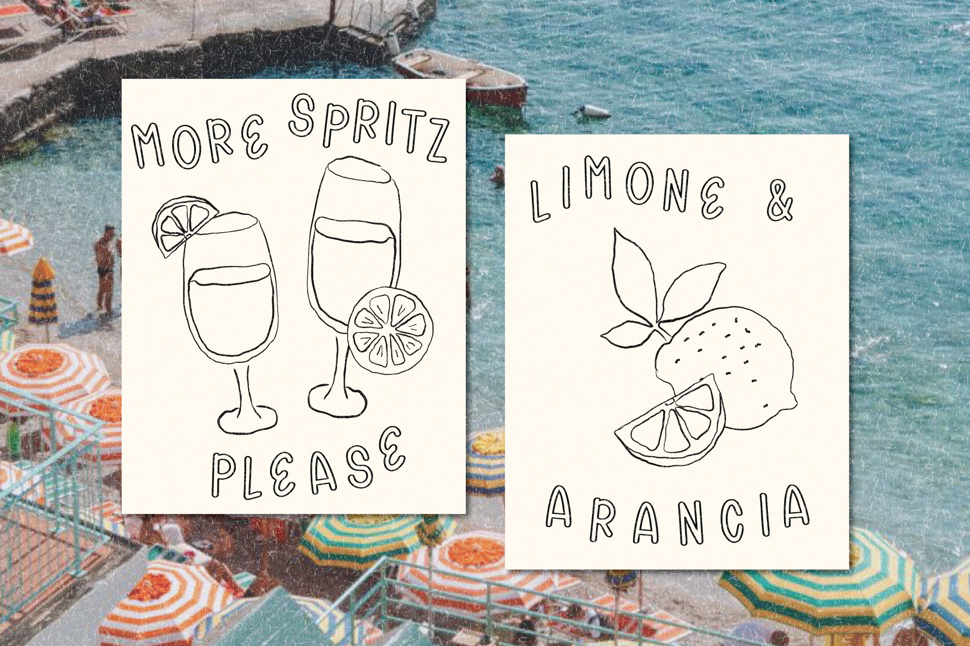
Italian Summer Color Palette Ideas
The fastest way to get this look is with color.
Not bright neon summer colors. Not red, green, and white slapped on everything. More like colors that have been sitting in the sun for a while and got prettier because of it.
Think butter yellow, tomato red, pistachio, cream, peach, soft blue, olive, terracotta, cherry, espresso brown, and that perfect faded navy that feels like an old beach umbrella.
A few combinations I love:
- Cream, tomato red, pistachio, and espresso brown.
- Butter yellow, soft blue, warm white, and cherry red.
- Peach, terracotta, olive, and vanilla.
- Strawberry pink, mint, custard yellow, and cocoa.
- Navy, lemon, cream, and a faded red.
You do not need all of them at once. Truly, please do not put every Italian summer color into one graphic unless chaos is the goal.
Pick a mood first. Gelato shop? Go creamy, pink, mint, and chocolate. Coastal postcard? Try blue, cream, lemon, and red. Rustic market? Olive, terracotta, peach, and warm white. Tiny café menu? Cream, espresso, tomato red, and maybe one soft accent color.
Suddenly the whole thing feels intentional instead of like you typed “Italian summer” into Pinterest and blacked out.
Typography Ideas for Italian Summer Branding
This is where the design really starts to feel alive.
Italian summer graphics need fonts with personality. Not stiff fonts. Not overly perfect fonts. Not the fonts that look like they came free with an accounting software trial.
You want something with charm.
A playful display font works beautifully for gelato packaging, Pinterest pins, café inspired graphics, and product labels. A soft serif can make everything feel romantic and a little editorial. A handwritten font adds that casual market sign feeling. A condensed serif can feel like an old travel poster. A rounded retro font can make the whole thing feel sweeter and more nostalgic.
The best font pairings usually mix something polished with something a little imperfect.
A playful display font with a simple serif. A romantic serif with tiny handwritten notes. A chunky retro font with a clean sans serif. A vintage serif with little script accents. A hand drawn font with something super simple underneath so the whole thing does not get too busy.
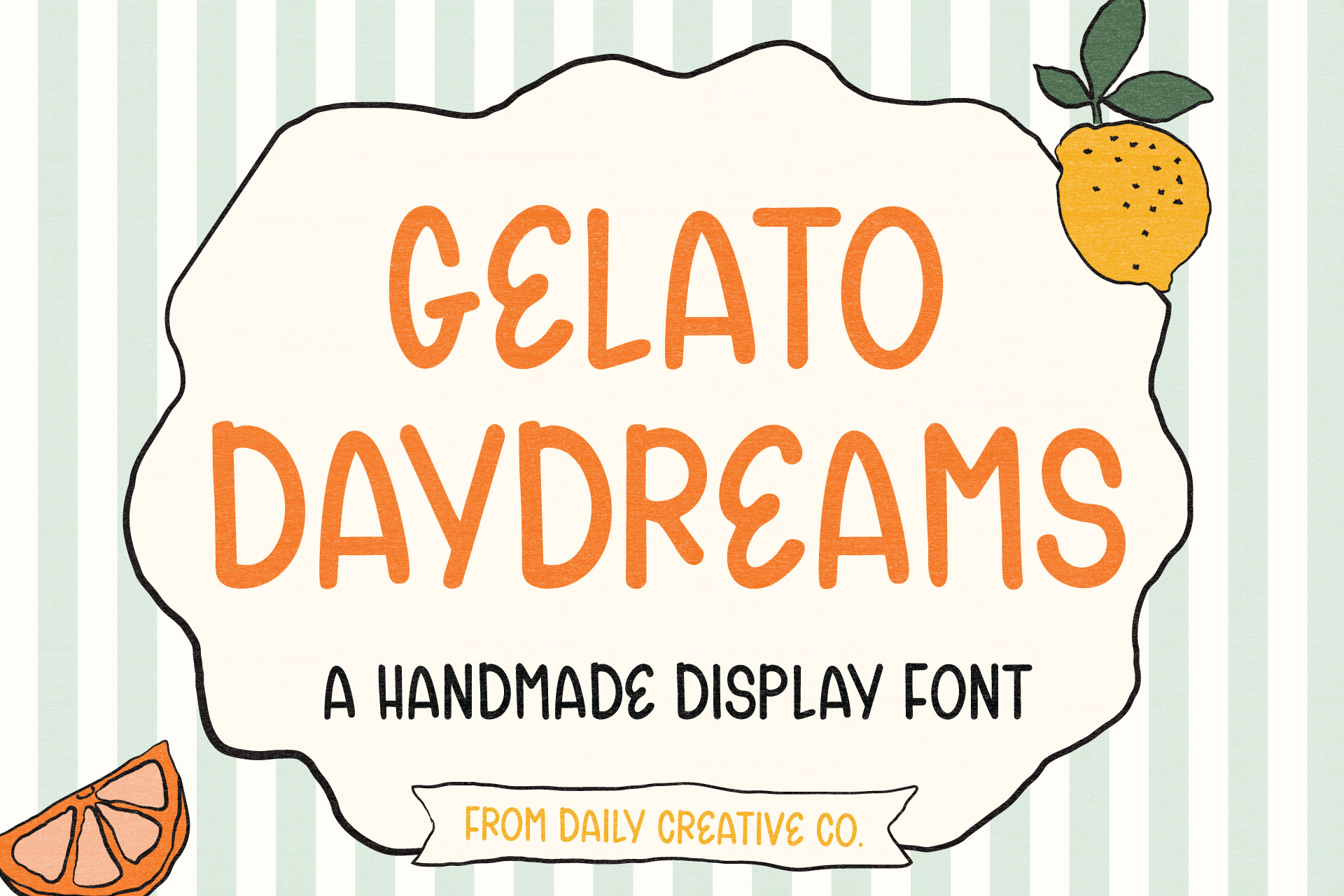
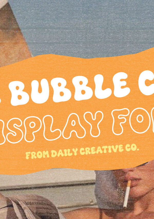
This is exactly why Gelato Daydreams works so well for this kind of design. It has that sweet, playful, slightly nostalgic feeling that makes a graphic feel more fun immediately. It feels cute without being childish, which is always the line I am trying to walk.
Italian Summer Packaging Design Ideas
Packaging is probably my favorite place to use this style. A label can be so simple and still feel adorable if the type and colors are doing their job. a gelato pint with a playful font and a small flavor sticker? Cute.
A candle label with olive green, soft peach, and a serif font? Very little Italian market gift shop. A coffee bag with espresso brown, cream, and a handwritten note? I am listening.
You can also add small details like scalloped labels, striped borders, oval frames, tiny fruit illustrations, paper texture, postage stamp shapes, or little doodles. The trick is not using all of them at once.
This is where people go wrong.
They add the lemons. And the stripes. And the checkers. And the map. And the pasta. And the Vespa. And suddenly it is giving themed restaurant menu instead of charming summer brand.
Pick a few details and let them breathe.
Italian Summer Social Graphic Ideas
This style is so good for social graphics because it feels scroll stopping without being loud.
You can use it for Pinterest pins, Instagram posts, carousel covers, product launch graphics, quote graphics, freebie promos, mood boards, and little “new thing just dropped” posts.
A cream background with a big playful headline can be enough.
Or you can make it more layered with photos, textures, tiny labels, stripes, fruit doodles, and a handwritten callout. It really depends on how much personality you want the graphic to have.
A few easy ideas:
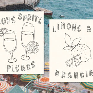
- Make a Pinterest pin with a creamy background, big playful type, and one tiny cherry or lemon.
- Create an Instagram carousel cover with striped edges and a vintage inspired headline.
- Design a quote graphic on a sun faded paper texture.
- Make a product launch graphic that looks like a tiny café menu.
- Create a mood board with gelato colors, tile patterns, soft blue, warm red, and playful typography.
- Make a “summer favorites” graphic with little sticker style labels and handwritten notes.
Nothing has to be overdone. Sometimes the cutest graphic is the one that looks like it took five minutes but actually took you forty-five because the red was not quite red enough.
We have all been there.
Italian Summer Branding Ideas for Small Businesses
The fun thing about this aesthetic is that it can work for way more than food brands.
Obviously, yes, it is perfect for gelato, coffee, olive oil, pasta, bakeries, candles, soap, stationery, and anything that can be placed in a cute little box.
But it also works for creative studios, photographers, wedding brands, digital product shops, designers, educators, and creators who want a seasonal campaign that feels a little warmer and more memorable.
- A wedding stationery designer could use scalloped frames and romantic serif type.
- A candle brand could use olive, peach, cream, and handwritten details.
- A designer could make a summer Pinterest series with gelato colors and playful display fonts.
- A digital product shop could use it for launch graphics, freebie promos, or a seasonal brand refresh.
It does not have to be literal. You can take the feeling and make it fit your brand!
That is usually where the best design happens anyway.
How to Keep It Cute and Not Cheesy
This is the part we need to talk about. Italian summer design can get cheesy very quickly if you use every obvious symbol at once. You do not need lemons, pizza, pasta, a Vespa, red checkers, a map of Italy, and the word “ciao” all in the same graphic.
Pick the feeling instead.
Want it to feel coastal? Try soft blue, cream, stripes, and a relaxed serif.
Want it to feel playful? Try gelato colors, rounded type, and tiny illustrations.
Want it to feel romantic? Try faded colors, paper texture, serif fonts, and vintage postcard layouts.
Want it to feel rustic? Try olive, terracotta, cream, handwritten type, and simple line art.
A clearer mood makes the whole design better. And usually, a lot less cheesy.
Easy Italian Summer Design Ideas to Try
- Make a gelato inspired Pinterest pin.
- Create a fake product label for a candle, coffee bag, soap box, or ice cream pint.
- Design a color palette using cream, tomato red, pistachio, and espresso.
- Make a summer brand mood board with type, texture, color, and photography.
- Create a carousel cover with stripes and a playful font.
- Design a little café menu graphic just for fun.
Try using a playful display font as the main personality, then keep everything else simple.
That last one is my favorite because type can do so much of the work. You do not always need a million design elements. Sometimes the right font, the right color, and one tiny doodle are enough.
Final Thoughts on Italian Summer Design
Italian summer design is charming because it feels warm, imperfect, and full of personality.
It does not feel like it was made in a cold little template factory. It feels like it belongs on a label, a postcard, a café menu, a gelato cup, a summer launch graphic, or a Pinterest pin you save immediately because the colors are just too good.
And if you want to bring that feeling into your own graphics, start with the font.
That is exactly why I made Gelato Daydreams. It is playful, sweet, and a little nostalgic, which makes it perfect for summer branding, packaging mockups, Pinterest graphics, social posts, and designs that need a tiny bit more sunshine.
Very cute. Very warm. Very “I want to put this on a gelato pint even though I do not sell gelato.”
Leave a Reply