
There’s a reason beach club branding shows up constantly on Pinterest boards and moodboard decks. It’s one of those aesthetics people don’t just look at, they want to live inside it. A great beach club identity doesn’t simply advertise a place. It sets a mood before anyone has even packed a bag.
That makes it one of the more fun categories to design for, and also one of the easiest to get slightly wrong. A logo can look beautiful in isolation and still fail to capture the feeling of a pool day, a coastal café, a retro resort. This is a practical look at what actually makes beach club branding work, from logo and font choices to color, packaging, and the small details that pull a whole world together.
What Makes Beach Club Branding Feel Distinctive?
A Clear Sense of Place and Personality
The strongest beach club brands feel specific. Mediterranean, retro Californian, tropical, minimal coastal, rather than a generic combination of a wave icon and blue and white stripes. That specificity comes from real references: a certain era of resort graphics, a particular coastline, a color combination that feels tied to one place rather than beach branding in general.
A Balance of Relaxed and Aspirational Design
Beach club branding lives in an interesting middle space. It needs to feel relaxed enough that people picture themselves showing up in sandals, but polished enough that it still reads as a destination worth getting dressed up for. Lean too casual and the brand feels like a beach shack. Lean too polished and it loses the warmth that made beach culture appealing in the first place.
Visual Details That Feel Like Part of a Larger World
The best examples don’t stop at the logo. A striped umbrella pattern, a repeated wave motif, a specific typographic treatment on a menu. These details show up again and again across touchpoints until the brand feels like a fully built environment instead of a single graphic slapped onto different products.
Choose a Beach Club Branding Style
Retro Beach Club Branding
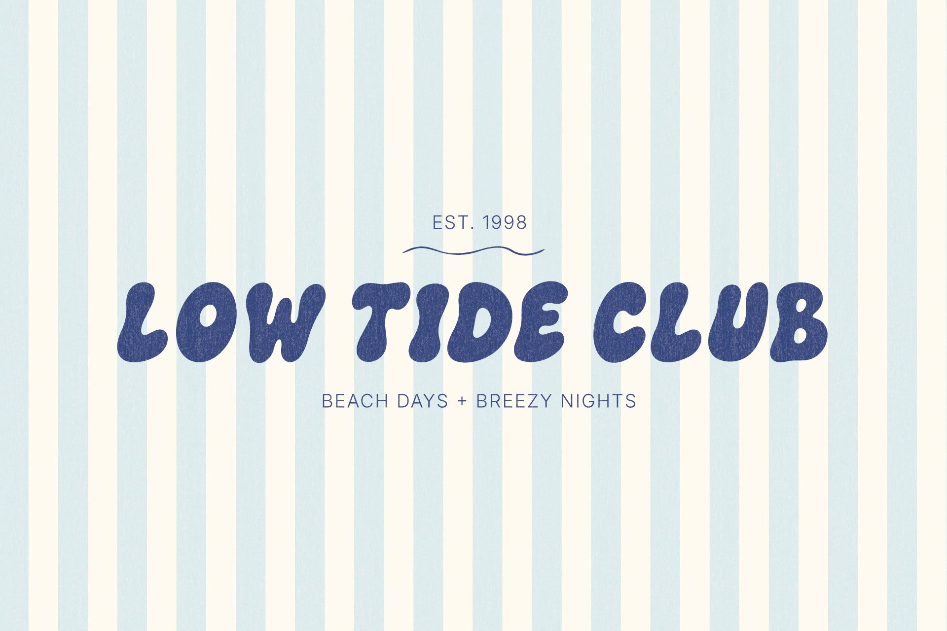
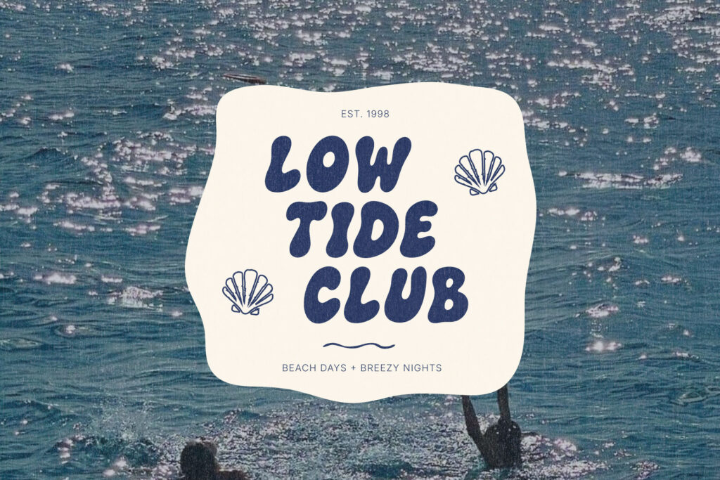
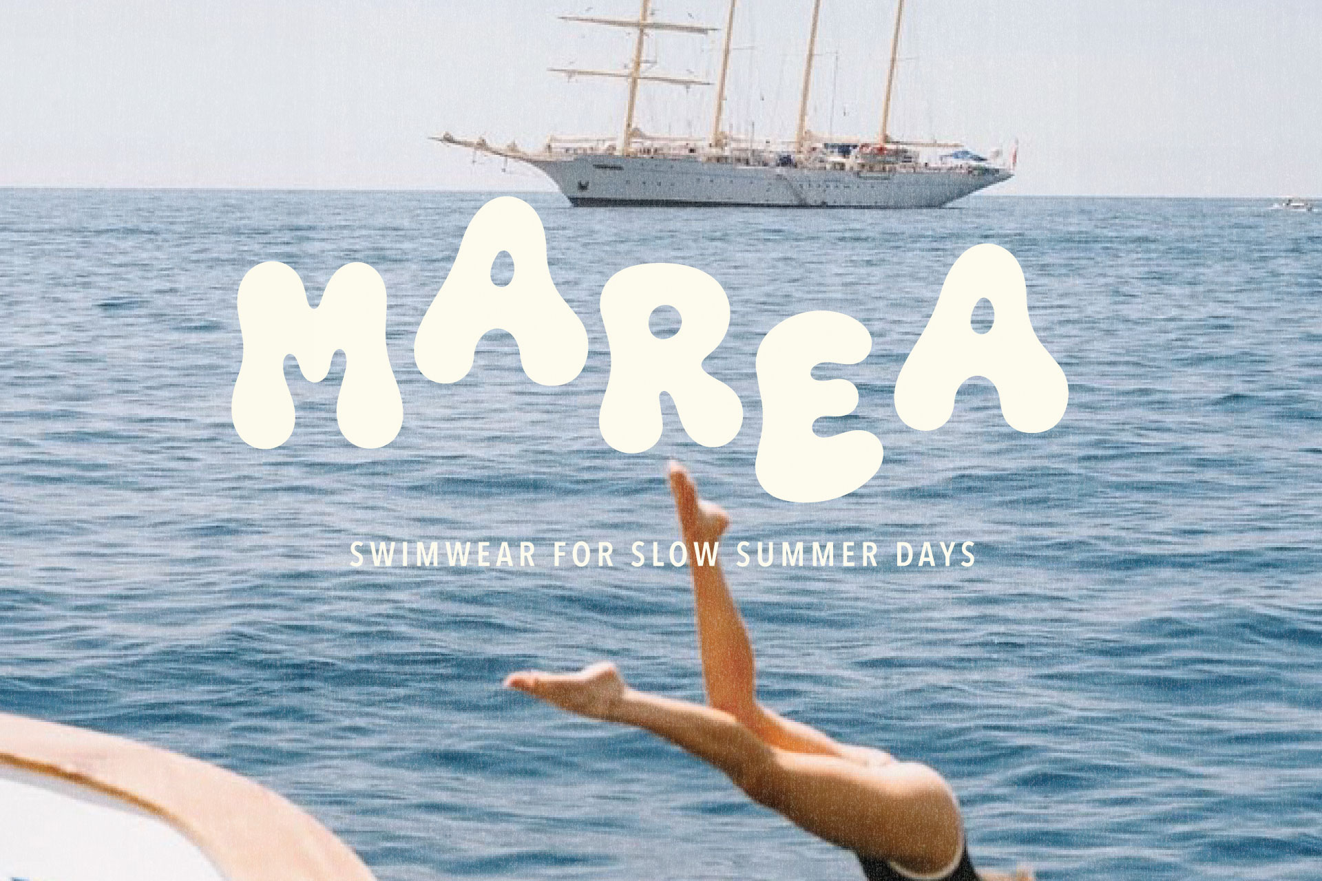
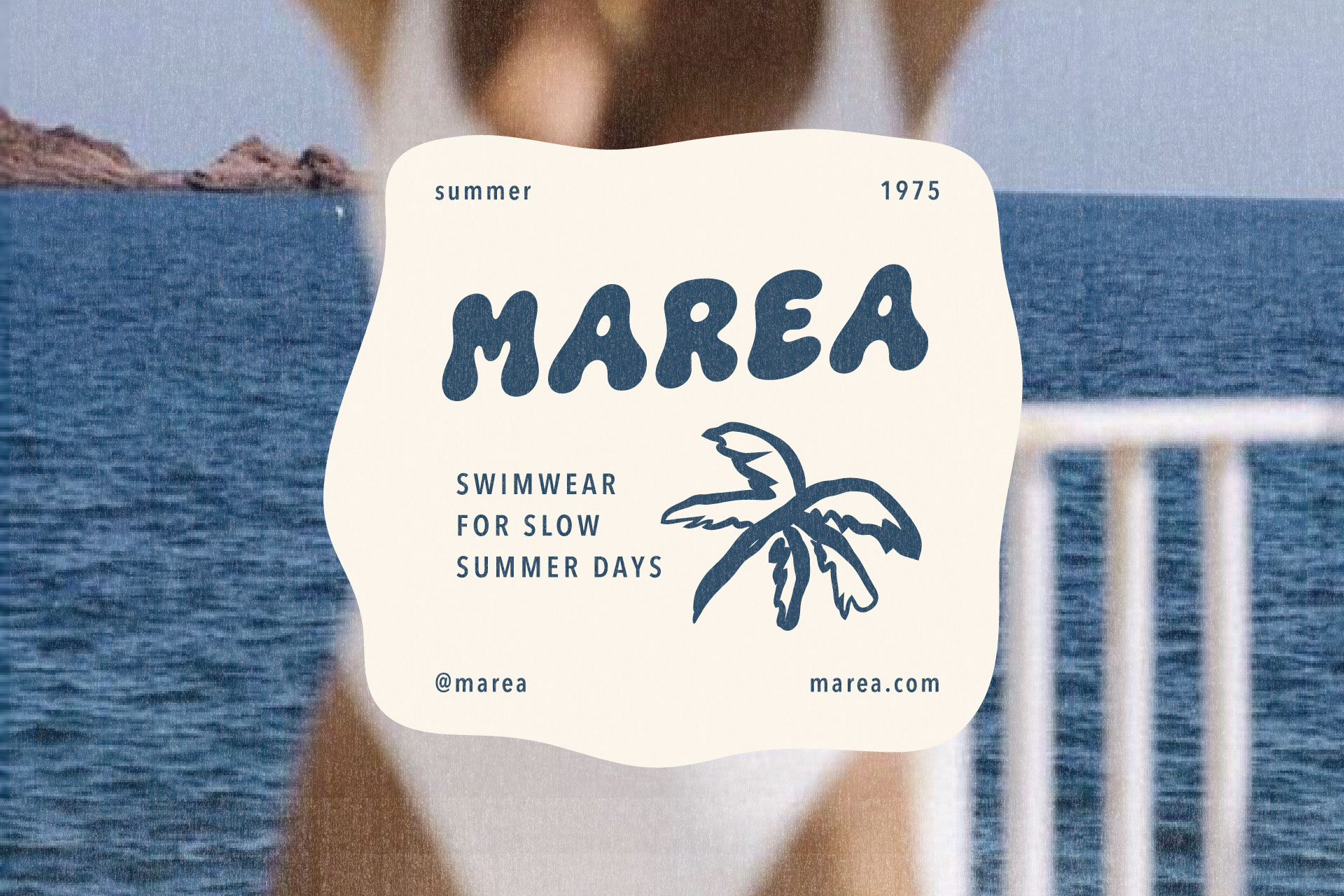
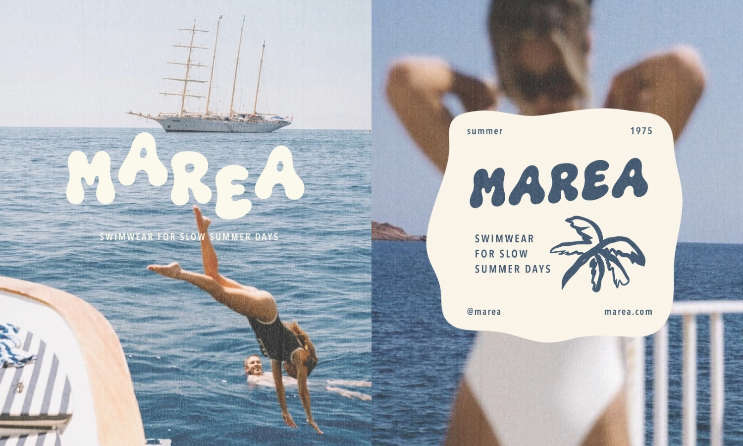
Retro beach branding pulls from mid-century resort signage, hand-painted motel lettering, vintage postcards. Rounded, bold typography. Sun-faded color palettes. A slightly worn, hand-drawn quality that feels collected rather than manufactured.
Mediterranean Resort Branding
This style draws on the Amalfi Coast, the Greek islands, the South of France: whitewashed textures, warm terracotta, deep blues, a mix of elegant serif type with playful accents. For a deeper look at this specific visual world, this guide to Italian summer design ideas is a useful companion piece, especially for packaging and menu inspiration that shares a lot of DNA with beach club branding.
Colorful and Playful Summer Branding
Bold, saturated, unapologetically fun. Built around bright color combinations and bubbly, expressive type, this style works especially well for family-friendly beach clubs, pool-day merchandise, and brands that want to feel energetic rather than exclusive.
Minimal Coastal Branding
At the opposite end, minimal coastal branding strips things down to a restrained palette, generous white space, and clean typography. It trades personality for a sense of quiet luxury, and it works well for boutique resorts and higher-end hospitality brands.
Vintage Surf Club Branding
Surf-inspired branding borrows from decades of board shop and surf club graphics: badge logos, bold condensed type, a slightly rough, screen-printed texture. It tends to feel more rugged and less polished than resort-style branding, which is exactly the point.
Beach Club Logo Ideas
Create a Typography-Led Wordmark
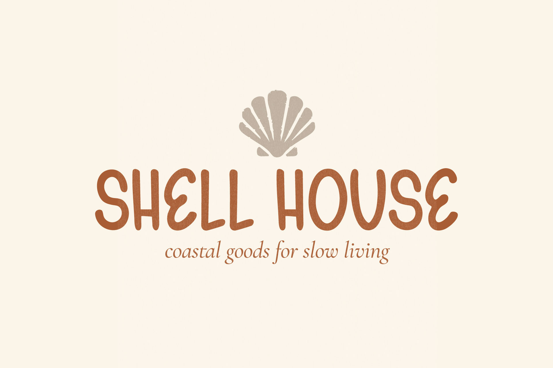
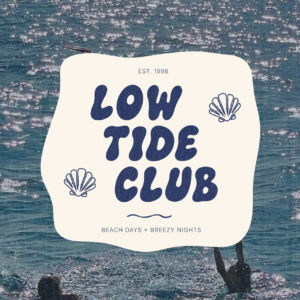
A wordmark puts all the personality into the letterforms themselves. No icon required. This is often the strongest choice for a beach club name that already carries a lot of character, since a well-chosen display font can communicate the entire vibe of the brand on its own.
Add a Simple Coastal Illustration or Emblem
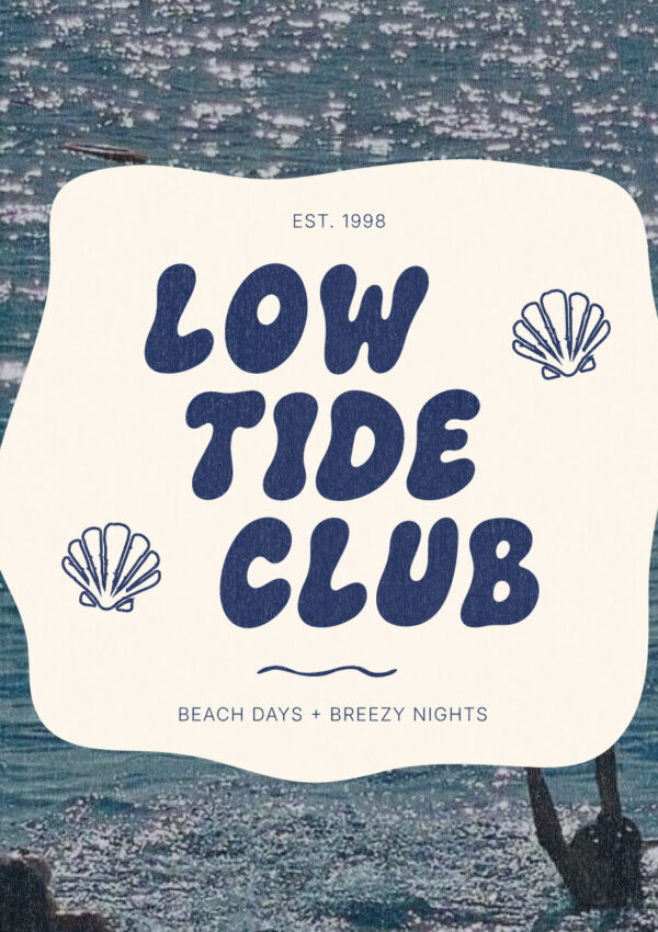
A small icon, a wave, a sun, a palm frond, a simple shell, can add just enough visual interest without overcomplicating the mark. The key word here is simple. One clean shape reads better at small sizes than a detailed illustration ever will.
Try a Badge-Style Beach Club Logo
Badge logos, with a name arced around a central icon or shape, borrow heavily from vintage surf and resort signage. They work particularly well for merchandise and stamped or embossed applications, where a contained, circular shape translates cleanly.
Create Alternate Logo Versions for Different Uses
A primary logo rarely covers every use case. A simplified icon-only version, a horizontal lockup, a stacked version, these give a beach club brand the flexibility to show up correctly on everything from a website header to a tiny product tag.
The Best Fonts for Beach Club Branding
Bold Display Fonts for Logos and Headlines
A bold, expressive display font is usually where a beach club brand gets most of its personality. Rounded, hand-drawn letterforms in particular carry a warmth that feels approachable rather than corporate, which is exactly the tone most beach club brands are reaching for.
Elegant Serif Fonts for Resort-Inspired Branding
For a more upscale resort feel, an elegant serif brings in a sense of polish without losing warmth. It’s a common pairing partner for a bolder display font, since the serif’s structure balances out a display font’s playfulness. If you’re building that pairing inside Canva specifically, this list of Canva font pairings is a good place to start narrowing things down.
Clean Sans Serif Fonts for Supporting Text
Menus, captions, contact information, any longer stretch of text needs a simple sans serif that stays out of the way. This is the workhorse of the type system, doing the quiet job of actually being read. This roundup of Canva fonts for branding includes several solid supporting options if you’re assembling a full type system there.
Handwritten Fonts for Casual Details and Accents
A handwritten script can work well for small accents, a signature line, a “welcome” note, a date on an event graphic, but it should stay in a supporting role. Save the main visual weight for a bolder display font and let a script add a softer, more personal touch in smaller doses.
Beach Club Color Palette Ideas
Sun-Washed Yellow, Ocean Blue, and Cream
A warm, faded yellow next to a clear ocean blue and a soft cream background reads as bright without feeling sharp. This combination leans retro and works well across signage, packaging, and merchandise alike.
Coral, Aqua, and Warm White
Coral and aqua together create a lot of energy, especially against a warm white base instead of a stark white one. Strong choice for playful, family-friendly beach clubs and summer product lines.
Mediterranean Blue, Tomato Red, and Soft Yellow
This one pulls directly from Mediterranean coastal towns and Italian summer packaging: deep blue, a punchy tomato red, a gentler yellow to balance the two. It’s a palette that pairs naturally with the same warm, nostalgic world that Gelato Daydreams was built around, if a beach club brand wants to lean slightly more Italian café than classic beach.
Sand, Sage, and Faded Coastal Blue
For a quieter, more minimal direction, sand and sage next to a muted, faded blue create a palette that feels calm and a little more elevated. This combination shows up often in boutique resort and wellness-adjacent branding.
Bright Poolside Colors With a Neutral Base
Bold poolside colors, hot pink, turquoise, bright orange, work best against a neutral base rather than against each other. A large area of cream, white, or sand gives the brighter accent colors somewhere to land instead of competing all at once.
Beach Club Packaging Design Ideas
Sunscreen and Skincare Packaging
Sunscreen and skincare tubes benefit from bold, legible type and a color palette that reads clearly even at a small, curved surface. This is a category where a strong display font on the product name does a lot of the branding work in very little space.
Beverage Cups, Bottles, and Cans
Cups, bottles, and cans are some of the most visible branding touchpoints a beach club has, since guests carry them around all day. A repeated wordmark or pattern here extends the brand experience well beyond the physical space itself.
Food Packaging and Takeaway Boxes
Food packaging needs to balance personality with practicality: legible at a glance, functional at real sizes, durable enough to hold up outdoors. This guide to fonts for food branding and packaging goes deeper into choosing type that works specifically for food and beverage applications.
Swimwear Tags, Bags, and Tissue Paper
Retail-adjacent touchpoints like hang tags, shopping bags, and tissue paper are small, often overlooked opportunities to reinforce the brand. A repeated pattern or a simplified version of the logo keeps these details feeling intentional rather than like an afterthought.
Hotel and Resort Amenities
For beach clubs attached to a hotel or resort, amenities, key cards, room signage, in-room materials, extend the branding into a guest’s private experience of the space, which matters just as much as the public-facing graphics.
Beach Club Menu and Hospitality Design
Poolside Food and Drink Menus
A menu is one of the most-read pieces of collateral in the entire brand system, which means it needs a clear hierarchy. A bold header, easy-to-scan category labels, simple, legible pricing. This is a place where a display font should be used sparingly, for headers only, not for full menu descriptions.
Hotel Room Materials and Welcome Cards
Welcome cards, room directories, other in-room materials are a chance to bring the brand’s personality into a quieter, more personal moment. These pieces can afford to feel a little warmer and more handwritten than public-facing signage.
Beach Towels, Umbrellas, and Branded Signage
Large-format applications like towels, umbrellas, and signage need bold, simple shapes that read from a distance. Fine detail gets lost here, so this is where the boldest, most confident version of the logo and type system should live.
Event Posters and Seasonal Promotions
Seasonal event graphics give a beach club brand room to experiment a little more than the core identity allows, while still staying recognizably part of the same visual world through consistent color and type choices.
Summer Social Media and Marketing Graphics
Instagram Posts and Stories
Social graphics are often the first place a potential guest encounters the brand, which makes consistent type and color treatment especially important here. A repeated font pairing across posts builds recognition even before someone sees the logo.
Pinterest Graphics and Moodboards
Pinterest rewards clear, visually distinct graphics with strong typography, which makes it a natural home for beach club branding. Bold display type set large, with plenty of breathing room, tends to perform well here.
Launch Campaigns and Promotional Graphics
A season opening, a new menu, a special event gives a beach club brand a reason to push its visual identity a little further, while staying anchored to the same core fonts and colors that show up everywhere else.
Email Headers and Website Banners
These wide, horizontal formats are a good home for a full lockup version of the logo alongside a short, punchy headline in the brand’s display font, giving digital touchpoints the same personality as the physical space.
Beach Club Merchandise Ideas
T-Shirts, Hats, and Tote Bags
Apparel and bags are some of the most effective, and most requested, merchandise items, and they work best with bold, simple graphics that hold up in a single color or two-color print.
Towels, Cups, and Beach Accessories
Practical merchandise, towels, cups, coolers, gets used constantly, which makes it valuable free advertising every time a guest brings it home. A clean, recognizable mark matters more here than an intricate design.
Stickers, Postcards, and Souvenir Graphics
Smaller keepsake items are a fun place to let the brand’s world expand a little, through illustrated details, seasonal graphics, or playful variations on the main logo.
How to Make Beach Club Branding Feel Cohesive
Repeat Core Colors and Typographic Treatments
Cohesion comes from repetition. The same two or three colors and the same font roles should show up across every single touchpoint, from the menu to the merchandise, so the brand feels unmistakably like itself no matter where someone encounters it.
Create a Small Set of Recognizable Graphic Elements
A pattern, an icon, a border treatment. Having two or three signature elements that repeat across packaging, signage, and social graphics does more to build recognition than constantly introducing new visuals.
Design for Every Brand Touchpoint, Not Just the Logo
A beach club brand is really a full environment: signage, menus, packaging, staff uniforms, social graphics, merchandise. Treating the logo as the entire branding project usually leaves the rest of the experience feeling disconnected from it.
Create Playful Beach Club Branding With The Bubble Club
Use It for a Bold Beach Club Wordmark
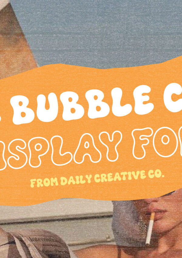
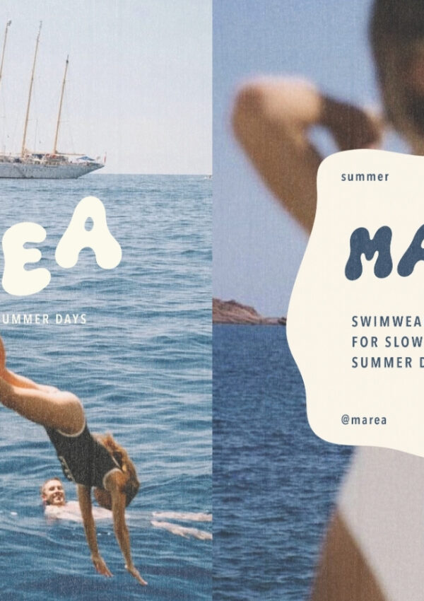
The Bubble Club is a natural fit for this world. Its rounded, hand-drawn letterforms and outline style carry the same warmth and confidence that beach club branding depends on, and it works especially well as a standalone wordmark for a beach club name that deserves to be the whole visual identity.
Build Branded Packaging and Merchandise
Because the font holds up at a range of sizes, it translates well from a large piece of signage down to a small product tag, which makes it a practical choice across the packaging and merchandise categories covered above.
Pair It With a Simple Supporting Typeface
As with any bold display font, The Bubble Club works best with a quiet supporting cast. A clean sans serif keeps menus and body copy legible, while an elegant serif can push the overall system a little more toward resort-level polish if that’s the direction the brand is heading.
Build a Beach Brand People Want to Step Into
Beach club branding works best when it stops feeling like a logo and starts feeling like an invitation. The strongest examples build an entire world, through color, type, packaging, and small repeated details, that someone wants to be part of before they’ve even arrived.
If you’re building that world for your own brand, The Bubble Club is a good place to start the typography, with bold, rounded letterforms designed to carry personality across everything from a wordmark to a beach towel.
Leave a Reply