
You found the font. The one with the bouncy baseline and the personality that makes you grin a little every time you type something in it. And now you’re staring at your layout wondering why it looks like a birthday party threw up on your brand board instead of looking intentional, elevated, and like something you’d actually put your name on.
This happens to almost every designer who falls for an expressive typeface. Display fonts are not the problem. The problem is that most of us were never taught how to build a layout around one. We learned hierarchy with safe, neutral type, and then we bring that same instinct to a font that has curves, personality, and opinions of its own, and things fall apart.
The good news is that playful display fonts are not inherently unprofessional. They just ask more of you. They need quieter partners, more thoughtful spacing, and a clear sense of when they should lead and when they should sit back. Once you understand that relationship, a bold, expressive font stops feeling like a liability and starts feeling like the most interesting decision in the whole design.
This is the part of the job I love most, so let’s actually get into it.
Why Playful Fonts Feel Risky (and Why That’s Not a Font Problem)
When a display font feels “too much,” it’s rarely the font’s fault. It’s almost always a supporting cast problem. Somebody paired it with another loud font, or used it for six lines of body copy, or let it run at the same size and weight everywhere so nothing in the layout has anywhere to rest.
A display font is a personality, not a system. It’s the friend who tells the best story at dinner. You don’t need everyone else at the table also trying to tell a story at the same volume. You need people who know when to laugh, when to ask a follow up question, and when to let the story land.
That’s the whole idea behind styling a display font well. The font brings the personality. Everything else around it brings the structure that lets the personality actually be heard.
Let the Display Font Provide Personality. Let Everything Else Provide Structure.
This is the single most useful mental shift I can offer you: your display font’s job is to be felt, not read for long stretches. It should show up where its energy adds something, like a logotype, a headline, a hero moment, or a single word that deserves attention.
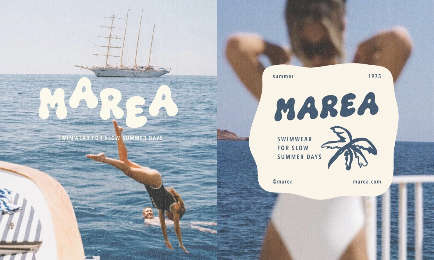
Everything else in the design, your body copy, your captions, your fine print, your navigation, exists to support that moment. Supporting text should be quiet, legible, and almost invisible in the best way. It’s doing its job when nobody notices it’s there.
This is also where a lot of the “how do I make my display font look professional” anxiety actually gets solved. Professional doesn’t mean muted. It means considered. A wildly expressive headline sitting above clean, well spaced body text reads as confident, not chaotic, because the reader’s eye always knows where to land first and where to rest after.
Display Font Pairing: Let the Quiet Font Do the Talking (Structurally)
If you only take one tactical lesson from this post, take this one. Pair your expressive display font with something quieter. A refined serif. A clean, well built sans serif. Something with very little personality of its own.
This is not about the display font being “too much” and needing to be toned down. It’s about contrast. Two decorative fonts fighting for attention is the fastest way to make a layout feel cluttered, even if each font is beautiful on its own. Your eye doesn’t know which one to trust, so it ends up trusting neither.
A good rule of thumb when you’re building any display font pairing:
One expressive voice. One quiet structural voice. That’s the whole team.
If you want a third font in the mix, it should be even quieter than your secondary font, and used sparingly, for things like captions, labels, or fine print. The moment you have two fonts competing for the “interesting” role, the whole hierarchy collapses.
This is one of the clearest lessons from the newest Type Drop, which I’ll get into a little further down, because seeing this principle applied across a few different brand directions makes it click in a way that’s hard to explain in text alone.
Typography Hierarchy Isn’t Just Big and Small. It’s Where the Eye Rests.
A lot of designers think hierarchy is solved once headline is big and body copy is small. That’s a start, but real hierarchy is about sequencing. Where does the eye land first? Where does it go next? Where does it get to rest?
With a playful display font, this matters even more, because the font itself already carries visual weight before you even touch scale. A single word set in a bubbly, hand drawn display face can hold its own against a much larger block of plain text. So don’t be afraid to use scale contrast aggressively. Let the display font be big and confident. Let your supporting type be noticeably smaller and quieter. The gap between the two is what creates rhythm instead of noise.
Spacing does a lot of this work too. Give your display font room to breathe, both around the letters and around the block of text it lives in. Tight spacing on an already expressive font reads as cramped and amateur. Generous spacing reads as intentional, even luxurious.
Negative Space Is What Makes Playful Typography Feel Elevated
If there’s one thing that instantly upgrades a display font from “fun” to “polished,” it’s negative space. Empty space isn’t wasted space. It’s what gives a bold, decorative headline somewhere to exist without competing with everything else on the page.
Think about the difference between a playful word crammed into a small package covered in other elements, versus that same word given its own moment, surrounded by air, with everything else pushed quietly to the edges. Same font. Completely different feeling. One feels like clutter. The other feels like a brand that knows exactly what it’s doing.
This is especially true for hand drawn or bouncy display fonts, since their organic shapes need room to read clearly. Crowd them and they turn into visual noise. Give them space and they become the star of the show.
Color Changes the Mood of a Font More Than You’d Expect
The exact same display font can feel like three completely different brands depending on the palette around it. A soft, sun bleached palette makes a playful font feel breezy and coastal. A punchy, saturated palette makes that same font feel loud, nostalgic, and full of energy. A more restrained, tonal palette makes it feel elevated and editorial, even though the letterforms haven’t changed at all.
This is one of the most underused tools for making a playful font feel intentional rather than childish. If a display font is reading too young or too loud for your brand, before you assume the font is wrong, try changing the palette around it. Muted, sophisticated color choices can make even a very bouncy, expressive font feel grown up and considered.
Use the Display Font Selectively, Not Everywhere
Expressive fonts lose their impact the moment they’re used for everything. If your headline, your subhead, your body copy, and your call to action are all set in the same playful display font, nothing stands out anymore, and the whole thing starts to feel exhausting to read.
Be selective. Let the display font own a handful of key moments: a logotype, a hero headline, a single standout word inside a sentence, a pull quote. Everywhere else, let a quieter font carry the reading weight. This selective use is exactly what makes a playful font feel premium instead of overwhelming. Restraint is what signals confidence.
Repeat the Font’s Personality Elsewhere in the Brand
Here’s a detail a lot of designers miss. A display font isn’t just letterforms, it’s a set of characteristics: maybe it has rounded terminals, a certain bounce, a hand drawn wobble, thick confident strokes, or playful ligatures. When you echo those characteristics elsewhere in the identity, in your icons, your border shapes, your packaging details, even your photography style, the whole brand starts to feel cohesive instead of like a font that got slapped onto an unrelated system.
This is part of what separates a brand that happens to use a fun font from a brand that feels genuinely built around that font’s personality. The typography and the visual world are speaking the same language.
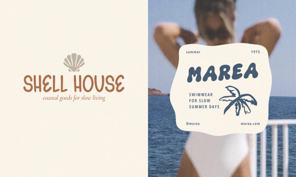
Know When the Font Should Lead and When It Should Support
Not every touchpoint needs your display font leading the charge. Sometimes it should sit back entirely, showing up only in a small logotype or a single accent detail, while a quieter typographic system carries the rest of the brand. Other times, like a hero headline or a product label, it should be front and center, doing the heavy lifting.
Learning to read a layout and ask “does this moment need personality, or does it need clarity” is a skill that develops with practice. But once you start asking that question deliberately, your use of display fonts gets a lot more confident, and a lot less accidental.
Seeing It in Practice: The Latest Type Drop
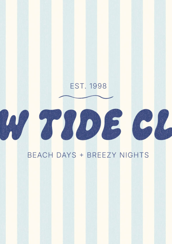
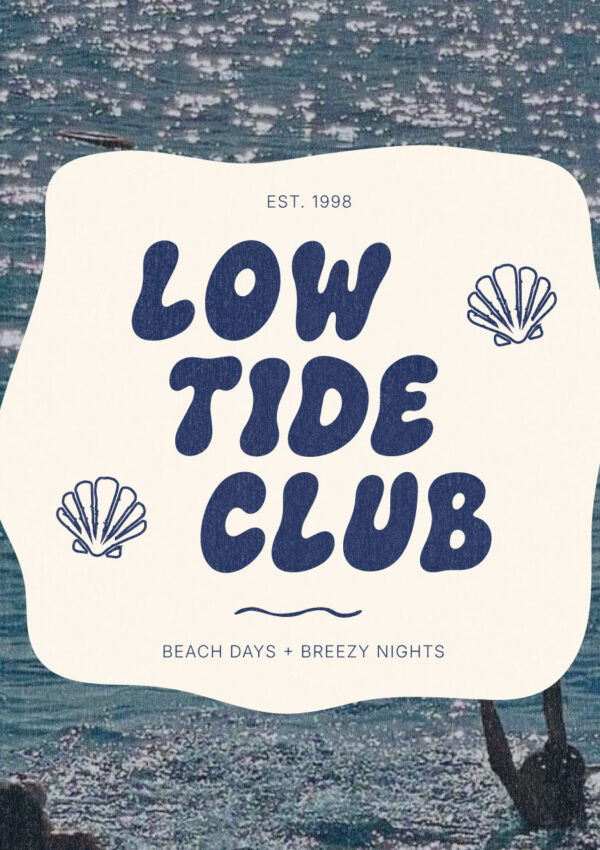
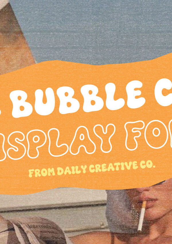
I actually built this month’s Type Drop, “How to Style a Playful Display Font,” around exactly this problem. It’s a set of visual inspiration built using two of my own fonts, Gelato Daydreams and The Bubble Club, styled across three completely different fictional brand directions.
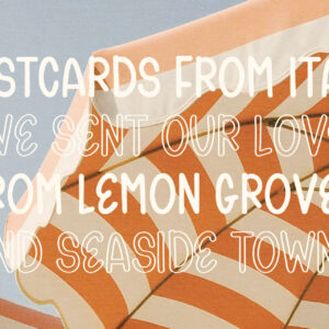
One direction takes Gelato Daydreams and pairs it with an elegant serif for a polished, Italian inspired brand feel. Another leans soft and sunny with a coastal, laid back mood. A third uses The Bubble Club to build a bold, nostalgic beach club identity that leans into color and confidence instead of restraint.
Same two fonts. Three completely different personalities. Nothing about the letterforms changed, only the supporting typography, palette, spacing, scale, and imagery around them. That’s really the whole point of this post put into a visual example instead of a paragraph.
This Type Drop is meant as visual inspiration and reference, the kind of thing you pull up when you’re trying to figure out how a font could feel in a real brand context, not a written, step by step tutorial. If you want to see how these ideas actually look side by side, it’s worth a look.
It’s currently available for a limited 24 hour window over on Patreon before it moves into The Vault with previous Type Drops. Head over to see How to Style a Playful Display Font and check the post!
A Few Final Thoughts on Making Bold Fonts Feel Professional
If you’re staring at a playful, expressive font wondering whether it belongs in a “serious” brand, the answer is almost always yes, as long as everything around it is doing its job. Quiet supporting type. Generous spacing. Thoughtful color. Selective use. A little bit of restraint in all the right places.
Bold and playful doesn’t have to mean chaotic. It just means the font is finally getting the kind of considered, structural support it actually needs to shine.
If you want to see these ideas in action, that’s exactly what this month’s Type Drop was built to show. And if you’re the kind of designer who gets genuinely excited about a well styled headline, you’re in good company around here.
About Type Drops
Type Drops are a resource for small but powerful design assets like brushes, textures, font pairings, and layout helpers, all created to work across tools like Procreate, Canva, Photoshop, and more. Each resource is designed to help you produce clean, polished, and expressive work without adding friction to your creative flow.
Stay tuned for next Friday’s drop!
Looking for More Free Design Resources?
Browse more Type Drop downloads including:
- 5 Typography Styles Using the Same Phrase (Free Font Study Download)
- Kindest Note Font Pairing Templates for Branding
- The Mahjong Edit Color Palette: A Unique Spring Color Palette for Branding and Design— Freebie Friday Download
- Kindest Note Demo Font, A Warm Handwritten Caps Font — Freebie Friday Download
- Whimsical Wavy Hand-Drawn Border Designs — Freebie Friday Download
- Paper Grain Texture for Canva and Procreate — Freebie Friday Download
Leave a Reply