
There is a specific fear that comes up almost every time a designer or brand owner falls in love with a playful font. It usually sounds something like, “I love this, but will it make us look like a kids’ brand?”
Fair question. Playful fonts have big personality, and big personality can tip into chaos if nobody is managing it. But a bold, rounded, expressive font is not the problem. The problem is almost always how it gets used. A playful typeface can sit at the center of a polished, adult, professional brand identity, as long as the rest of the design knows how to support it.
This is a guide to doing exactly that. How to use playful fonts with intention, so the personality reads as confident instead of accidental.
Can a Playful Font Still Look Professional?
Playful Does Not Have to Mean Juvenile
Playful and childish are not the same thing, even though they get lumped together constantly. A font with rounded shapes, uneven edges, or a hand-drawn quality can feel warm, human, and confident. What pushes it toward childish is usually everything happening around it, too many colors, too many effects, too much decoration competing for attention at once.
Think about the difference between a candy shop sign and a birthday party invitation covered in balloons and glitter. Both might use a bubbly font. One feels curated. One feels like it’s trying too hard. The font itself is rarely the deciding factor.
The Difference Between Personality and Visual Clutter
Personality comes from one confident decision, made well. Clutter comes from a lot of small decisions made without a plan. A brand with personality usually has one expressive element, a display font, a bold color, an illustration style, and everything else is built to support it. A brand that reads as clutter usually has three or four loud elements competing at the same volume, with nothing quiet enough to let the eye rest.
Choose a Playful Font That Fits Your Brand Personality
Look at the Shape and Style of the Letterforms
Before anything else, look closely at what’s actually happening in the letterforms. Rounded corners read differently than sharp ones. Wide proportions feel different than narrow, condensed shapes. Uneven, hand-drawn lines feel different than a font built entirely from perfect geometric curves. These details communicate tone far more than the general label of “playful” ever will.
Decide How Playful You Actually Want the Brand to Feel
Playful exists on a spectrum. A bakery aiming for warm and approachable needs a different level of playfulness than a kids’ clothing line aiming for pure fun, and both need something different than a beauty brand looking for just a hint of personality in one headline. Get specific about where your brand actually sits before choosing a font.
Choose Character Over Random Novelty
A font should feel like a deliberate choice, not a random one grabbed because it looked fun in a font list. Look for a typeface with a consistent visual logic behind it, something with a clear point of view rather than a pile of unrelated decorative flourishes. Real character tends to hold up across a full brand system. Novelty fonts tend to fall apart the moment you try to use them for more than one graphic.
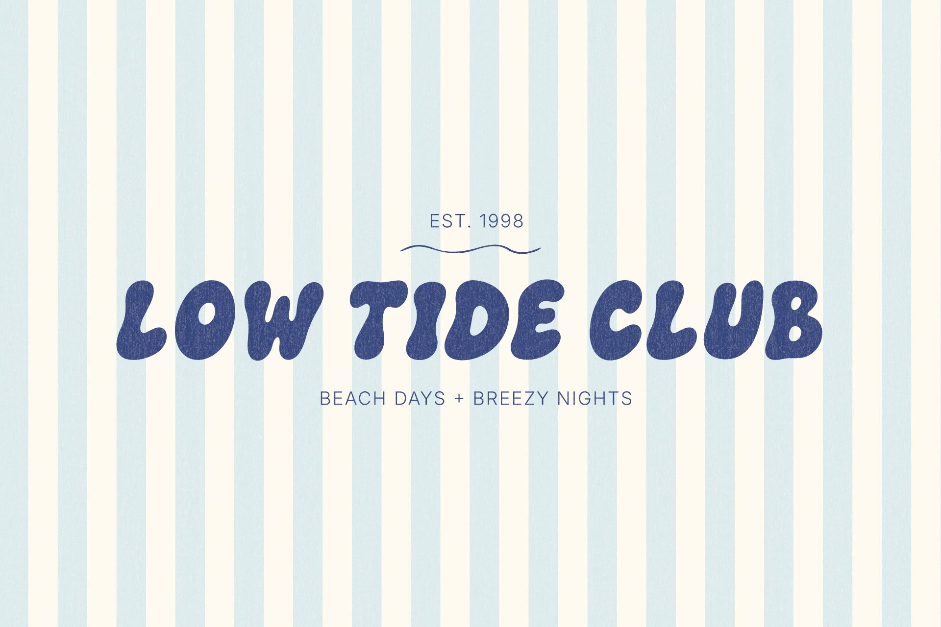
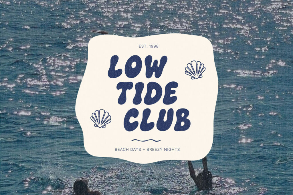
Use Playful Fonts as Display Fonts
Save Them for Logos, Headlines, and Short Phrases
A display font, playful or otherwise, is built to be seen in short bursts. A logo. A headline. A product name. A single word on a graphic. This is where a bold, decorative typeface earns its keep, because it only has to hold a reader’s attention for a second or two.
Avoid Using Decorative Fonts for Long Paragraphs
The moment a playful font gets asked to carry a full paragraph, the whole thing starts working against itself. Exaggerated shapes and uneven letterforms that look charming in a headline become genuinely hard to read at length, and that’s one of the fastest ways a fun, intentional font turns into a design that feels unprofessional, simply because it was handed a job it was never built to do.
Create Contrast Between Display and Body Text
The relationship between your display font and your body text should feel obvious at a glance. One is loud, one is quiet. One sets the tone, the other carries the information. When that contrast goes missing, and everything on the page is fighting for the same amount of attention, the layout starts to feel busy no matter how nice any individual font is.
Pair a Playful Font With Simpler Typography
Use a Clean Sans Serif for a Modern Look
A simple, well-built sans serif is usually the easiest way to balance a playful display font. It gives the bold font room to be the personality piece while everything else, body copy, captions, contact details, stays legible and out of the way.
Add an Elegant Serif for a More Elevated Feel
Pairing a playful display font with a refined serif pushes the whole look slightly more polished, which can be useful for a brand that wants warmth without losing a sense of quality. This pairing shows up often in stationery and invitation design, where a font needs to feel personal and celebratory without looking casual. This font pairing example built around a “kindest note” template is a good look at how that balance plays out in practice.
Avoid Pairing Two Fonts That Compete for Attention
This is usually where a pairing starts to feel off. Two decorative fonts, or two fonts with a similar amount of visual weight, end up fighting for the same attention instead of doing different jobs. Want a closer look at exactly where pairings tend to go wrong? This breakdown of common font pairing mistakes covers the specific patterns worth avoiding, and this list of Canva font pairings is a solid starting point if you’re building the system there.
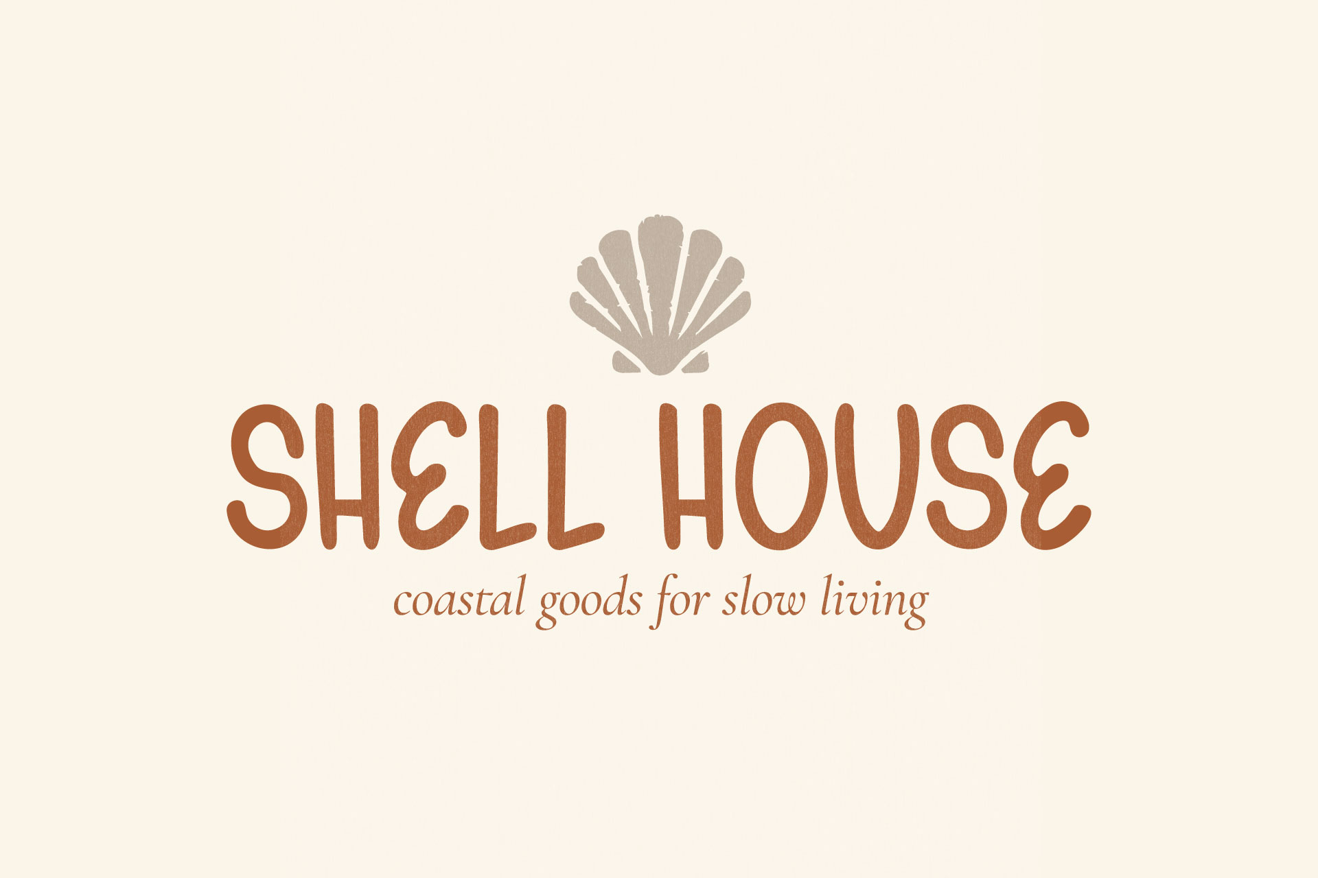
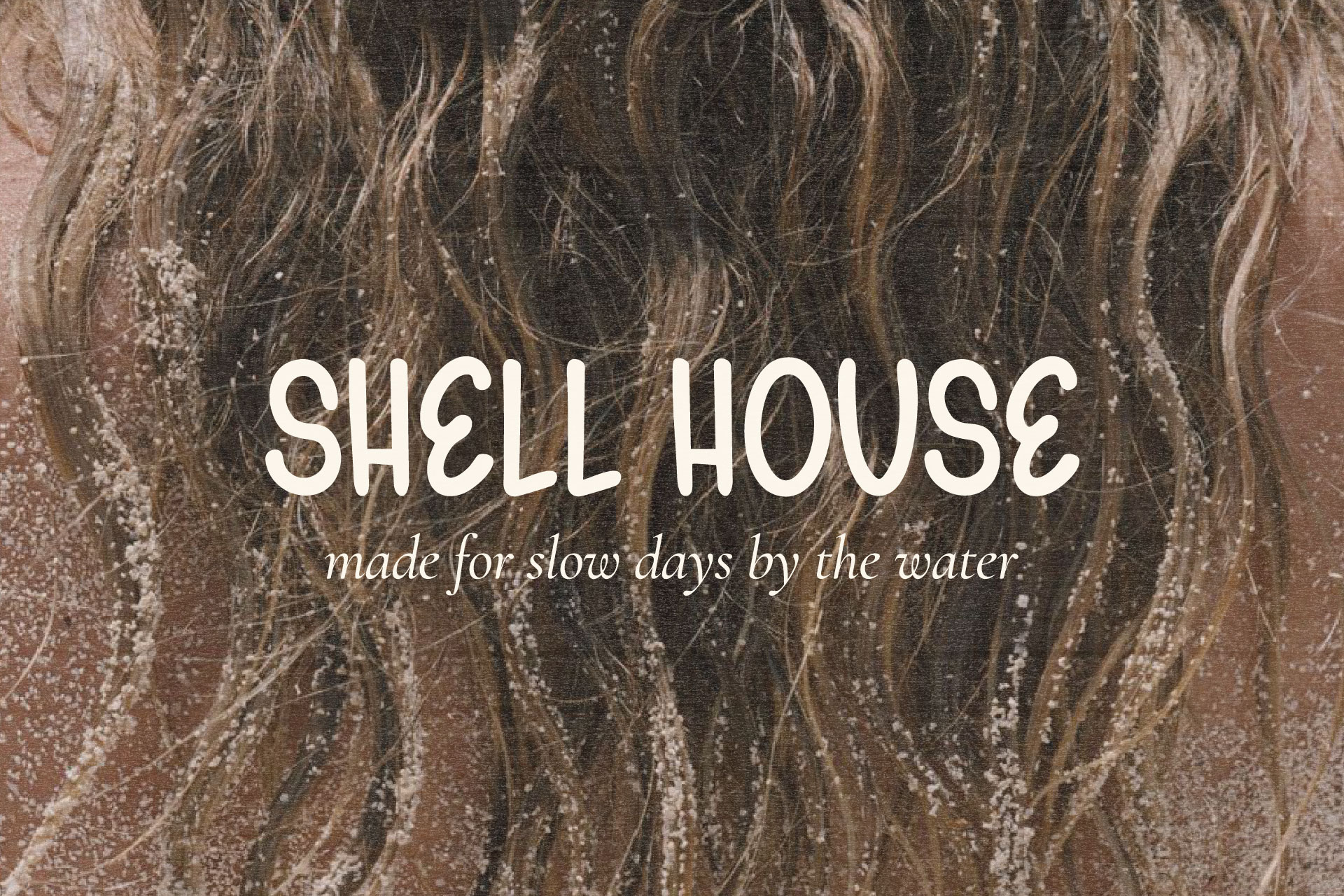
Build a Clear Typography Hierarchy
Give Each Font a Specific Job
Every font in a system should have a role. One handles headlines. One handles body copy. One might handle small accents, a date, a tagline, a category label. A font doing a job it was never meant to do is usually where things start to look unintentional.
Use Size and Spacing to Guide the Eye
Hierarchy isn’t just about which font you use. It’s about scale and spacing too. A display font set far too close in size to the body copy around it loses its impact, even if it’s technically the “main” font in the layout. Give it room to actually be the largest, boldest thing on the page. This look at five typography styles using different fonts is a useful reference if you want to see how different fonts can be layered together into a cohesive system.
Keep the Most Expressive Font at the Top of the Hierarchy
The most playful, most detailed font in your system should be the first thing a reader notices, not something they have to search for among several other loud elements. If your most expressive font isn’t clearly leading the hierarchy, something else in the layout is probably competing with it.
Use Color Without Overwhelming the Typography
Start With a Focused Brand Color Palette
A tight, intentional color palette does a lot of the work that people mistakenly ask their font to do. If a brand feels chaotic, the culprit is often five competing colors, not the typeface.
Balance Bright Colors With Neutrals
Bright, saturated colors need a quiet partner to sit against, or the whole composition starts to feel loud everywhere at once. A neutral background gives bold type and bright color somewhere to land. This guide to neutral background colors for typography is a good resource if you’re working out that balance for a playful brand.
Use Contrast to Keep the Words Easy to Read
Playful typography still has to be legible. Strong contrast between the type and its background matters more with a decorative font than a plain one, because there’s already more visual information in the letterforms for the eye to process.
Give Playful Typography Enough Breathing Room
Avoid Crowding Bold Letterforms
Bold, rounded letters need space around them to read as confident rather than cramped. A display font squeezed into a tight corner of a layout tends to look like an afterthought, no matter how good the font itself is.
Use White Space to Make the Design Feel More Intentional
Empty space is doing more work than people give it credit for. A layout with generous margins and clear breathing room reads as considered, even when it uses a very bold, very expressive font. No breathing room, and the same layout starts to feel busy, regardless of how restrained the font actually is.
Adjust Tracking and Line Spacing Carefully
Small adjustments to letter spacing and line spacing can change how a bold font feels entirely. Slightly opened-up tracking on a headline can make a chunky, playful font feel more editorial. Tight spacing pushed too far can make it feel cramped and hard to read.
Keep the Rest of the Brand System Consistent
Repeat the Same Font Roles Across Your Designs
Once you decide which font handles which job, repeat that decision everywhere. A brand where the display font sometimes shows up in headlines and sometimes in body copy starts to feel unpredictable, and unpredictability reads as unpolished.
Use Consistent Colors, Shapes, and Image Treatments
Typography is only one part of the system. Consistent color use, consistent shapes, a consistent photography or illustration style, all of it reinforces the same tone the font is setting. When those elements drift from one graphic to the next, even a great font pairing won’t hold the brand together.
Create Simple Brand Typography Guidelines
A short, simple set of typography guidelines, which fonts, which sizes, which use cases, saves a lot of inconsistency down the line. It doesn’t need to be a lengthy brand manual. Even a one-page reference is usually enough to keep a playful brand looking intentional as more graphics get added over time.
Common Mistakes That Make Playful Fonts Look Childish
Using Too Many Playful Fonts at Once
One expressive font is a personality. Two or three stacked together is noise. If more than one font in a layout is asking for attention, the brand starts to feel unfocused rather than fun.
Adding Too Many Colors, Effects, and Illustrations
Drop shadows, outlines, gradients, confetti, stickers, a rainbow palette, all of it can individually be a fine choice. Stacked together around an already bold font, it pushes a design past playful and into overwhelming fast.
Using the Font for Too Much Text
This one comes up constantly. A display font asked to set a full sentence, let alone a paragraph, loses legibility and starts to feel like a mistake rather than a style choice. Keep it to short, high-impact text and let something quieter carry the rest.
Choosing a Font That Does Not Match the Audience
A font that reads as fun for one audience can read as unserious for another. A wellness brand targeting a more mature customer base needs a very different level of playfulness than a brand selling party supplies to college students. Match the font to who’s actually going to be looking at it, not just to what feels fun in the moment.
A Playful Font Example: The Bubble Club
Why The Bubble Club Works as a Personality Font
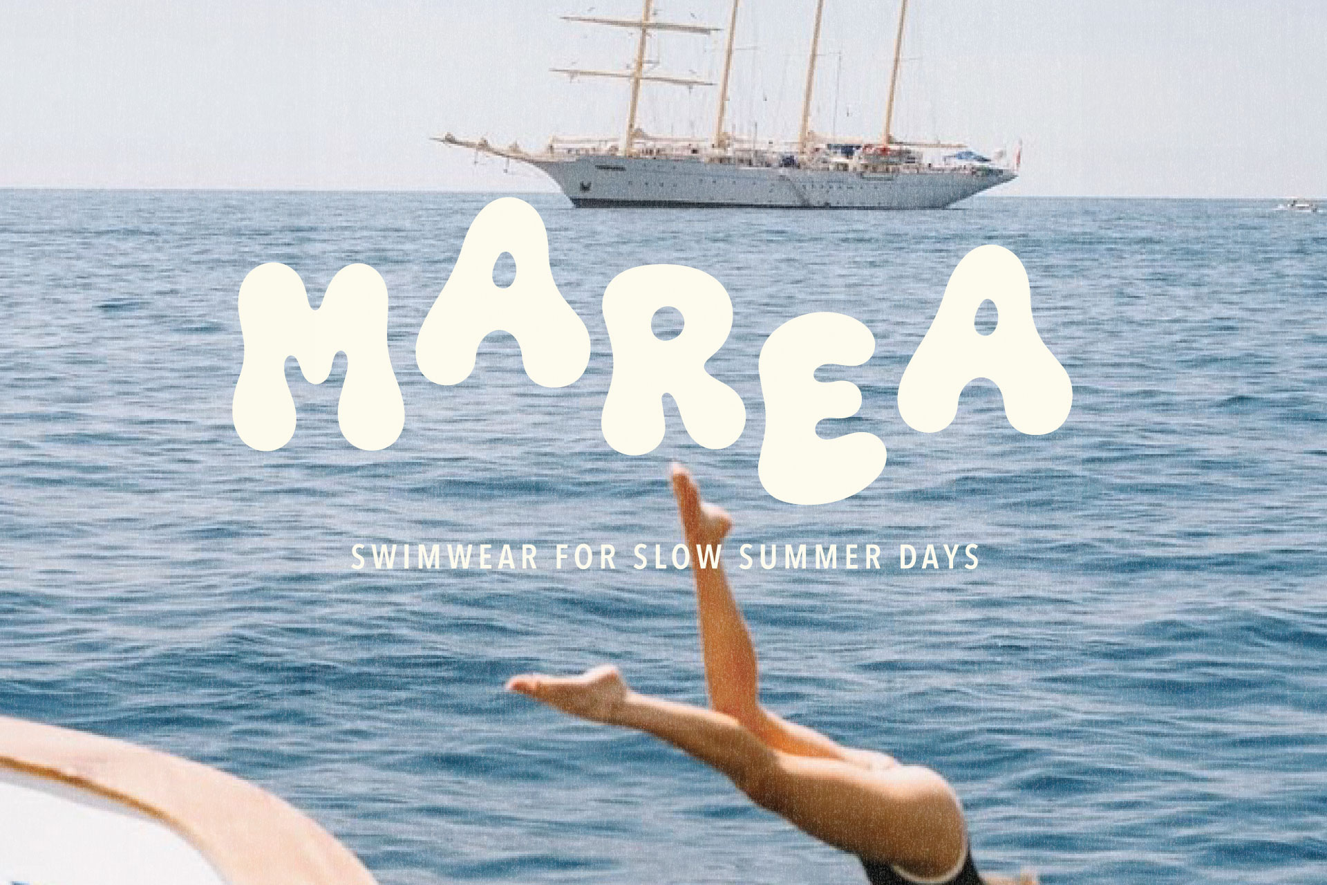
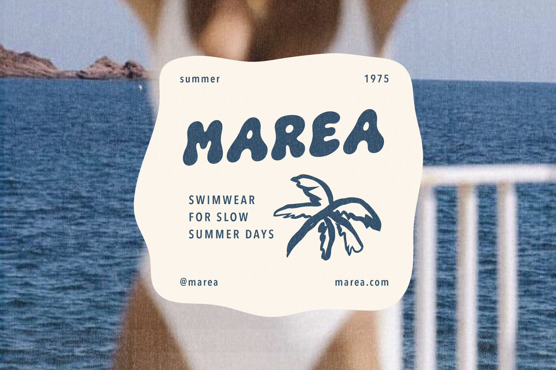
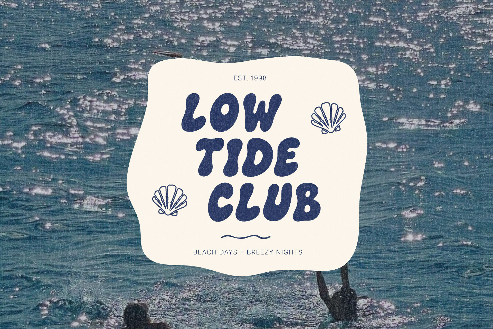
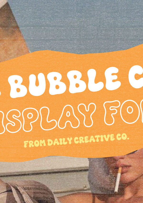
The Bubble Club is a good example of a font that leans fully into playful without losing structure. Its rounded, hand-drawn letterforms and double-letter ligatures give it a lot of personality, but the shapes stay consistent and controlled rather than random or overly decorative. That consistency is exactly what keeps a bold display font from tipping into looking amateur.
Where to Use It in a Brand Identity
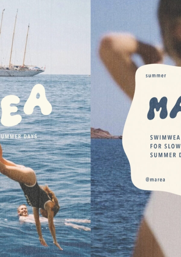
Like most strong display fonts, The Bubble Club does its best work in short, high-impact spots. A logo. A headline. A product name. A single word on a package or social graphic. It’s not built to carry paragraphs, and it doesn’t need to. Its job is to be the loudest, most memorable moment in the layout.
How to Balance It With Supporting Fonts
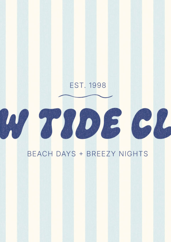
Because The Bubble Club already carries so much visual weight on its own, I’d almost always pair it with something quiet. A clean sans serif for a modern brand, or a simple serif if the brand wants a touch more polish. The supporting font’s only job is legibility. Let the display font be the one with all the personality.
The Best Playful Branding Feels Intentional
Playful typography is not the risk people assume it is. The real risk is using it without a plan, letting color, effects, and competing fonts pile up until the personality turns into noise. A bold, expressive font can absolutely anchor a polished, professional brand, as long as it has a clear job, enough space to do it, and a quieter supporting cast around it.
If you’re looking for a font to build that kind of moment into your own brand, The Bubble Club is a good place to start, with rounded, hand-drawn letterforms built to carry personality without losing its footing.
Leave a Reply