
There is a specific moment in a branding project when you realize the logo has good bones but no personality. The layout works. The colors are fine. The type is just sitting there, doing nothing. That gap is exactly what a playful display font is built to fill.
The Bubble Club was designed for that moment. It’s a hand-drawn display typeface with rounded, bubbly letterforms that carry a lot of visual weight in very little space, which makes it useful for logos, packaging, social graphics, and pretty much anywhere a brand needs its type to actually say something.
This post is a closer look at what makes a display font like this one work, how to use it well, and where it tends to shine.
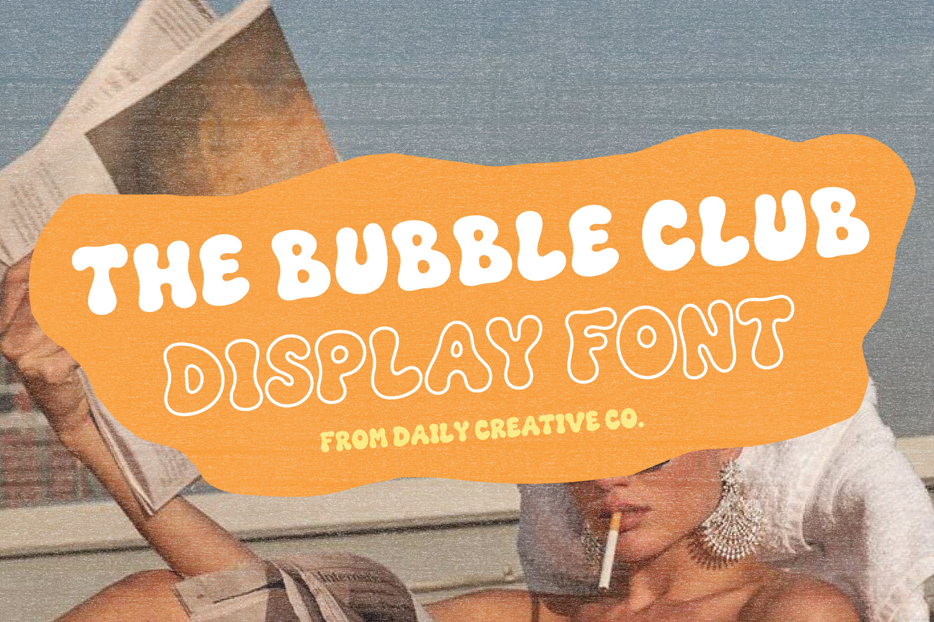
Meet The Bubble Club Playful Display Font
A Hand-Drawn Font With Bold, Bubbly Letterforms
Every letter in The Bubble Club started as a drawing before it became a font file, and that distinction matters more than people expect. A hand-drawn font carries small inconsistencies on purpose, the kind you find in old hand-painted signage or a beach club logo that has been on the same building since the seventies. Straight lines are never quite straight. Curves swell a little more on one side than the other. That’s what keeps it from reading as a font pulled off a generic list.
The letterforms themselves are wide, rounded, and full. Terminals are soft rather than sharp. Proportions lean chunky, which gives the font its weight and presence even at a small size.
What Makes The Bubble Club Feel Playful and Full of Personality
A lot of it comes down to a few specific choices. The letters are noticeably rounder than a standard sans serif, with generous curves instead of tight corners, and the spacing is close but not cramped, so words read as one solid shape rather than a row of separate letters. There’s also a set of double-letter ligatures, which connect repeated letters like the two Ls in “bubble” or the two Os in “pool” into a single custom shape instead of stacking two identical letters side by side.
Small details like that are usually the difference between a font that looks good in a specimen image and one that actually holds up once you build something real with it.
What Is a Playful Display Font?
Display Fonts Are Designed to Make an Impact
A display font is built for attention, not for reading paragraphs. It’s meant to be seen at a large size, in a short amount of text, usually a headline, a word, or a phrase. Where a body font needs to disappear into the background and let the content lead, a display font is the content. It carries tone, mood, and personality before a reader processes a single word.
That’s the whole job of a font like The Bubble Club. It is not trying to be neutral. It’s trying to make a specific impression the second someone sees it.
When to Use a Display Font Instead of a Body Font
Display fonts work best in short bursts. A logo, a headline, a product name on a package, a single word on a poster. The more text you ask a display font to carry, the more it works against you, because those exaggerated shapes that make it interesting at three words start to slow a reader down at three sentences.
Choosing type for a paragraph of copy? Go quieter. Choosing type for a name, a title, a moment that needs to grab someone’s eye? That’s where a display font earns its place.
The Best Ways to Use The Bubble Club Font
Logo and Wordmark Design
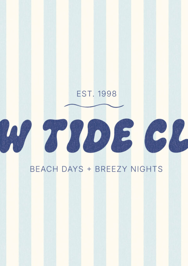
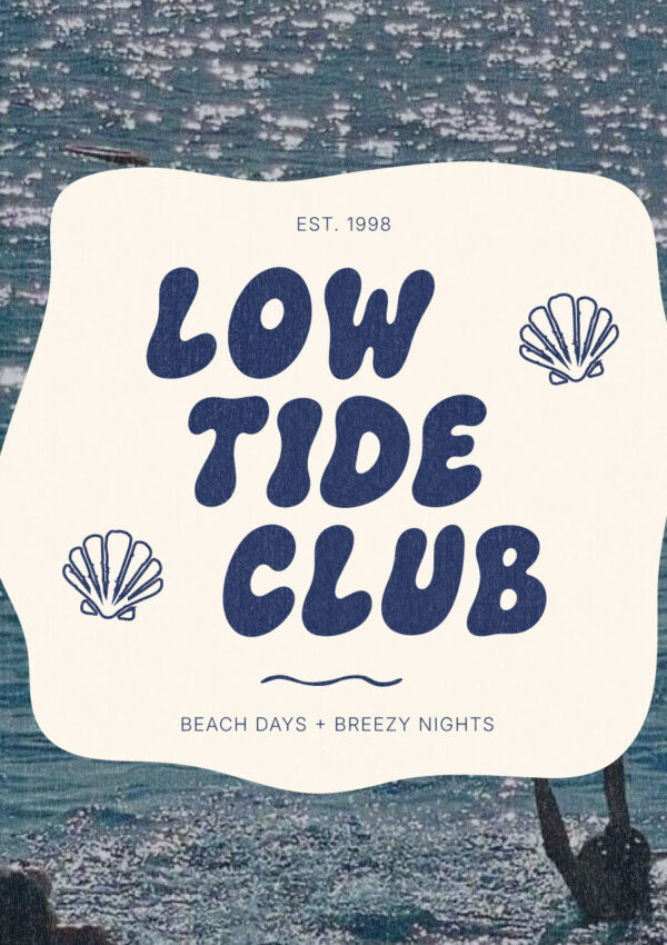
A wordmark built with The Bubble Club tends to feel like a finished logo rather than a placeholder, largely because of those ligatures and rounded proportions. It works especially well for shorter brand names, where the font has room to be the whole visual identity instead of competing with a long string of letters.
Product Packaging and Labels
On packaging, a display font like this one has to do a lot of work in a small physical space, often viewed from a few feet away on a shelf. The wide, rounded shapes of The Bubble Club hold up at smaller print sizes better than a lot of delicate script fonts do. Most people don’t realize how much this matters until they see their label shrunk down for the first time.
Social Media Graphics and Pinterest Pins
For Pinterest pins, Instagram graphics, and other scroll-based content, a bold display font gives you something to anchor the whole graphic around. A single word set in The Bubble Club can carry an entire pin without needing much else at all.
Posters, Menus, Invitations, and Event Graphics
Anywhere there’s a headline moment, a display font like this one has room to be expressive. A menu header. An invitation title. The top of an event poster. These are the places where type gets to have a little fun.
Apparel, Merchandise, and Creative Products
Rounded, bold letterforms print well on apparel and merchandise, where fine detail tends to get lost but confident, simple shapes translate cleanly.
How The Bubble Club Looks in Different Brand Styles
Colorful and Playful Branding
In a bright, saturated color palette, The Bubble Club leans into its bubbly shapes even more. This is where the font feels most at home, next to bold color blocking and confident graphic choices.
Beach, Resort, and Summer-Inspired Branding
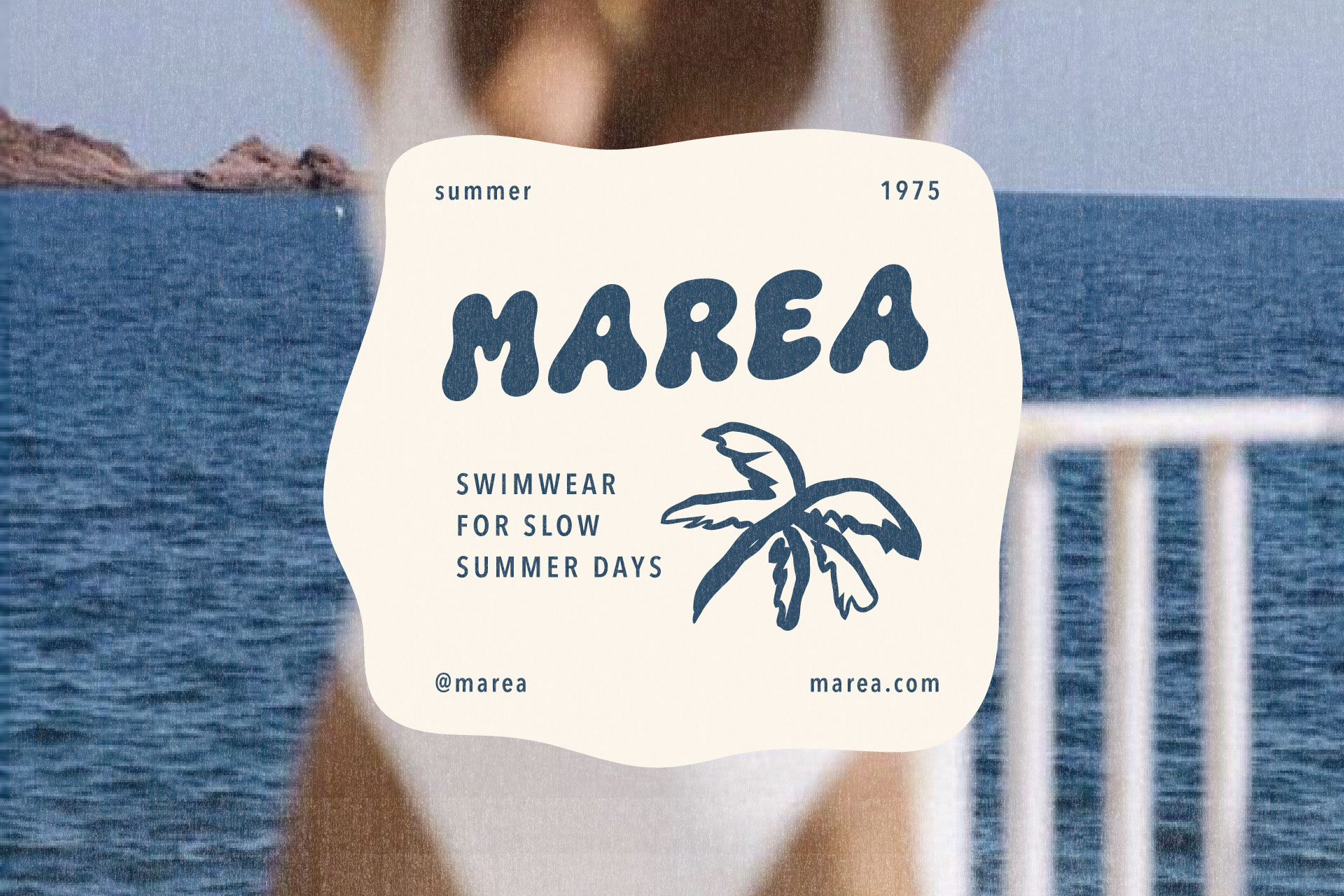
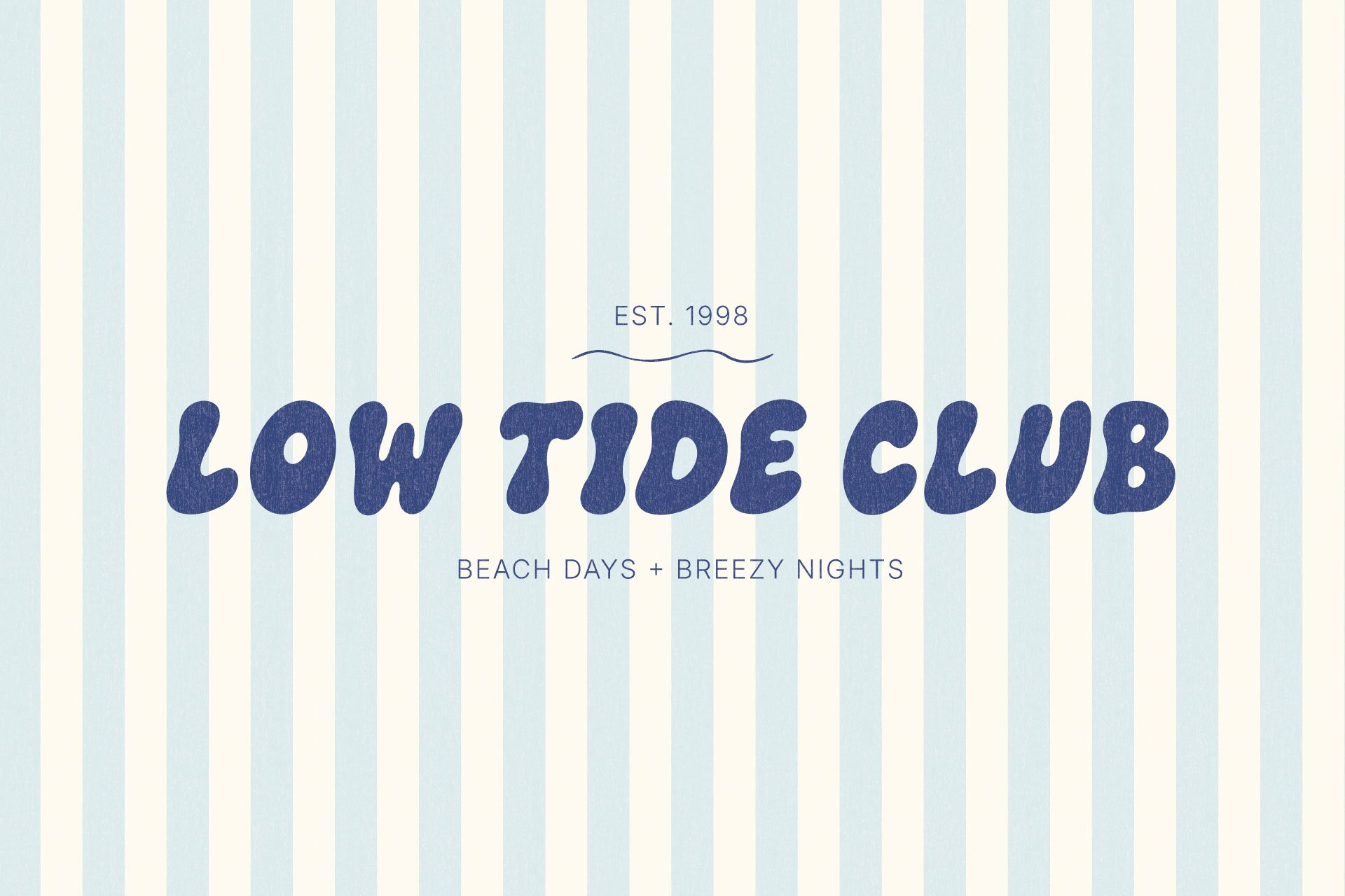
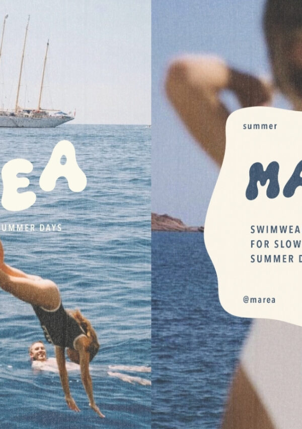
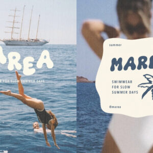
The font’s rounded shapes and outline style pair naturally with beach club logos, pool day graphics, and retro resort visuals. Same energy as an old motel sign or a hand-painted pool gate, which is exactly the reference point it was designed around.
Food, Beverage, and Dessert Packaging
For food and beverage brands, a font like this can make a product feel approachable and a little indulgent without tipping into childish. If you’re working on packaging typography more broadly, this guide to fonts for food branding and packaging goes deeper into how to choose type that actually holds up on a shelf.
Boutique and Lifestyle Branding
For boutique shops and lifestyle brands, The Bubble Club works best as an accent moment rather than a full identity system. Used on a headline, a sale graphic, or a seasonal campaign, it adds warmth without asking the rest of the brand to change.
How to Pair The Bubble Club With Other Fonts
Pair It With a Clean Sans Serif Font
A simple, modern sans serif is usually the easiest pairing there is. It gives The Bubble Club room to be the loud one in the layout while the sans serif quietly handles body copy, contact details, captions, whatever needs to stay legible and out of the way.
Pair It With an Elegant Serif Font
A refined serif creates more contrast and can push a brand toward something slightly more polished or boutique. The roundness of The Bubble Club against the structure of a serif tends to read as playful with a little more sophistication underneath it.
Keep Supporting Typography Simple
This is usually where a pairing starts to feel off. Two fonts, similar weight, similar energy, and suddenly they’re fighting each other instead of doing different jobs. Keep it quiet. The Bubble Club is already carrying the personality of the layout, so the supporting font’s job is legibility and contrast, not competing for attention. For a closer look at exactly where pairings tend to go wrong, this article on common font pairing mistakes covers the specific patterns to watch for, and this list of Canva font pairings is a useful starting point if you’re building the pairing there.
Tips for Designing With a Bold Display Font
Use It for Short, High-Impact Text
Save it for the words that matter most. A brand name. A headline. A single call to action. The shorter the text, the harder the font can work for you.
Give the Letterforms Plenty of Space
Bold, rounded letters need room to breathe. Tight margins or crowded layouts flatten the impact a display font is supposed to have.
Build Clear Typographic Hierarchy
Decide what the reader should notice first, second, and third, then size and weight your type to match. The Bubble Club should almost always be the largest, boldest element in a hierarchy, not competing at the same size as everything else around it.
Let the Font Be the Main Personality Piece
Once a display font is doing its job, everything else in the design should support it rather than try to match its energy. You do not need six fonts fighting for attention. One expressive font and one quiet one is almost always enough, and it’s usually more than enough.
What Is Included With The Bubble Club Font?
Letters, Numbers, Punctuation, and Special Characters
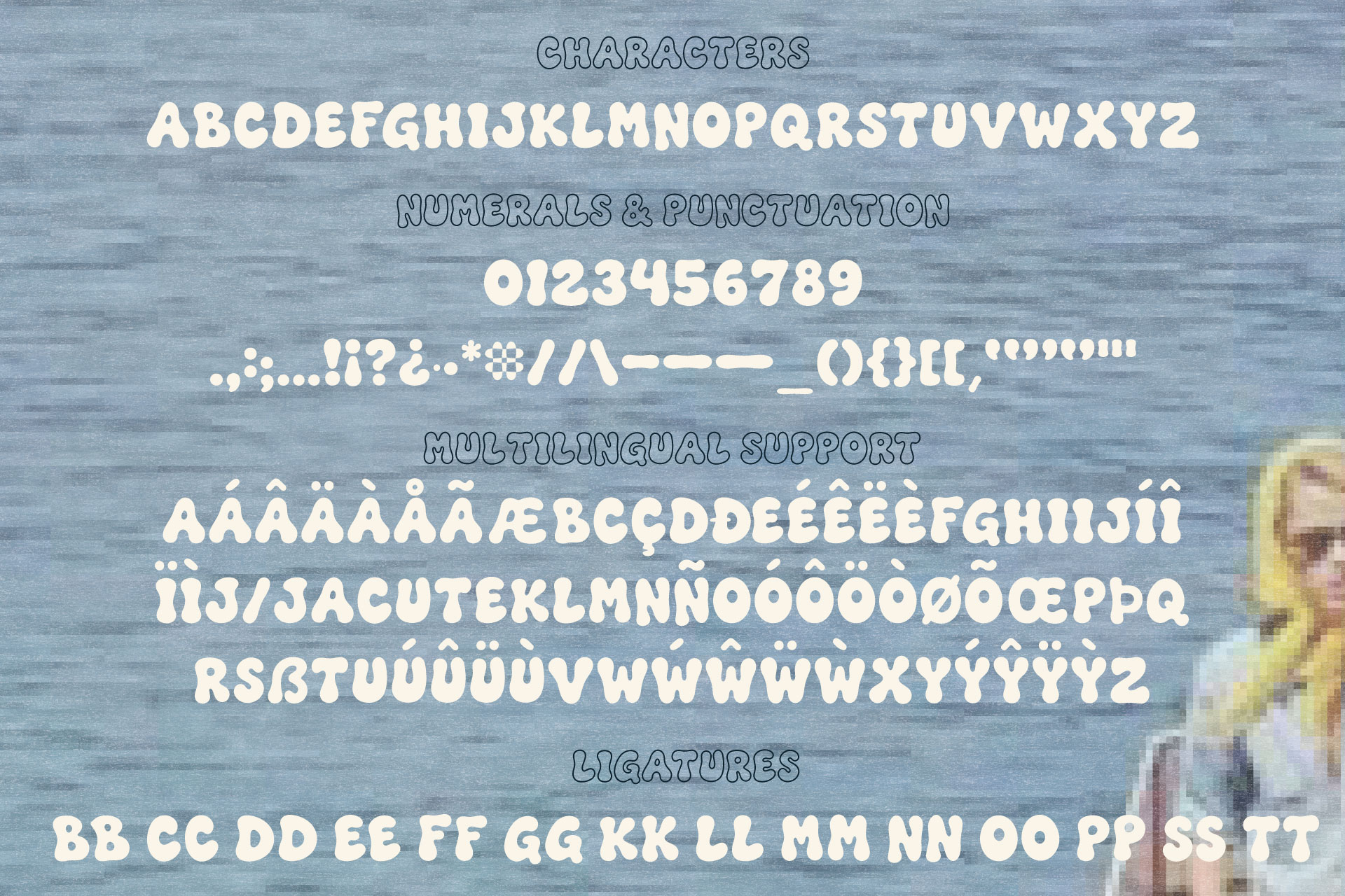
The family includes a full uppercase and lowercase character set, numerals, and standard punctuation. Enough flexibility to set full words, numbers for pricing or dates, and short phrases without hitting gaps in the character set.
Double-Letter Ligatures for More Natural-Looking Words
The double-letter ligatures are one of the more distinctive parts of this font. Instead of two identical letters sitting side by side, repeated letters merge into a single custom shape. Small detail. Usually the first thing that makes a word set in The Bubble Club look intentional rather than assembled.
Font File Types and Software Compatibility
The font comes in standard file formats compatible with design software as well as Canva, so it works whether you’re building a full brand system in Illustrator or putting together a quick social graphic. If you’re new to using custom fonts inside Canva specifically, this walkthrough on uploading fonts to Canva on mobile covers the process step by step.
Who Is The Bubble Club Font Made For?
Graphic Designers and Brand Designers
For designers working on client branding, packaging, or editorial layouts, The Bubble Club offers a ready-made display option with enough built-in detail that it doesn’t need much dressing up to look finished.
Creative Business Owners and Product-Based Brands
Boutique shops, cafés, beauty brands, and other product-based businesses often need type with personality but don’t have an in-house designer on staff. This font gives that kind of brand a way to look distinctive without starting from scratch.
Content Creators and Digital Product Sellers
For anyone building Pinterest graphics, digital products, or marketing materials, a bold, ready-to-use display font like this one saves time while still standing apart from the fonts everyone else is reaching for. If your visual world leans more toward Italian cafés and gelato shops than beach clubs, Gelato Daydreams is the sister font family worth a look.
Create Something Fun With The Bubble Club
A good display font does one thing extremely well. It gives a brand a voice before anyone reads a single word. The Bubble Club was built to do exactly that, with rounded, hand-drawn letterforms and a set of details, like the double-letter ligatures, that hold up once you actually put the font to work in a real layout.
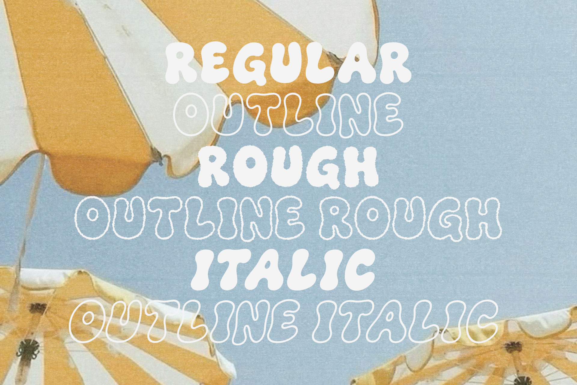
If you have a logo, package, or graphic that needs a little more personality, The Bubble Club is available in the shop now, with regular and outline styles included in the family.
Leave a Reply