
Most brand refreshes do not start with typography. They start with a color palette, maybe a logo concept, usually a Pinterest board full of things that feel right without anyone quite knowing why yet. Fonts get chosen last. Often quickly. Often based on whatever looked nice in a font menu at ten o’clock at night.
That is backwards.
Typography is one of the fastest ways a brand tells someone who it is. It deserves the same intentional process as everything else in the identity, not a rushed decision at the end of a long project. This is a practical walkthrough for choosing fonts that actually match your brand, not just fonts that happened to catch your eye during a scroll.
Why Your Brand Fonts Matter
Typography Communicates Before the Words Are Read
A reader processes the shape of a letter before they process what it says. Rounded feels different than sharp. Bold feels different than delicate. That reaction happens in a fraction of a second, long before anyone gets to your tagline.
Fonts Help Shape Brand Recognition and Consistency
Consistency is quiet work, and typography does a lot of it. Someone might not consciously clock a specific typeface, but repeated exposure across a logo, a website, and packaging builds familiarity in the background the same way a repeated color palette does. It adds up without anyone noticing it adding up.
The Wrong Font Can Send the Wrong Message
A mismatched font creates a kind of friction people can feel before they can name it. A wellness brand set in something harsh and condensed feels off. A children’s brand set in a stiff corporate serif feels equally strange. The font does not have to be bad. It just has to be wrong for that specific brand, and people notice, even if they could never explain what tipped them off.
Start With Your Brand Personality
Choose Three to Five Words That Describe the Brand
Before opening a single font menu, get specific. Warm, bold, playful, refined, nostalgic, minimal, whatever the honest answer is. Three to five words. Write them down. You will need something concrete to measure font choices against later, because “I’ll know it when I see it” tends to fall apart around the fourth font option.
Think About How You Want Your Audience to Feel
Personality words are useful, but feeling is the actual target. Reassured. Excited. Nostalgic. Indulged. Calm. A font that technically checks every personality box on paper can still miss the emotional response you were actually going for, and that gap is usually invisible until you see the font in a real layout.
Separate Your Actual Personality From Current Design Trends
This is where a lot of brand font decisions quietly go wrong. It is easy to confuse what is trending right now with what your brand actually is. A trend-driven font choice tends to age fast, and it rarely holds up once the trend passes, because it was never really about you in the first place. If you have gotten stuck overthinking this exact decision (most of us have), this piece on finally nailing brand design without overthinking everything walks through how to get out of that loop and trust a direction that is actually yours.
Understand the Main Types of Brand Fonts
Serif Fonts
Serif fonts have small strokes at the ends of their letters. They tend to read as traditional, trustworthy, or editorial, depending on the specific style, and they show up constantly in publishing and luxury branding, anywhere a brand wants a sense of established credibility.
Sans Serif Fonts
Sans serif fonts drop those small strokes for a cleaner, more geometric shape, which is exactly why they dominate digital interfaces and body copy across nearly every industry you can think of. Clean, direct, highly legible. If you are building a system in Canva and want a reliable sans serif to anchor it, this roundup of Canva fonts for branding is worth browsing.
Script and Handwritten Fonts
These mimic real handwriting or brush lettering, bringing something personal into a brand that a typed font simply cannot fake. They work well as accents. A signature, a small warm touch. They start to struggle the moment you ask them to carry more than a phrase, so keep expectations realistic.
Display and Decorative Fonts
Display fonts are built to make an impact in very little space. A logo. A headline. A single word. They usually carry the most personality of any font category, and they are almost always the wrong choice for anything longer than a sentence.

Match Font Characteristics to Your Brand Personality
Bold and Rounded Fonts Feel Friendly and Expressive
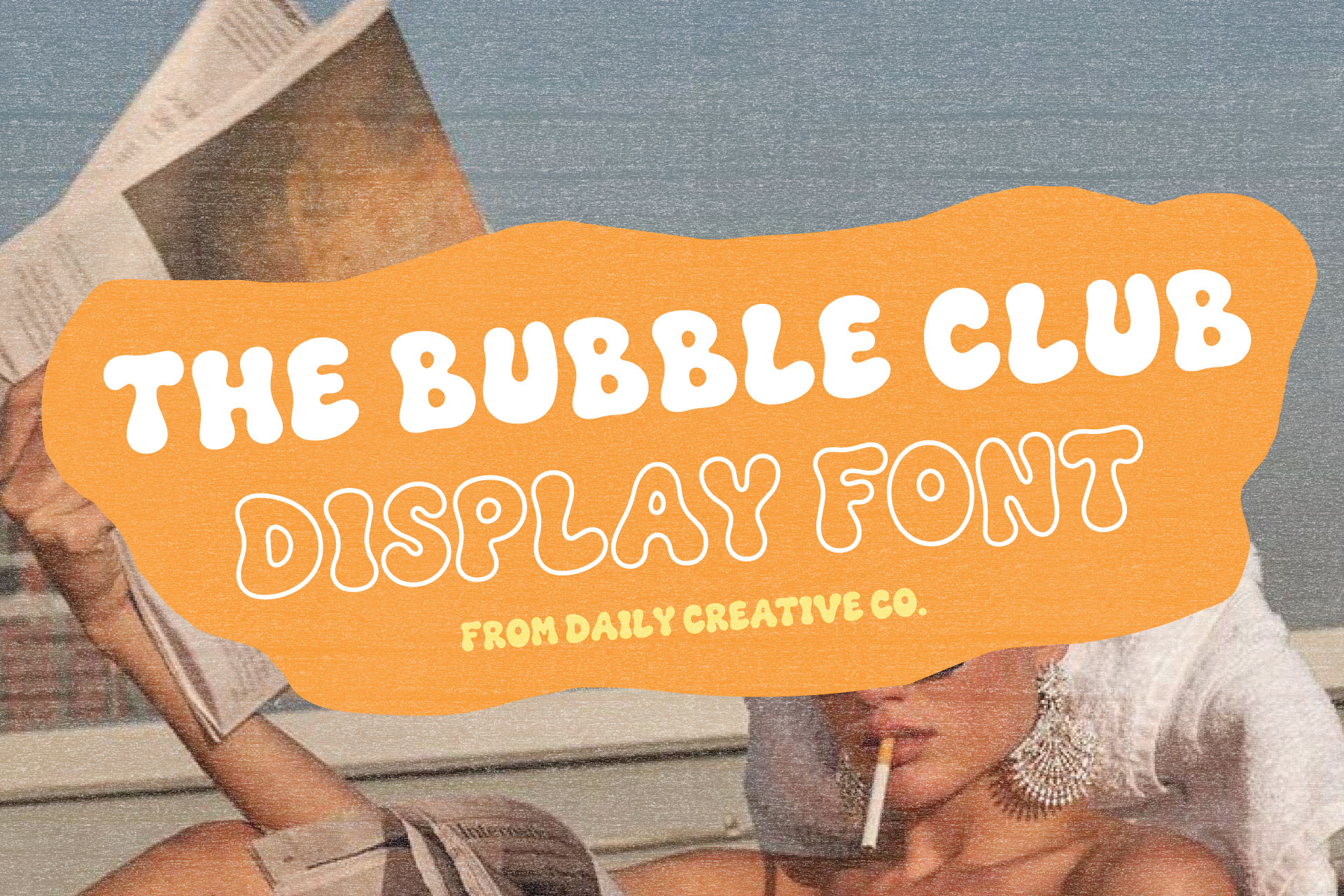
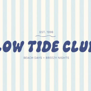
Wide, rounded letterforms with soft curves read as approachable and warm before a reader has processed a single word. This is the territory of a font like The Bubble Club, where the roundness of the shapes is doing most of the emotional work on its own.
High-Contrast Serif Fonts Can Feel Elegant or Editorial
Serifs with a strong difference between thick and thin strokes tend to feel refined, sometimes fashion-forward, occasionally a little untouchable. Common territory for beauty and luxury brands chasing an elevated tone.
Clean Sans Serif Fonts Can Feel Modern and Direct
A well-built, simple sans serif communicates clarity without adding much decoration at all. Dependable. Not flashy. A solid choice for a brand that wants to feel current and straightforward rather than ornamental.
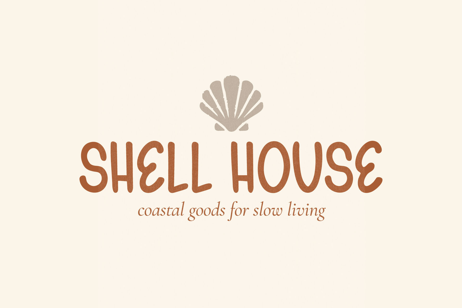
Handwritten Fonts Can Add Warmth and a Human Touch
A handwritten font signals that a real person is behind the brand. For a small business, a boutique, anything founder-led, that can be a genuinely powerful trust signal, one that a polished corporate font could never quite pull off.
Unusual Display Fonts Can Make a Brand More Memorable
A distinctive display font is often the exact thing that separates a brand people remember from one that blends into everything else on the shelf. This is where a font stops being purely functional and starts contributing an actual opinion.
Choose a Primary Brand Font
Decide Where Your Primary Font Will Be Used
Get clear on where the primary font actually needs to show up before you choose it: a logo, headlines, packaging, all of it. A font that only ever needs to appear in a wordmark has very different requirements than one asked to hold up across dozens of applications, and confusing the two leads to a lot of wasted time.
Look for a Font With a Recognizable Point of View
The strongest primary fonts have a clear identity of their own. Something specific in the letterforms that makes the brand recognizable even out of context, even without the logo attached to it. A font with no particular personality will rarely do that job well, no matter how clean or well-made it happens to be.
Make Sure It Works With Your Brand Name and Key Words
Test it on the actual name, not just the alphabet. Some fonts look fantastic in a specimen image and fall apart the second you set a specific word, especially one with an unusual letter combination or a repeated letter that suddenly looks awkward next to itself.
Choose a Supporting Brand Font
Create Contrast Without Creating Conflict
A supporting font should feel different enough from the primary to create real hierarchy, but not so different that the two look like they belong to separate brands entirely. This list of Canva font pairings is a good reference for seeing what strong, working contrast actually looks like.
Prioritize Readability for Longer Text
The supporting font is almost always the one carrying body copy and captions, so legibility matters more than personality here. This is not the place to sneak in a second decorative font just because you like it.
Let the Supporting Font Support
This is usually where a pairing starts to feel off. If the supporting font is pulling as much attention as the primary font, the hierarchy breaks and the whole system starts to feel unresolved. Its job is to make the primary font look good. That’s it.
How Many Fonts Should a Brand Use?
A Simple Two-Font Brand System
For most brands, two fonts is enough. One primary, one supporting. It keeps the system simple to maintain and easy for anyone on the team to apply consistently, months or years down the line, without needing a reference guide open the whole time.
When a Third Accent Font Makes Sense
A third font, usually a script or a smaller decorative option, can work as an occasional accent. A signature line. A seasonal callout. Something small. It should stay limited rather than becoming a third voice competing for attention. This look at five typography styles using different fonts shows what a balanced multi-font system looks like when it is handled with restraint.
Why More Fonts Do Not Automatically Create More Personality
Adding fonts feels productive. It feels like you’re adding personality with every new addition. Usually you’re just adding inconsistency instead. A brand with one confident, well-chosen font almost always reads as more polished than a brand juggling four fonts that were each picked for a slightly different reason on a slightly different day.
Test Your Fonts Across Real Brand Applications
Test the Logo and Wordmark
Always test on the actual brand name and logo layout before committing to anything. A font that looks great in a preview window can behave completely differently once real letters and real spacing get involved.
Test Website Headings and Body Copy
Set real headline and body copy on an actual page, not a mockup. Long-form legibility problems tend to hide until there is a real paragraph of text sitting in front of you.
Test Packaging and Printed Materials
Print behaves differently than a screen, full stop. Test the font at the actual physical size it will appear on packaging or printed materials. Small details that read fine on a monitor have a way of disappearing entirely at real-world scale.
Test Social Media and Marketing Graphics
So much brand exposure happens through social graphics now that this step cannot be skipped. Test the font cropped, layered over an image, compressed down to the smaller sizes most platforms default to.

Test Small Sizes and Mobile Screens
A font that looks bold and confident at a large size can lose all of that confidence the moment it shrinks to a mobile screen or a tiny icon. Check the smallest realistic size the font needs to perform at, and be honest with yourself about what you see.
Check Font Quality, Features, and Licensing
Review the Full Character Set
Before committing, check that the font actually includes everything you need. Full upper and lowercase letters, numerals, and whatever punctuation your brand tends to use regularly.
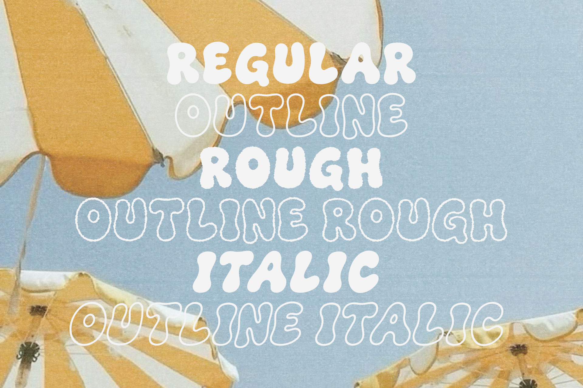
Look for Alternates, Ligatures, and Multiple Styles
Alternate letters, ligatures, multiple weights or styles, these details add flexibility across a full brand system, and they are frequently the difference between a font that looks handmade and one that reads as slightly generic.
Confirm the Font License Covers Your Intended Uses
Licensing varies a lot from font to font. It is worth confirming upfront that a license actually covers how you plan to use it, whether that means a logo, packaging, products for sale, or web use. Check the actual terms. Never assume.
Check Language and Software Compatibility
Make sure the font file works with whatever software you actually use day to day, and that it supports any special characters or languages your brand needs to communicate in.
Common Brand Font Mistakes to Avoid
Choosing a Font Only Because It Is Trending
A trend-driven font choice ages quickly, almost every time, and it rarely reflects the brand’s real personality. Just what was popular the week the decision got made.
Prioritizing Personality Over Readability
A font can be full of character and still fail completely if nobody can comfortably read it. Personality should never come at the total expense of legibility, especially anywhere text is meant to be read at length rather than glanced at.
Selecting Fonts That Are Too Similar
Two fonts with a similar weight, width, or general style create a weak, muddy contrast instead of a clear hierarchy. This breakdown of common font pairing mistakes covers this specific issue in more detail, along with a handful of other pairing pitfalls worth knowing about before you commit to anything.
Creating a Font System That Is Too Complicated
Too many fonts. Too many weights. Too many special-case exceptions nobody remembers the reasoning behind six months later. All of it adds friction for whoever has to apply the brand consistently, including future you at eleven at night trying to finish a graphic.
Forgetting to Test the Font Before Committing
It is so easy to fall in love with a font in a specimen image and skip the testing step entirely. That is exactly how a font ends up looking incredible on a mood board and falling apart the moment it meets an actual layout.
When a Playful Display Font Is the Right Choice
You Want the Brand to Feel Friendly and Expressive
If warmth and approachability are core to how you want the brand to feel, a playful display font gives you a fast, effective way to say that before a customer reads a single word of copy.
Your Logo or Packaging Needs More Character
A logo or package that feels flat often just needs more personality in the type. Not a whole new concept. Just a font willing to do more of the talking.
You Have a Simple Supporting Font to Balance It
A playful display font works best when it has something quiet to lean on. Without that balance, even a genuinely great font can start to feel chaotic once it’s asked to carry an entire layout by itself, and that is rarely the font’s fault.
The Bubble Club as a Personality-Filled Brand Font
What Kind of Brand Personality It Communicates
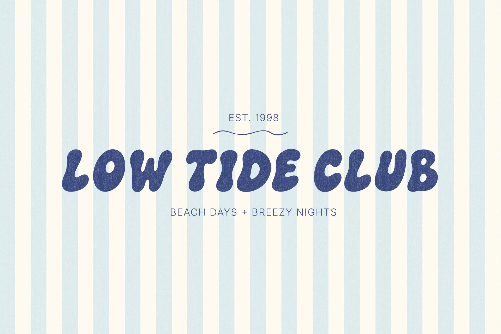
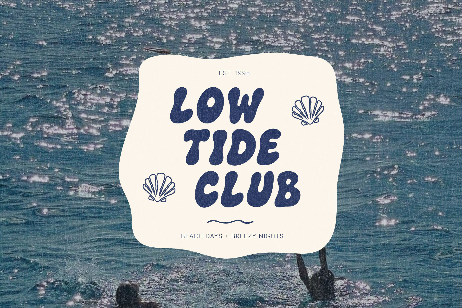
The Bubble Club communicates friendly, expressive, and confident without tipping into childish, which is a harder balance to strike than it sounds. Its rounded, hand-drawn letterforms and double-letter ligatures give it a specific, recognizable point of view rather than generic playfulness borrowed from nowhere in particular.
Where It Works Best in a Brand System
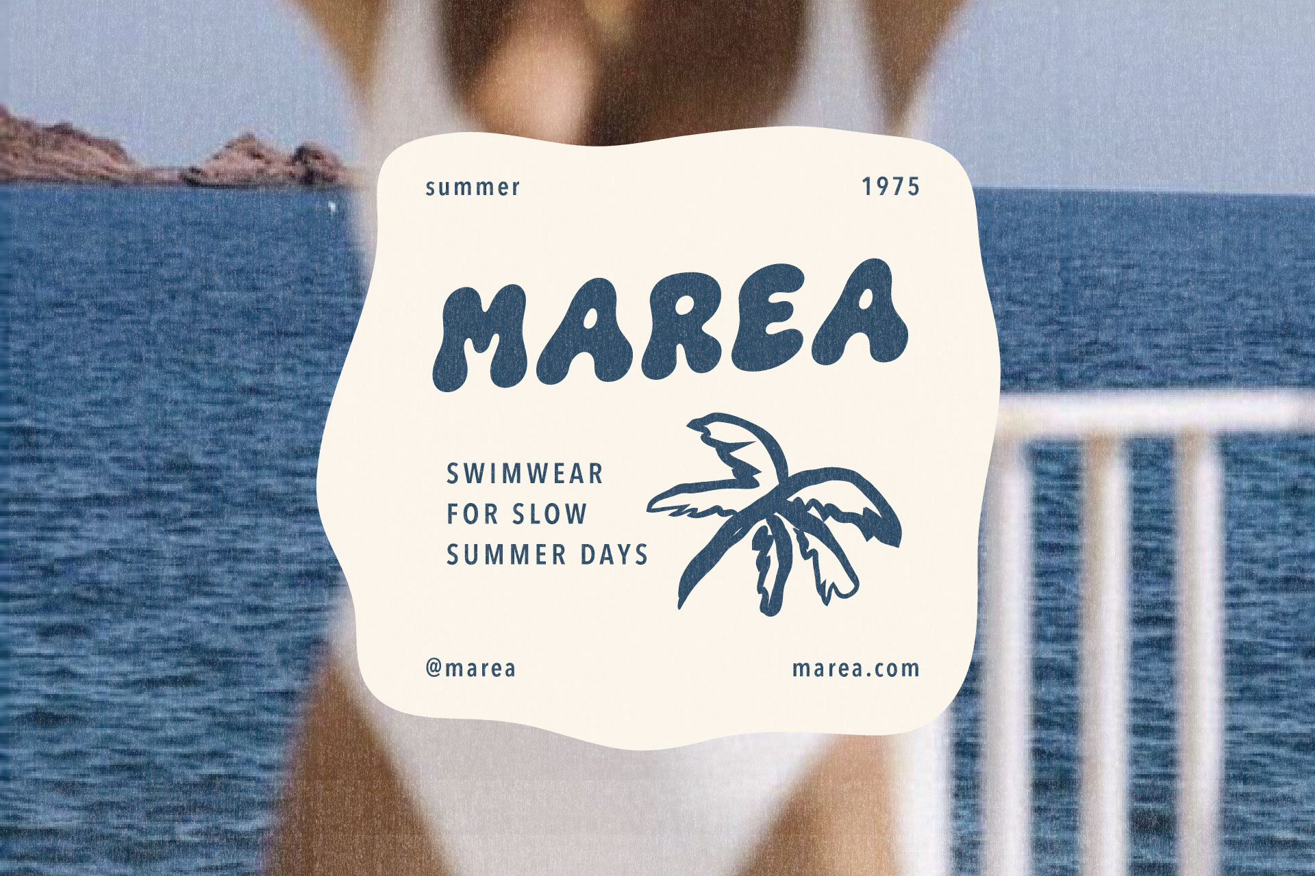
Like most strong display fonts, it does its best work in short, high-impact moments. A logo. A headline. A product name. Not paragraphs. Its bold, rounded shapes hold up well across logos, packaging, and merchandise alike, which is exactly what you want from a font asked to travel across that many surfaces.
What to Pair With It
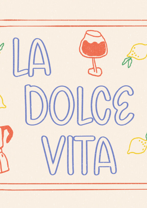
A clean sans serif is the easiest supporting pairing for a modern brand. An elegant serif can push the system toward something a little more polished, if that’s the direction you’re heading. Either way, the supporting font’s only job is legibility, letting The Bubble Club stay the clear personality piece. And if your brand leans more toward Italian cafés and warm, nostalgic packaging than beach and resort energy, Gelato Daydreams is the sister font family built around exactly that world, following the same principles for pairing and use.
Choose Fonts That Feel Like Your Brand, Not Everyone Else’s
The fastest way to end up with generic branding is choosing fonts based on what everyone else is using instead of what your brand actually is. Start with personality. Understand what different font types communicate. Build a simple system with clear roles for each font, and test everything in real applications before you commit to anything permanent.
If you’re looking for a font with enough personality to anchor that kind of system, The Bubble Club is a strong place to start, rounded and hand-drawn, built to give a brand real character instead of another template that looks like everyone else’s.

Leave a Reply