
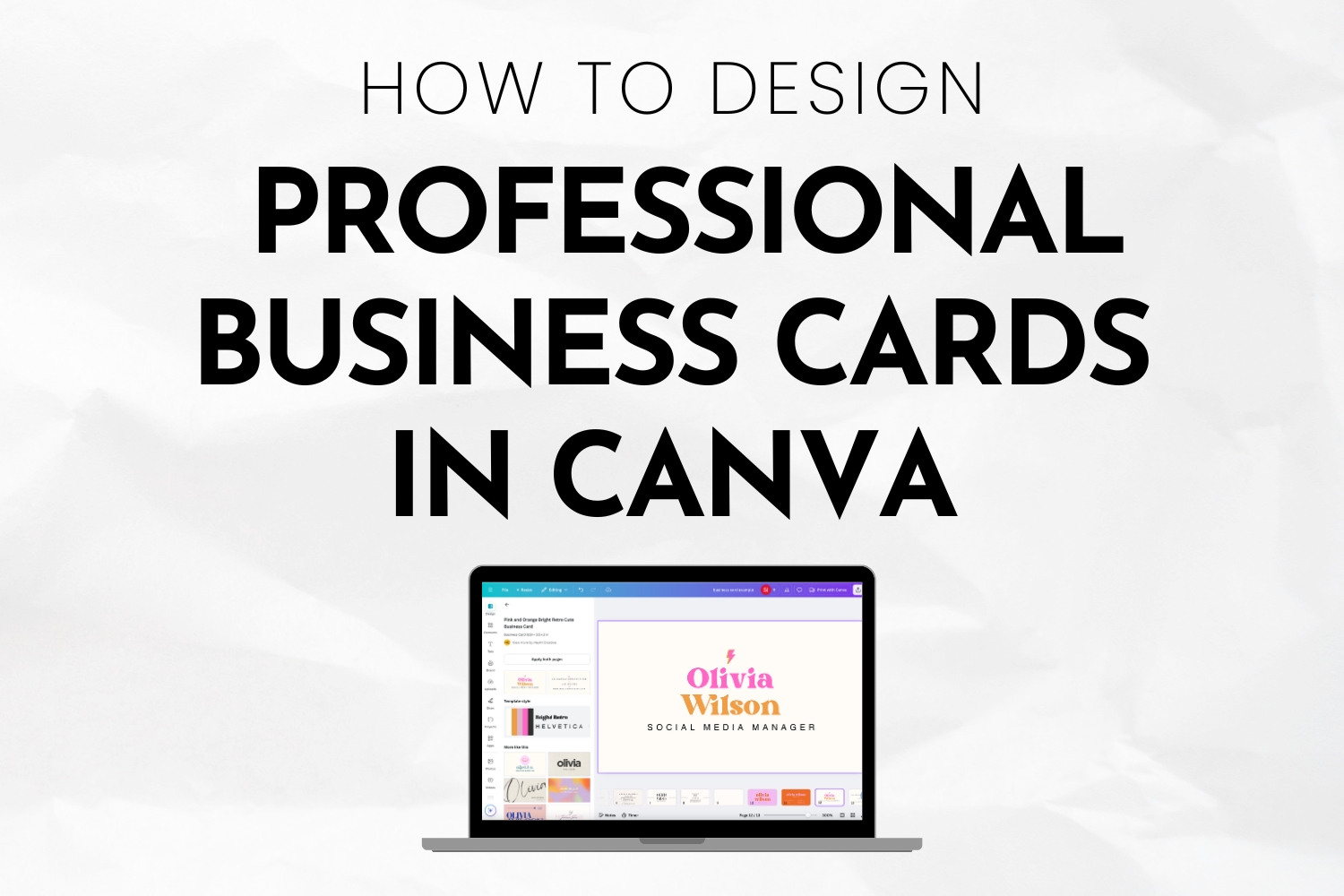
Picture walking into your first major networking event with business cards that make people say “wow!” I recently read a study that revealed 72% of people judge companies by their business card quality – talk about pressure! I’ve spent so much time talking with entrepreneurs and small business owners about heightening their branding – creating business cards in Canva has become my go-to recommendation for entrepreneurs and professionals alike.
I’ve watched so many students transform from complete beginners to confident designers using this incredible tool. The best part? You don’t need expensive software or years of design school to create cards that look like they cost hundreds of dollars!
Let’s dive into how to create Canva business cards for beginners!
Getting Started with Canva Business Cards
The first time most people get introduced to Canva, their eyes light up like it’s Christmas morning! The platform’s business card maker is seriously a game-changer for anyone looking to create professional cards without the typical design software learning curve.
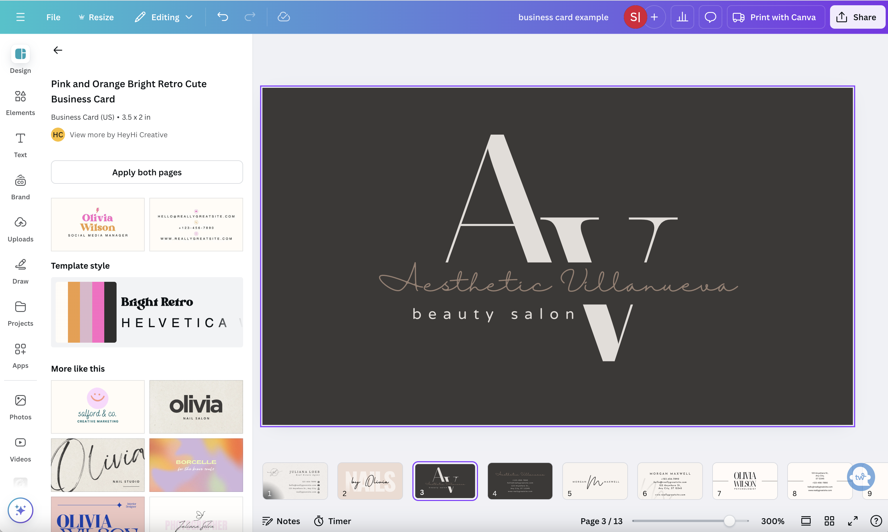
I always emphasize starting with the right workspace setup during my design workshops. The magic happens when you click that “Create a Design” button and search for “Business Cards” – you’ll find yourself in a perfectly sized canvas ready for your creative genius. The standard business card dimensions are automatically set to 3.5 x 2 inches, which saves you from those annoying sizing headaches.
I learned the hard way about the importance of bleeds in printing – trust me, those edge-to-edge designs need that extra space! Canva Pro includes this feature, and it’s worth every penny if you’re serious about your business cards. Speaking of Pro features, the ability to resize designs instantly and access premium templates has saved me countless hours of work.
Digital formats are trending these days, but don’t underestimate the power of a physical card. When setting up your workspace, consider creating both versions for your business cards. It’s never a bad idea to have both formats. The digital format allows for clickable elements and vibrant colors, while print designs need to account for color variations in the printing process.
Creating a dedicated folder for your business card projects keeps everything tidy and accessible. Take advantage of Canva’s brand kit feature to store your colors, logos, and fonts – it’s like having your own digital design assistant!
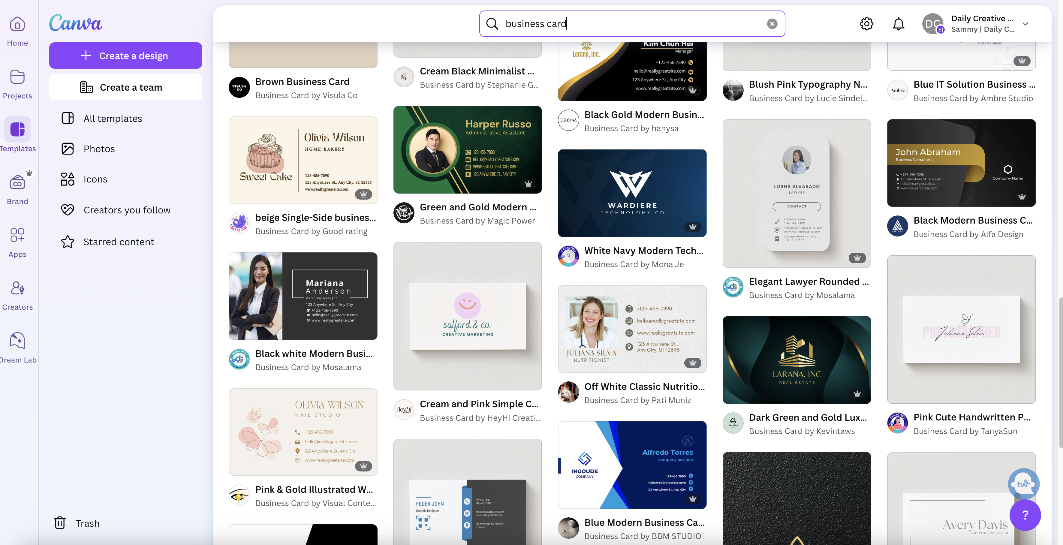
Selecting the Perfect Business Card Template
Choosing the right template sets the foundation for a killer business card. Through years of teaching design principles, I’ve discovered that template selection is where most beginners get stuck. There are SO many options. It can be hard to make a decision! The key? Understanding your industry’s visual language.
Canva’s template library is massive – almost overwhelmingly so. For tech startups, I point my students toward clean, minimalist designs with plenty of white space. Financial advisors? Traditional layouts with subtle modern touches tend to work best. The template you choose should reflect your brand’s personality while maintaining professionalism.
One thing that drives me crazy is seeing people use templates without customization. Think of templates as a starting point, not a final destination. During my design consultations, I encourage clients to mix elements from different templates to create something unique.
The most successful business cards I’ve seen combine familiarity with unexpected touches. Take my client in real estate – we chose a classic layout but added a subtle geometric pattern that referenced architectural elements. The result? A memorable card that still felt appropriate for her industry.
Modern templates often feature bold typography and unconventional layouts, while traditional options stick to centered text and conventional spacing. Your choice should align with your target audience’s expectations while still standing out in a stack of cards.
Essential Business Card Design Elements
Typography can make or break a business card design. Through countless revisions with my clients, I’ve found that combining no more than two fonts creates the most professional look. My foolproof combo? A bold sans-serif for names and a clean serif for contact details.
New to typography? Bookmark this post as a reminder and checklist to refer back to during your design journey – 15 Expert Canva Typography Tips to Elevate Your Designs Instantly.
Color choice requires serious thought. During a recent branding workshop, a participant used eight different colors on her card – it looked like a rainbow exploded! The most effective cards typically stick to 2-3 colors max, perfectly aligned with your brand palette. I’ve got a tried-and-true rule for color selection: 60% dominant color, 30% secondary color, and 10% accent.
Color theory is essential in business card design. If you don’t feel 100% comfortable choosing a color palette, I suggest giving this post a once-over while you’re working on your new business cards – Canva Color Theory: Mastering Color Palettes in Design.
Logo placement feels like an art form in itself. Through years of experimentation, I’ve found that positioning your logo at 1/3 the width of the card creates perfect visual balance. Nothing pains me more than seeing tiny logos crammed into corners! Your logo deserves prime real estate – it’s your brand’s handshake. Don’t be afraid to play around with this though. Some logos look better in different formats.
Sometimes you’ll find a company doesn’t have a logo or the current one is incredibly outdated. If this is the case, you might find it helpful to create an entirely new logo for the rebrand. Check out my post on How to Create a Professional Logo in Canva: A Step-by-Step Guide for Beginners for logo-specific tips.
Contact information hierarchy is crucial. In my design career, I’ve noticed many people trying to cram every possible way to reach them onto their cards. Keep it simple: name, title, phone, email, and website are usually enough. Social media handles? Only include the platforms where you’re professionally active.
White space isn’t empty space – it’s breathing room for your design elements. Think of it like arranging furniture in a room. You wouldn’t cram every inch with chairs and tables, right? The same principle applies to business card design.
Customizing Your Business Card Design
Text editing in Canva feels like having a digital Swiss Army knife at your disposal. The platform offers incredible flexibility for manipulating text elements. During my workshops, I demonstrate how slight adjustments in letter spacing can transform ordinary text into something extraordinary.
The brand color implementation process deserves special attention. Canva’s color picker tool lets you grab exact color codes from your logo or website. This consistency builds brand recognition – something I learned while working with multiple startups over the years.
Graphics and images need careful handling on business cards. Many of my students initially struggle with proportion – either their images are too dominant or barely visible. Finding that sweet spot takes practice, but I’ve found that images should typically occupy no more than 30% of the card’s real estate.
Effects and animations bring digital cards to life, but moderation is key. Subtle gradients and shadows can add depth without overwhelming the design. My digital business card features a gentle hover effect that highlights contact information – just enough interactivity to be engaging without feeling gimmicky.
I’ve discovered that layering elements creates visual interest. Start with your background elements, then add your core information, finishing with subtle decorative touches. This approach ensures your card maintains a clear hierarchy while still looking sophisticated.
Advanced Design Techniques in Canva
Double-sided designs open up a world of creative possibilities. The front of your card should focus on immediate impact, while the back can include additional details or creative elements. Teaching this concept to my design students always leads to exciting breakthroughs in their work.
Grid systems provide the foundation for professional layouts. I always emphasize the importance of proper alignment. There’s nothing worse than finishing your design, sending it to print and only realizing the alignment is off when you receive your box of 500 cards. Yikes. Canva’s smart guides make this process practically foolproof – they’re like having a digital design mentor looking over your shoulder.
QR codes have experienced a massive comeback. Integrating them into business card designs requires finesse – they shouldn’t dominate the layout but need to be large enough to scan easily. My current card includes a subtle QR code that leads to my digital portfolio.
The magic of gradients lies in their subtlety. Too often, I see designs with harsh color transitions that scream “amateur.” Instead, opt for gentle color shifts that add dimension without drawing attention to themselves. Canva’s gradient tool allows for precise control over these transitions.
Layer management might seem technical, but it’s crucial for creating sophisticated designs. Think of it like painting – you start with the background and work your way forward. This approach has helped my students create complex designs while maintaining perfect organization.
Optimizing Your Design for Printing
Print specifications can feel like a foreign language at first. My design students often panic when I mention CMYK and RGB color modes, but it’s simpler than it sounds. Digital screens use RGB colors, while professional printers need CMYK.
Resolution requirements caused me headaches early in my design career. The standard for professional printing is 300 DPI (dots per inch), and Canva maintains this quality standard automatically. Low-resolution images look pixelated and unprofessional – I learned this lesson the hard way after ordering 500 cards with a blurry logo when I was in school!
Bleed areas might sound technical, but they’re essential for edge-to-edge designs. Professional printers need that extra 0.125 inches around the edges of your design. My rule of thumb? Always extend background elements into the bleed area, but keep important information within the safe zone – about 0.25 inches from the edge.
File formats matter more than most people realize. For professional printing, PDF is king. It preserves your design exactly as intended and includes all the necessary printing information. I’ve found that downloading both PDF and PNG versions gives you options for different uses – PDF for printing and PNG for digital sharing.
Paper selection dramatically impacts your final product. Through years of experimentation, I’ve discovered that 16pt cardstock offers the perfect balance of durability and sophistication. Matte finishes work beautifully for minimal designs, while spot UV coating adds dramatic flair to specific elements.
Business Card Design Best Practices
- Design mistakes can make or break your professional image.
The most common error I see? Overcrowding. Your business card isn’t a billboard – it’s more like a perfectly crafted tweet. Every element needs to earn its place on that 3.5 x 2-inch canvas.
- White space utilization terrifies many beginners.
Many beginner designers feel compelled to fill every inch of the card. Empty space actually makes your design more powerful – it’s like taking a breath between sentences. My most successful designs often use less than 60% of the available space.
- Visual hierarchy guides the viewer’s eye through your information.
The technique I use involves creating three distinct levels of importance: immediate impact (your name), secondary information (contact details), and supporting elements (design accents). This approach ensures your card communicates effectively at a glance.
- Mobile-friendly elements matter in our digital world.
QR codes should link to mobile-optimized websites, and phone numbers should be tap-to-call enabled in digital versions. The future of business cards bridges the physical and digital realms – I’ve seen this trend accelerate dramatically in recent years.
- Testing across platforms ensures consistency.
Your design might look perfect on your 27-inch monitor but completely different on someone’s phone screen. Print a test batch before ordering in bulk – this small investment can prevent costly mistakes.
Frequently Asked Questions About Canva Business Card Design
I’ve accumulated a list of questions that pop up time and time again. The real-world challenges my students face have helped shape these practical answers.
What size should my business card be in Canva?
Standard business cards measure 3.5 x 2 inches (88.9 x 50.8 mm). Canva automatically sets these dimensions when you select the business card template. For international use, consider that European standard sizes differ slightly at 85 x 55 mm.
Is Canva Pro worth it for business card design?
Based on my experience working with both versions, Canva Pro offers significant advantages for business card design. The ability to resize designs, access premium templates, and remove image backgrounds has proven invaluable for my clients. The brand kit feature alone saves hours of work when creating multiple design variations.
Can I print my Canva business cards anywhere?
While Canva offers printing services, you’re not limited to their service. I’ve helped students successfully print their designs through local print shops and online services. The key is downloading your design as a PDF with bleed marks and using the correct color mode (CMYK for professional printing).
How many designs can I create in Canva?
Free users can create unlimited designs, including business cards. My recommendation? Create multiple versions of your card and test them with colleagues before finalizing. Some of my best designs emerged from experimental variations.
Why do my colors look different when printed?
Screen colors (RGB) and print colors (CMYK) often vary slightly. Professional printers use the CMYK color system, which has a more limited color range than what you see on screen. I always advise ordering a small test batch before committing to a large print run.
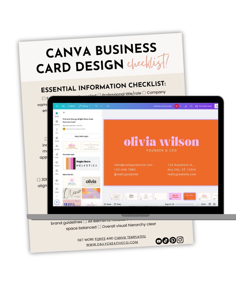
Business Card Design Checklist
Print this checklist and keep it handy during your design process. Through years of teaching, I’ve refined this list to cover all crucial elements of professional business card design. Grab it for free below!
Troubleshooting Common Design Issues
Through teaching thousands of students, I’ve encountered virtually every possible design challenge. These solutions address the most common issues that arise when creating business cards in Canva.
Blurry Logo or Images:
- Upload high-resolution image files (minimum 300 DPI)
- Avoid enlarging small images beyond their original size
- Use vector logos when possible
- Download the design at highest quality settings
Text Formatting Problems:
- Reset text formatting if fonts appear inconsistent
- Group text elements to maintain spacing
- Use text boxes for better control over placement
- Lock elements in place once perfectly positioned
Color Matching Issues:
- Use the color picker tool to match exact brand colors
- Save brand colors in your brand kit for consistency
- Test print to check color accuracy
- Adjust saturation if colors print too dark or light
Alignment Difficulties:
- Enable grid lines for precise placement
- Use the position tools for exact measurements
- Group elements that should move together
- Take advantage of Canva’s smart guides
Export and Printing Problems:
- Download as PDF with crop marks for professional printing
- Include bleed in the export settings
- Use “Background Remove” tool for clean edges
- Test print before ordering in bulk
File Size Issues:
- Compress images before uploading to Canva
- Remove unused elements from the design
- Break complex designs into simpler components
- Use Canva’s built-in image compression options
Each of these sections adds practical value to our main article, providing quick reference points and solutions to common challenges. The checklist, in particular, serves as a valuable tool for ensuring no crucial elements are overlooked in the design process.
Canva Business Card Design Conclusion
Creating the perfect business card in Canva combines technical precision with creative expression. Throughout my years teaching design, I’ve watched countless professionals transform their business cards from basic contact cards into powerful marketing tools. The principles and techniques shared here have been battle-tested across industries and design styles.
Your business card represents more than contact information – it’s a physical piece of your brand that lives in someone else’s wallet or desk drawer. Take the time to craft something memorable. The tools are at your fingertips, and with Canva’s user-friendly platform, professional-quality design is within everyone’s reach.
Remember that great design evolves. Test different versions, gather feedback, and refine your card over time. The goal isn’t perfection on the first try – it’s creating something that effectively represents your brand and resonates with your target audience.
Ready to start designing? Jump into Canva and begin exploring templates that align with your vision. Your perfect business card design awaits, and with these guidelines, you’re well-equipped to create something truly remarkable. The business card you design today might lead to your next big opportunity tomorrow!
Related Posts You’ll Love:
- How to Create a Professional Canva Business Presentation: A Step-by-Step Guide
- How to Use Canva for Business: A Complete Guide to Boost Your Brand
- 11 Best Canva Pro Features Worth Paying For – A Designer’s Guide
- Best Laptops for Canva in 2025: Top Choices for Designers
- Master Canva Photo Editing: Tips and Tricks for Professional Results


Leave a Reply