When I was studying graphic design during my undergrad, we spent countless hours wrestling with complex presentation software. I’ll never forget the shock on our faces when we discovered the simplicity of other students using Canva for their business school presentations.
The statistics speak volumes – research shows that 91% of presenters report increased confidence with professionally designed slides, and I’ve witnessed this transformation firsthand with hundreds of students and clients.
As someone who’s spent years helping businesses elevate their visual communications, I’m excited to share my insider knowledge of creating impactful business presentations using Canva!
This post is all about how to create captivating business presentations in Canva!
Understanding Canva’s Business Presentation Features
During my years of consulting, I discovered that many professionals were barely scratching the surface of Canva’s capabilities. The platform’s drag-and-drop interface revolutionized my approach to creating pitch decks. I’ve watched countless faces light up when they realize they don’t need a design degree to create professional-looking slides.
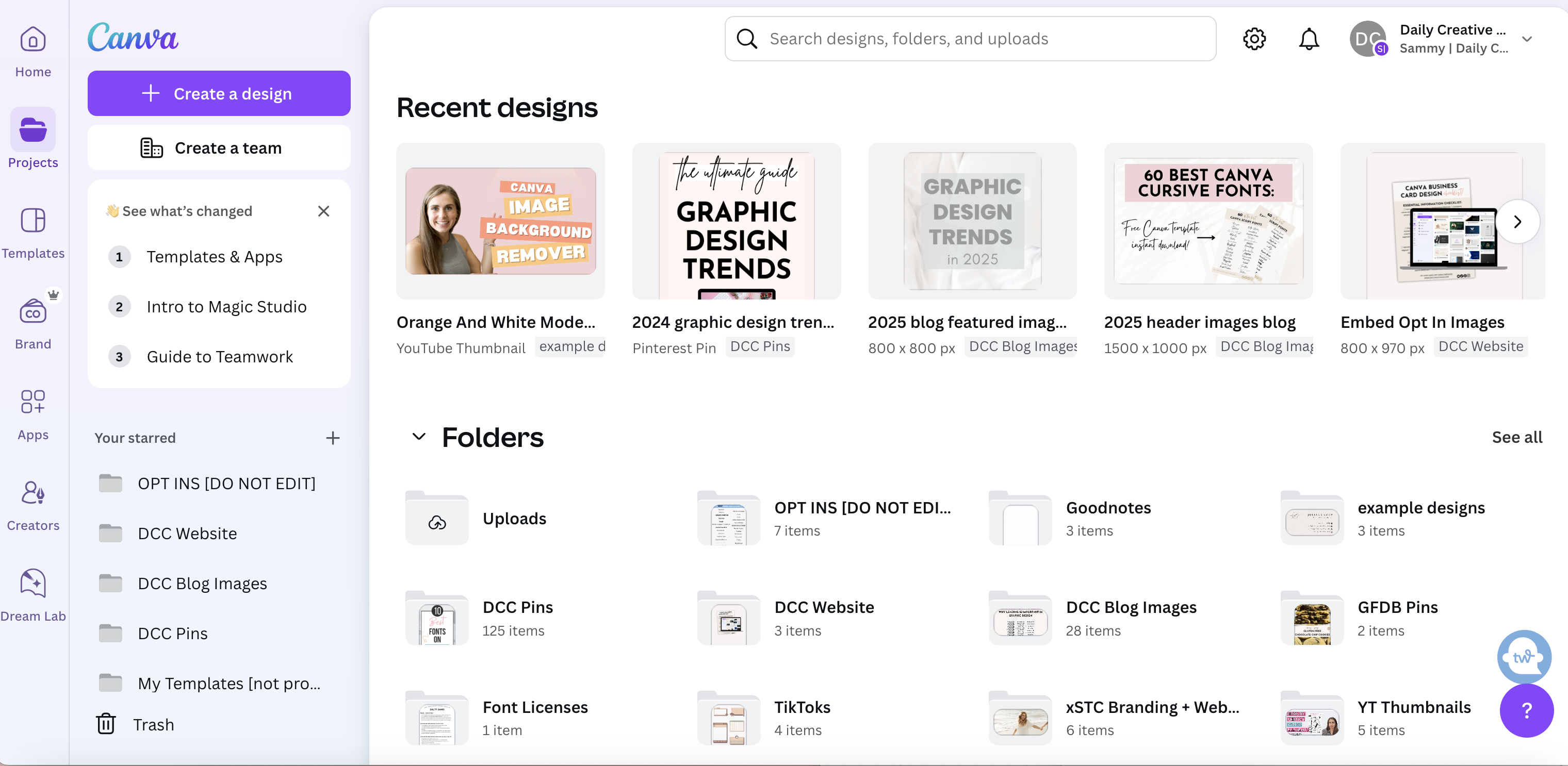
The Brand Kit integration changed everything for my corporate clients. Picture this – instead of manually checking hex codes and font specifications, everything’s right there at your fingertips. It’s like having a personal design assistant who never forgets your brand guidelines! The real magic happens with the collaboration tools. My team recently completed a 50-slide investor pitch while working across three different time zones.
Background removal became my secret weapon for creating clean, professional slides. My clients often laugh when I tell them about the hours I used to spend in Photoshop doing what Canva now does in seconds. Magic Resize has saved me during last-minute presentation format changes – converting from standard slides to mobile-friendly formats happens instantly.
Truthfully, learning these features took some trial and error. I cringe thinking about the time I accidentally shared editable templates with a competitor! That taught me the importance of understanding permission settings. These days, I always create separate template versions for different access levels.
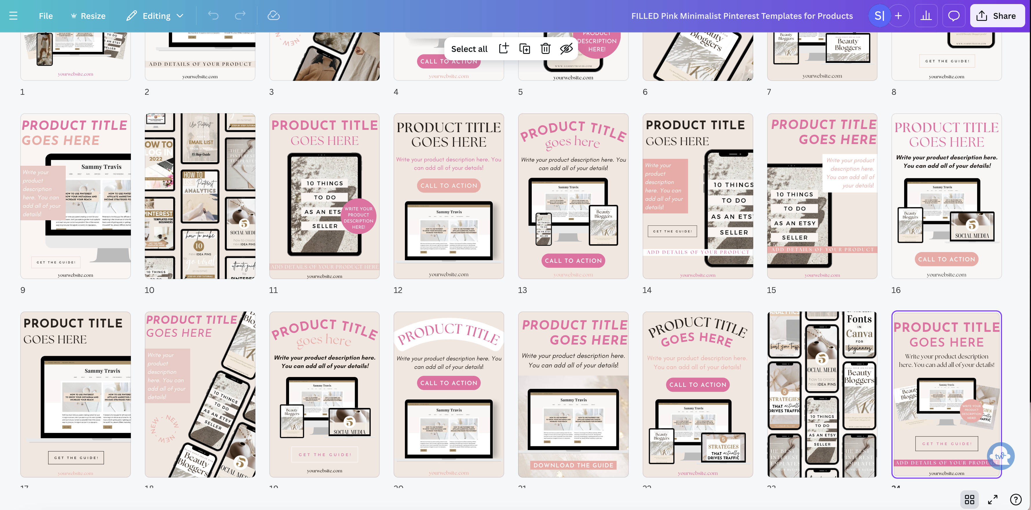
Selecting and Customizing Professional Templates
The template selection process makes or breaks a presentation. My design background taught me to look beyond the obvious choices. While working with a healthcare startup, I actually adapted a real estate template that perfectly matched their minimalist brand aesthetic. The key lies in seeing the structural bones beneath the surface design.
Template customization requires strategic thinking. My graduate students initially struggled with maintaining visual consistency while modifying templates. Through experimentation, we discovered that starting with color scheme adjustments before touching layout elements produces more cohesive results. The breakthrough moment comes when you understand that templates are starting points, not final destinations.
New to Canva templates? Check out my post on How to Use Canva Templates: A Step-by-Step Guide for Beginners and Canva Keyboard Shortcuts: 50+ Time-Saving Commands.

My experience with different industries shaped my approach to template adaptation. Financial presentations demand data-focused layouts, while creative agencies need more visual flexibility. I learned to evaluate templates based on their core structure rather than surface-level design elements. This perspective shift transformed how my clients approach template selection.
The power of saving custom templates revolutionized my workflow. Creating master templates for different presentation types saves hours of repetitive work. My clients particularly appreciate having preset layouts for quarterly reports, pitch decks, and training materials – each maintaining their unique brand identity while sharing consistent design elements.
Design Principles for Business Presentations in Canva
Understanding visual hierarchy transformed my presentation designs. My background in cognitive psychology helps me guide viewers’ attention through complex information. The 7×7 rule became second nature after seeing how it improved audience engagement in real-world presentations.
White space intimidates many beginners. Teaching executives to embrace emptiness on their slides often feels like convincing someone to leave money on the table. The transformation in their presentations after implementing proper spacing principles validates this approach every time. Strategic use of negative space actually makes content more impactful.
Typography choices reflect presentation personality. My design courses emphasize the psychology behind font pairings. Professional presentations typically benefit from a combination of clean sans-serif fonts for headlines and readable serif fonts for body text. Understanding these principles elevates the overall presentation quality.
The grid system provides essential structure. My experience teaching design fundamentals highlighted how proper alignment creates subconscious order. Implementing consistent grid structures across slides creates a professional flow that audiences appreciate, even if they don’t consciously notice it.
Creating Engaging Visual Content
Data visualization became my specialty after years of helping startups pitch to investors. Instead of overwhelming audiences with raw numbers, I transform complex data into digestible charts that tell compelling stories. Canva’s chart options might seem basic at first glance, but combining them with custom elements creates powerful data narratives.
Stock photos require careful consideration in business presentations. My experience art directing corporate campaigns taught me that generic office photos often undermine credibility. Integrating relevant, high-quality visuals that align with your message makes presentations more memorable and impactful. I’ve found that custom illustrations often communicate complex concepts more effectively than photographs.
Animation features deserve thoughtful application. My clients frequently ask about adding movement to their slides, but restraint proves crucial. Professional presentations benefit from subtle transitions that enhance the narrative flow without distracting from the content. The best animations support your message rather than overshadow it.
Visual consistency emerged as a critical factor through my consulting work. Each element should contribute to your overall message. Removing unnecessary decorative elements often strengthens presentations. The discipline of maintaining visual consistency across slides creates a professional, cohesive experience.
Advanced Business Presentation Features
Presenter view revolutionized my virtual training sessions. The ability to see upcoming slides while maintaining eye contact with the audience through the camera transformed my delivery. My presentation skills workshops focus heavily on leveraging this feature effectively, as it helps speakers maintain confidence and control.
Interactive elements elevate audience engagement significantly. Clickable links and embedded multimedia transform static presentations into dynamic experiences. The key lies in strategic placement – interactive elements should enhance understanding rather than interrupt the flow.
Creating custom layouts became essential for my clients. Their unique presentation needs often require specialized configurations. The ability to save these layouts as templates streamlined the creation process for future presentations. This approach ensures consistency across large organizations while maintaining flexibility for different content types.

Optimizing Presentations for Different Platforms
Platform optimization became critical in our hybrid work environment. My experience with clients has taught me that presentations must perform flawlessly whether viewed on boardroom screens or mobile devices. Understanding platform-specific requirements helps avoid technical issues that could undermine your message.
File size management requires strategic thinking. Through trial and error, I discovered techniques for maintaining visual quality while reducing file sizes. This knowledge proved especially valuable when creating presentations for clients with strict file size limitations or bandwidth constraints.
Mobile optimization changed my approach to slide design. Teaching presentation design to busy executives showed me the importance of mobile-friendly layouts. Content must remain legible and impactful on smaller screens without sacrificing visual appeal or professional polish.
Format conversion knowledge saves presentations from technical difficulties. My experience with international conferences taught me to prepare for various platform requirements. Understanding how to optimize presentations for different formats ensures your message reaches its audience effectively, regardless of viewing platform.
How to Create Canva Business Presentations Conclusion
Creating professional business presentations in Canva combines technical skills with strategic thinking. Mastering these techniques transforms not just presentations but also presenter confidence.
The features and strategies covered in this blog post provide a foundation for creating impactful business presentations that resonate with audiences across platforms and purposes. Take these insights and adapt them to your unique presentation needs. Your next presentation could be the one that sets new standards in your organization!
Related Posts You’ll Love:
- How to Use Canva for Business: A Complete Guide to Boost Your Brand
- 11 Best Canva Pro Features Worth Paying For – A Designer’s Guide
- Canva Business Card Design: How to Create Professional Cards in Minutes
- 15 Must-Know Canva Design Hacks to Create Graphics Like a Pro
- 45 Best Canva Font Pairings and Canva Font Combinations
- How to Upload Fonts to Canva + Video Tutorials: (Pro, Mobile & Fixes for Every Issue)
- Canva Licensing Explained: A Complete Guide to Free, Pro, and Enterprise Use


Leave a Reply